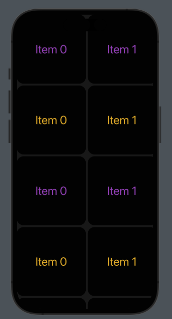
Today, we often see complex interfaces built using carousel components, as seen on Netflix, Amazon, and others. In this post, I will show you how to build one using SwiftUI. Let’s get started.
First, I’ll show you an example of a carousel built using only text and a rectangle. This is a minimal example meant to help you understand the fundamentals. Then, in the second example, I’ll add some images.
As usual, let’s start from the end.

It’s possible to scroll any row horizontally and vertically.
The code:
struct ContentView: View {
    var colorsRow: [Color] = [.purple,.yellow]
    var body: some View {
        ScrollView {
            VStack(spacing: 5) {
                ForEach(0..<10) { j in
                    ScrollView(.horizontal) {
                        HStack(spacing: 5) {
                            ForEach(0..<10) { i in
                                VStack {
                                    Text("Item \(i)")
                                        .foregroundColor(colorsRow[j % 2])
                                        .font(.largeTitle)
                                        .frame(width: 200, height: 200)
                                        .background(.black)

                                }.cornerRadius(20)
                            }
                        }
                    }
                }
            }.background(.black)
                .opacity(0.9)
        }.edgesIgnoringSafeArea(.all)
    }
}
We use two ScrollViews for this implementation: the first for vertical scroll (default behavior) and the second for horizontal scrolling. Note the “.horizontal” parameter. In the VStack, we specify the spacing, which is the space between rows. In the HStack, the spacing is the space between columns.
The first ForEach loop is for rows, and the second is for columns. The color of the text is chosen using the modulo of the row.
Finally, we added a bit of opacity for a better Look and Feel.
Note: English is not my native language, so I’m sorry for some errors. I appreciate it if you correct me.


