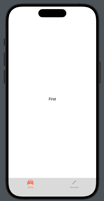
In this post, we’ll explore how to customize the TabView with just a few lines of code.
As usual, let’s start from the end:

We’ll specifically look at how to:
- Change the color of the tabBar.
- Modify the text and color of each tab item.
struct ContentView: View {
    var body: some View {
        TabView{
            Group {
                Text("First")
                .tabItem {
                    Label("First", systemImage: "car")
                }
                Text("Second")
                    .tabItem {
                        VStack{
                            Image(systemName: "pencil")
                            Text("Second")
                        }
                    }
            }.toolbarBackground(.visible, for: .tabBar)
            .toolbarBackground(Color.black.opacity(0.1), for: .tabBar)
        }
    }
}
(Note that in the tab item, the text and icon are defined in two different ways, just to demonstrate this possibility).
To set the color of the tabBar, we use:
.toolbarBackground(.visible, for: .tabBar)
.toolbarBackground(Color.black.opacity(0.1), for: .tabBar)
So, the background should be visible, utilizing black color with an opacity setting. Note that the properties are applied to the Group that contains the elements in the TabView. If we skip the Group, the properties will not be applied to all the tabs.
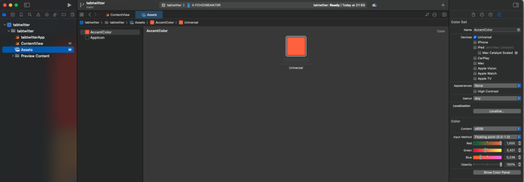
To change the color of the icon and the text of the tab item, we must define the accent color in the assets:

The AccentColor will be used for the tab item elements, as well as for buttons and other components.
Now you have the knowledge needed to customize your TabView.
Note: English is not my native language, so I apologize for any errors. I use AI solely to generate the banner of the post; the content is human-generated.
To subscribe to my newsletter [https://nicoladefilippo.com/#mailinglist]
