The Apple User Interface Guidelines don’t mention floating buttons, and there is no native component for them. However, some applications, such as Twitter and the Gmail client, do use them.
In this post, we’ll explore how to create a floating button, taking the Gmail app client as our example.
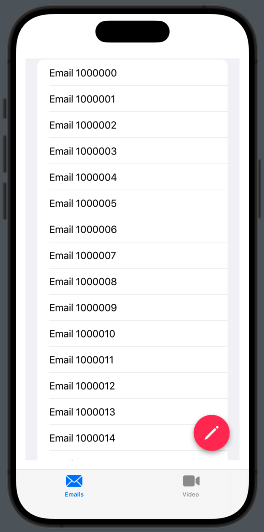
We aim to create this:

Therefore, we need to create a TabView. Inside the first tab, we’ll use a ZStack that contains both a list and a button.
struct ContentView: View {
    var body: some View {
        TabView {
            NavigationStack {
                ZStack {
                    List(initList(), id:\.self) { mail in
                        Text(mail)
                    }
                    VStack {
                        Spacer()
                        HStack {
                            Spacer()
                            NavigationLink { EmptyView()} label:{
                                Image(systemName: "pencil")
                                    .font(.title.weight(.semibold))
                                    .padding()
                                    .background(.pink)
                                    .foregroundStyle(.white)
                                    .clipShape(Circle())
                                    .shadow(radius: 4, x: 0, y: 4)
                            }.padding()
                        }
                    }.padding()
                }
            }.tabItem {
                Label("Emails", systemImage: "envelope")
            }
            Text("Second tab")
                .tabItem {
                    Label("Video", systemImage: "video")
                }
        }
    }
    func initList() -> [String] {
        var emails = [String]()
        for i in 1000000...1000100 {
            emails.append("Email " + String(i))
        }
        return emails
    }
}
The list is initialized with the initList utility function. Within the ZStack, we display the list of emails and a navigation link represented by a button. The button is placed within a VStack accompanied by a Spacer, pushing it to the bottom. Additionally, it is nested inside an HStack with another Spacer, positioning it on the right side.
Tapping on the button we move on an EmptyView.
Feel free to experiment with the code—it’s the best way to learn and discover new possibilities. Dive in and have fun!
If you’d like to stay updated with the latest content from my blog, consider subscribing to my weekly newsletter.


1 comment