Sure, sometimes when developing mobile applications, you find yourself in situations where you want some elements to have dimensions proportional to the screen. In such cases, GeometryReader is what you need.
With GeometryReader, it’s possible to assign sizes to our elements relative to their containers.
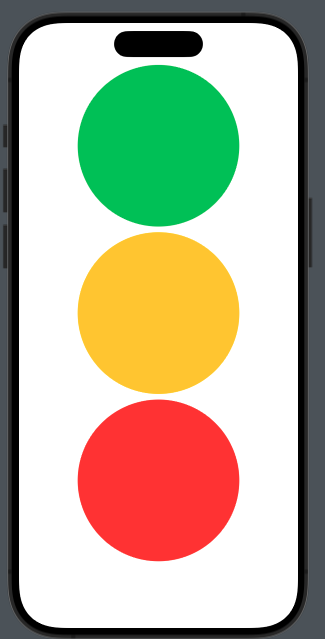
Let’s look at an example. Suppose we want to create a semaphore where each circle occupies a third of the screen width, like this

The code:
struct ContentView: View {
    var body: some View {
        GeometryReader { geometry in
            VStack {
                Circle().frame(height: geometry.size.height * 0.3).foregroundStyle(.green)
                Circle().frame(height: geometry.size.height * 0.3).foregroundStyle(.yellow)
                Circle().frame(height: geometry.size.height * 0.3).foregroundStyle(.red)
            }.frame(width: geometry.size.width)

        }
    }
}
Thus, for each circle, we set the height to 30% of the GeometryReader’s area (in this case, the screen) and set the size of the VStack to match the width of the render. If we omit this setting, the circles would be displayed on the left because the width of the VStack would default to the width of the circles.
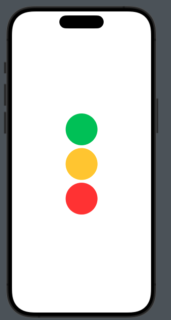
As mentioned at the beginning of this post, GeometryReader is excellent for setting the sizes of our elements relative to their containers. Now, let’s see how to create a circle with its height being 30% of a VStack that has a size of 300×300:
struct ContentView: View {
    var body: some View {
        VStack {
            GeometryReader { geometry in
                VStack {
                    Circle().frame(height: geometry.size.height * 0.3).foregroundStyle(.green)
                    Circle().frame(height: geometry.size.height * 0.3).foregroundStyle(.yellow)
                    Circle().frame(height: geometry.size.height * 0.3).foregroundStyle(.red)
                }.frame(width: 300)
            }
        }.frame(width: 300, height: 300)
    }
}
to have:

