In this post, we’ll learn how to configure the toolbar using SwiftUI:
- How to add a button to the main toolbar.
- How to add a button to the bottom toolbar.
- How to customize the title.
Add buttons in the main toolbar:
To keep things simple and have something in the view, we’ll start with a view that includes a NavigationStack and a list of colors. The objective is to add a “+” button at the top right. To do this:
struct ContentView: View {
    var colors = ["red", "green", "brown", "purple"]
    var body: some View {
        NavigationStack {
            List(colors, id:\.self) { color in
                HStack {
                    Text(color)
                }
            }
            .toolbar(content: {
                ToolbarItem(placement: .confirmAction) {
                    Button("+") {
                        // your action
                    }.font(.largeTitle)
                }
            })
        }
    }
}
In the toolbar we add a ToolbarItem that contains a button, note the placement, it’s “.confirmAction”, in the Apple world the confirm actions are always on the right. Intead of this value it’s possible also use .topBarTrailing.
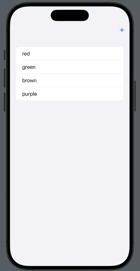
Instead of positioning the button on the top right, if you want it on the top left, use .cancelAction or .topBarLeading as the placement.
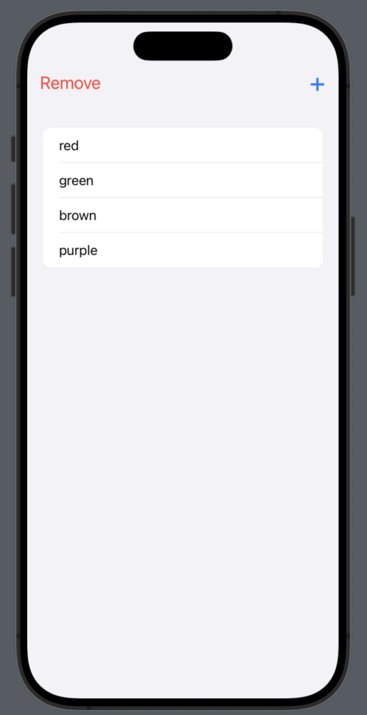
Obviously, it’s possible to use both placements at the same time:”
NavigationStack {
            List(colors, id:\.self) { color in
                HStack {
                    Text(color)
                }
            }
            .toolbar(content: {
                ToolbarItem(placement: .topBarTrailing) {
                    Button("+") {

                    }.font(.largeTitle)
                }
                ToolbarItem(placement: .topBarLeading) {
                    Button("Remove") {

                    }.font(.title2)
                     .foregroundStyle(.red)
                }
            })
        }
To have:
Add buttons in the bottom toolbar:
struct ContentView: View {
    var colors = ["red", "green", "brown", "purple"]
    var body: some View {
        NavigationStack {
            List(colors, id:\.self) { color in
                HStack {
                    Text(color)
                }
            }
            .toolbar(content: {
                ToolbarItem(placement: .bottomBar) {
                    Button("+") {

                    }.font(.largeTitle)
                }
            })
        }
    }
}
The only change here is in the placement, which is now .bottomBar.
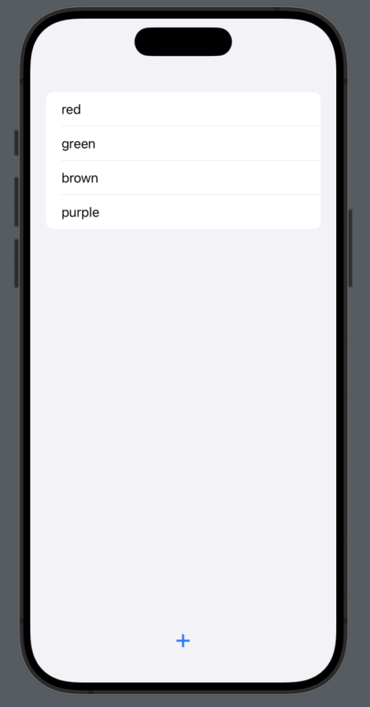
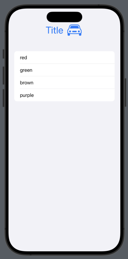
The toolbar can be useful when creating a custom title, such as one with an image. In that case, we can write something like this:
struct ContentView: View {
    var colors = ["red", "green", "brown", "purple"]
    var body: some View {
        NavigationStack {
            List(colors, id:\.self) { color in
                HStack {
                    Text(color)
                }
            }.toolbar {
                ToolbarItem(placement: .principal) {
                    HStack {
                        Text("Title")
                        Image(systemName: "car")
                    }.font(.largeTitle)
                        .foregroundStyle(.blue)
                }
            }
        }
    }
}
In this way we set in the center of the main bar a text and an image:
In this post, we explored how to use the toolbar. In the next one, we will learn how to add a real action to the button, such as opening a sheet.
Note: English is not my native language, so I’m sorry for some errors. I appreciate if your correct me.

