
In this post, I’ll present a list of the principal pickers in SwiftUI:
- Default Picker
- Date Picker
- Color Picker
- Segmented Controller (yes, it’s a picker)
- Wheel
Default Picker
The code:
struct ContentView: View {
    var films = ["A New Hope", "The Empire Strikes Back", "Return of the Jedi "]
    @State private var selectedFilm = "The Empire Strikes Back"

    var body: some View {
        VStack {
            Picker("Please choose a film", selection: $selectedFilm) {
                ForEach(films, id: \.self) { film in
                    Text(film)
                }
            }
            Text("You selected: \(selectedFilm)")
        }
    }
}
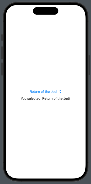
In this case, we show three film names, starting with the second one selected.
Date Picker
Now, we want to use a picker to select a date; in this case, we have more options:
struct ContentView: View {
    @State private var date = Date()

    var body: some View {
        VStack {
                DatePicker(
                    "Start Date",
                    selection: $date,
                    displayedComponents: [.date, .hourAndMinute]
                )
            Text(date.ISO8601Format())
        }
    }
}
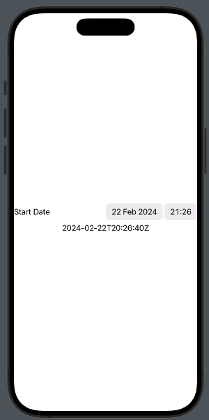
In this example, we set the DatePicker to the current datetime, and show the date, hours, and minutes (we can also choose to display only one, or both pieces of information).
If we want to display a calendar, we have to set datePickerStyle(.graphical) in this way:
DatePicker(
                    "Start Date",
                    selection: $date,
                    displayedComponents: [.date, .hourAndMinute]
                ).datePickerStyle(.graphical)
Color Picker
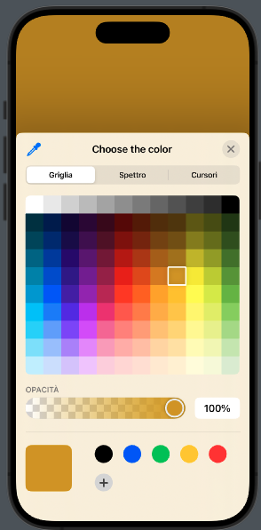
Sometimes, we want the user to choose a color, whether for settings or in a drawing application. In this case, we use the ColorPicker. In the code below, we select a color, and it becomes the background color of the view:
struct ContentView: View {
    @State private var bgColor =
            Color(.sRGB, red: 1, green: 1, blue: 1)

    var body: some View {
        ZStack {
            Color(bgColor)
            ColorPicker("Choose the color", selection: $bgColor)
        }.ignoresSafeArea(edges: .all)
    }
}
Segmented Controller
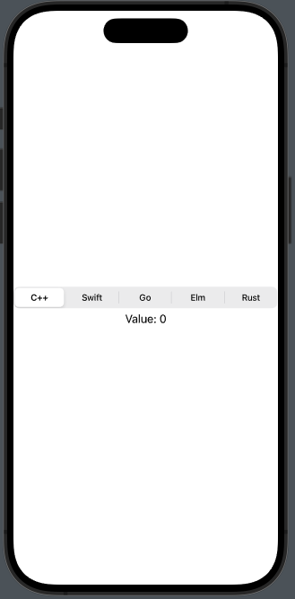
This is a picker that can create confusion, at least by its name, because usually this type of component is called ‘Segmented something.’ However, in SwiftUI, it’s simply called a Picker.
struct ContentView: View {
    @State private var selectedLanguage = 0

    var body: some View {
        VStack {
            Picker("What is your favorite language?", selection: $selectedLanguage) {
                Text("C++").tag(0)
                Text("Swift").tag(1)
                Text("Go").tag(2)
                Text("Elm").tag(3)
                Text("Rust").tag(4)
            }
            .pickerStyle(.segmented)

            Text("Value: \(selectedLanguage)")
        }
    }
}
Wheel
To have the wheel, it is sufficient to change the pickerStyle to .wheel in the example above.
I invite you to use this type of components whenever possible to avoid requiring users to type. Typing can be a tedious action, and it also increases the chance of inserting incorrect data.
Note: English is not my native language, so I apologize for any errors. I use AI solely to generate the banner of the post; the content is human-generated.


