In the previous post (https://nicoladefilippo.com/navigation-in-swiftui/) we saw how to navigate between the views in the app. In this post, we see another element to implement the navigation, the toolbar and how to customize the navigation bar.
Toolbar
First, create an empty project:
struct ContentView: View {
    var body: some View {
            Text("Hello, world!")
                .padding()
    }
}
Add the NavigationView:
struct ContentView: View {
    var body: some View {
        NavigationView {
            VStack {
                Text("Hello, world!")
                    .padding()
            }
        }
    }
}
Now add the toolbar:
struct ContentView: View {
    var body: some View {
        NavigationView {
            VStack {
                Text("Hello, world!")
                    .padding()
            }
            .navigationBarTitle("Title", displayMode: .inline)
            .toolbar(content: {
                NavigationLink(destination: EmptyView()) {
                    Image(systemName: "paperplane")
                    .font(.title)
                    .foregroundColor(.primary)
                }
            })
        }
    }
}
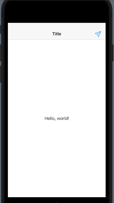
First, add a navigationTitle or a navigationBarTitle then add the toolbar. In the content you can write any object with user interaction (i.e. Button); in this example, we use a NavigationLink showing an image, paperplane, and how destination an EmptyView, for real app replace it with your view.

Customize
Start to the end:


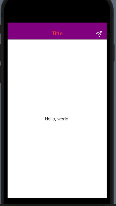
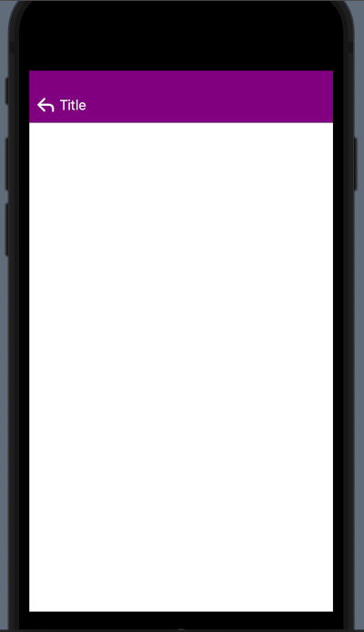
We want to have a purple navigationBar, with a custom font, and a different arrow to come back. How to do it?
 init() {
        let navBarAppearance = UINavigationBarAppearance()

        navBarAppearance.backgroundColor = UIColor.purple

        navBarAppearance.largeTitleTextAttributes = [.foregroundColor: UIColor.systemRed,  .font: UIFont(name: "ArialRoundedMTBold", size:35)!]

        navBarAppearance.titleTextAttributes = [.foregroundColor: UIColor.systemRed, .font: UIFont(name: "ArialRoundedMTBold", size: 20)!]


        UINavigationBar.appearance().standardAppearance = navBarAppearance
        UINavigationBar.appearance().scrollEdgeAppearance = navBarAppearance
        UINavigationBar.appearance().compactAppearance = navBarAppearance

        navBarAppearance.setBackIndicatorImage(UIImage(systemName: "arrow.turn.up.left"), transitionMaskImage: UIImage(systemName: "arrow.turn.up.left"))

        UINavigationBar.appearance().tintColor = UIColor.white
    }
We need to write an init function in the ContentView. In this function, we declare a navBarAppearance of UINavigationBarAppearance type.
For this, we define the property backgroundColor, largeTitleTextAttributes and titleTextAttributes (you can try to use different value and see the different effect).
Then we use the navBarAppearance for the standardAppearance, scrollEdgeAppearance and compactAppearance. Where:
- standardAppearance is the appearance settings for a standard-height navigation bar
- scrollEdgeAppearance is the appearance settings to use when the edge of any scrollable content reaches the matching edge of the navigation bar.
- compactAppearance is the appearance settings for a compact-height navigation bar.
(See https://developer.apple.com/documentation/uikit/uinavigationbar/3198028-standardappearance )
To change the image for the backIndicator use the setBackIndicatorImage, instead to change the colour of the image in the toolbar, set a value to UINavigationBar.appearance().tintColor.
To change the colour to a tabbar:
UITabBar.appearance().barTintColor = .purple
You can use the tabbar example from the previous post and work on it.
If you want, you can ask me for some arguments and I will try to satisfy you.
Note: English is not my native language, so I’m sorry for some errors. I appreciate it if your correct me.


