In this post, we’ll learn how to use LazyVGrid and LazyHGrid, two powerful and efficient grids to display multiple items.
The fundamental element for these types of grids is the GridItem, which can be of three types:
- .adaptive
- .fixed
- .flexible
GridItem Adaptive
GridItem Adaptive is essential for a responsive layout. By setting a minimum size for it, the grid will try to adapt to all the available space.
Take a look at using LazyHGrid:
struct ContentView: View {
    let rainbowColors = [Color.red, Color.orange, Color.yellow, Color.green, Color.mint, Color.teal, Color.cyan, Color.blue, Color.indigo, Color.purple, Color.brown]
    var body: some View {
        ScrollView(.horizontal) {
            LazyHGrid(rows: [GridItem(.adaptive(minimum:150))]) {
                        ForEach(rainbowColors, id:\.self) { color in
                            Circle()
                            .fill(color)
                        }
                    }
                    .padding()
                }
    }
}
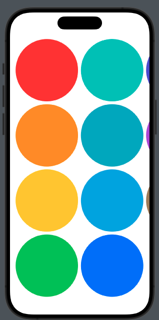
We can also define different sizes for the rows:
ScrollView(.horizontal) {
            LazyHGrid(rows: [GridItem(.adaptive(minimum:150)),GridItem(.adaptive(minimum:100))]) {
                        ForEach(rainbowColors, id:\.self) { color in
                            Circle()
                                                    .fill(color)
                        }
                    }
                    .padding()
                }
So we have:
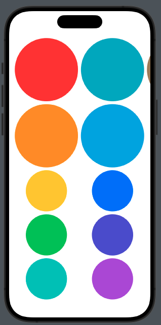
So, the two different dimensions are used to adapt to the screen.
This type is helpful when we have a dynamic number of elements, such as in a playlist.
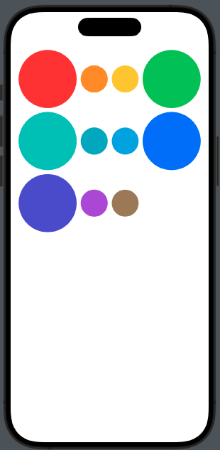
Using the Vertical grid:
ScrollView() {
            LazyVGrid(columns: [GridItem(.adaptive(minimum:100)), GridItem(.adaptive(minimum:50)),GridItem(.adaptive(minimum:100))]) {
                        ForEach(rainbowColors, id:\.self) { color in
                            Circle()
                            .fill(color)
                        }
                    }
                    .padding()
                }
}
GridItem Fixed
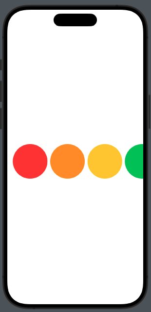
In this case, the GridItem has a fixed size for the horizontal layout:
ScrollView(.horizontal) {
            LazyHGrid(rows: [GridItem(.fixed(100))]) {
                ForEach(rainbowColors, id:\.self) { color in
                    Circle()
                                            .fill(color)
                }
            }
            .padding()
        }
For vertical:
ScrollView() {
            LazyVGrid(columns: [GridItem(.fixed(100))]) {
                    ForEach(rainbowColors, id:\.self) { color in
                        Circle()
                        .fill(color)
                    }
                }
                .padding()
            }
}
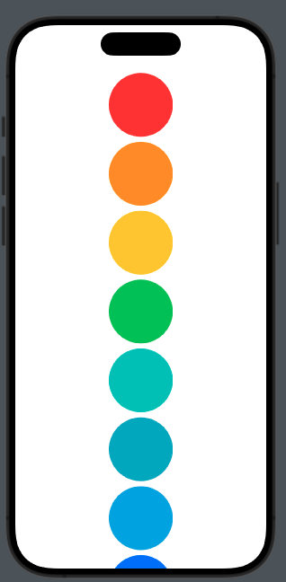
This is helpful when you need a fixed number of columns or rows. In this case, by adding GridItem with a fixed size, we don’t have adaptability to the screen.
Take a look at this example:
ScrollView() {
            LazyVGrid(columns: [GridItem(.fixed(150)),GridItem(.fixed(150)),GridItem(.fixed(150))]) {
                    ForEach(rainbowColors, id:\.self) { color in
                        Circle()
                        .fill(color)
                    }
                }
                .padding()
            }
we have:
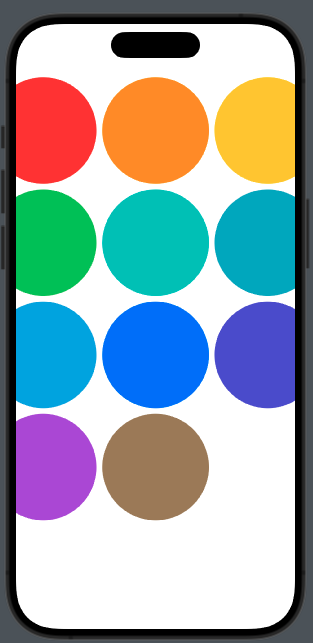
Three columns of circles with fixed size but truncated.
GridItem Flexible
With flexible, we define the size of GridItem within a range. For example:
ScrollView(.horizontal) {
            LazyHGrid(rows: [GridItem(.flexible(minimum: 10, maximum: 50)),GridItem(.flexible(minimum: 20, maximum: 100))]) {
                ForEach(rainbowColors, id:\.self) { color in
                    Circle()
                    .fill(color)
                }
            }
            .padding()
        }
To have:
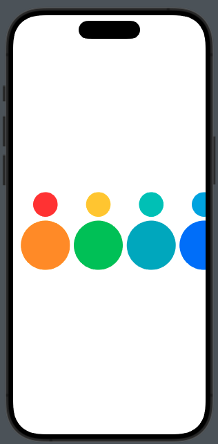
It’s helpful when we need different sizes for different content, such as images and text.
Let’s try the vertical case for exercise.
Note: English is not my native language, so I apologize for any errors. I use AI solely to generate the banner of the post; the content is human-generated.


