
State
In every software or application we need to share information from the different components, in this post we’ll see how to do it in SwiftUI.
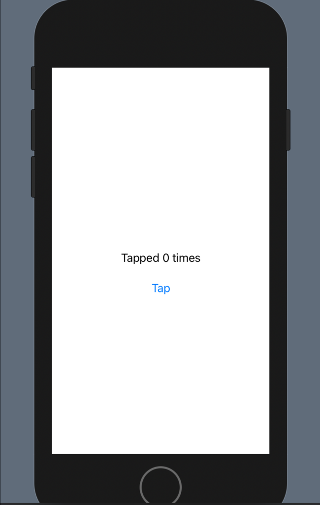
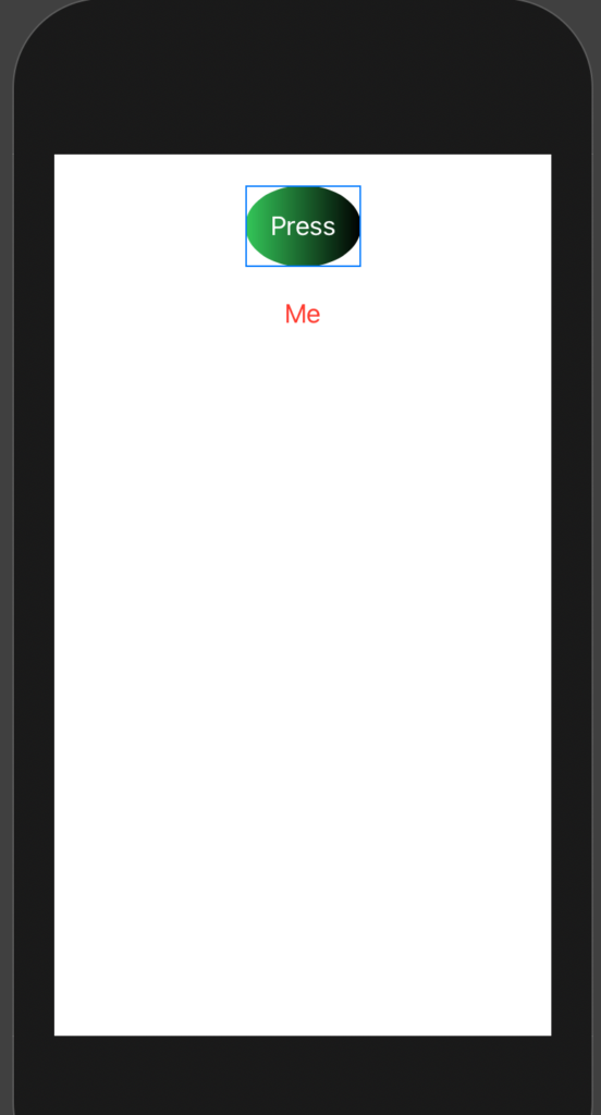
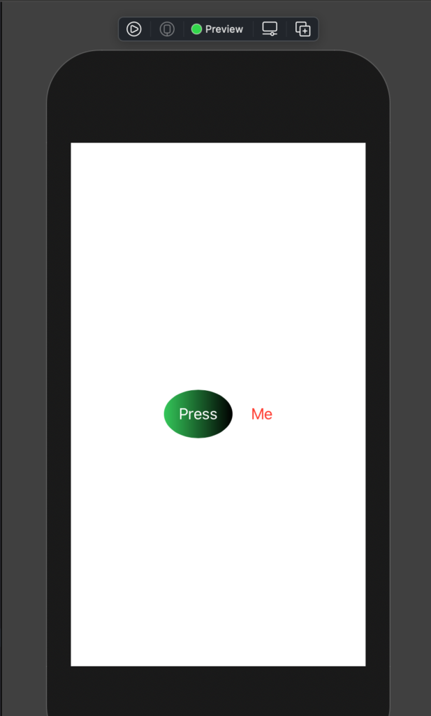
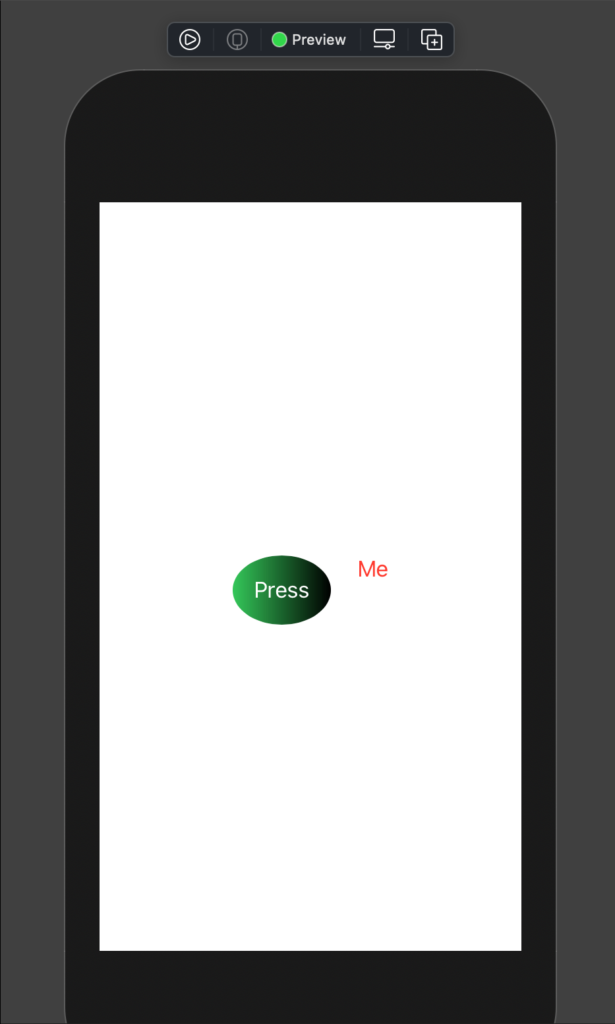
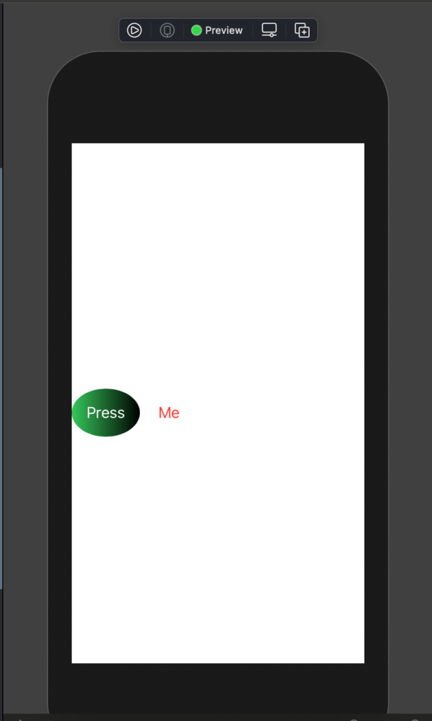
In the first example, we want to make a simple application that tapping on a button, the app shows the number of times that the button is tapped, more simple to show that to explain:
Let’s see the code:
struct ContentView: View {
    @State var counter: Int = 0

    var body: some View {
        VStack {
            Text(("Tapped \(counter) times"))
                .padding()
            Button(action: {counter = counter + 1}, label: {
                Text("Tap")
            })
        }
    }
}
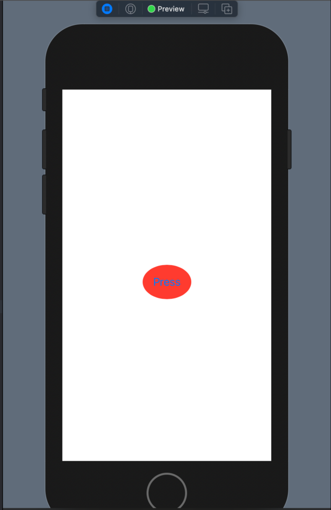
The counter variable is defined as @State, this means that every change to the counter is propagated in the application.
Thus, every time that we tap the button, the counter is increased by one.
Note: the code counter is initialized to 0, if you remove this, to change in
@State var counter: Int
You’ll have an error in the ContentView_Previews, to fix it, change the code in this way:
struct ContentView_Previews: PreviewProvider {
    static var previews: some View {
        ContentView(counter: 0)
    }
}
In this way, the counter is initialized in the preview. We have to initialize the counter in every place where the ContentView is called.
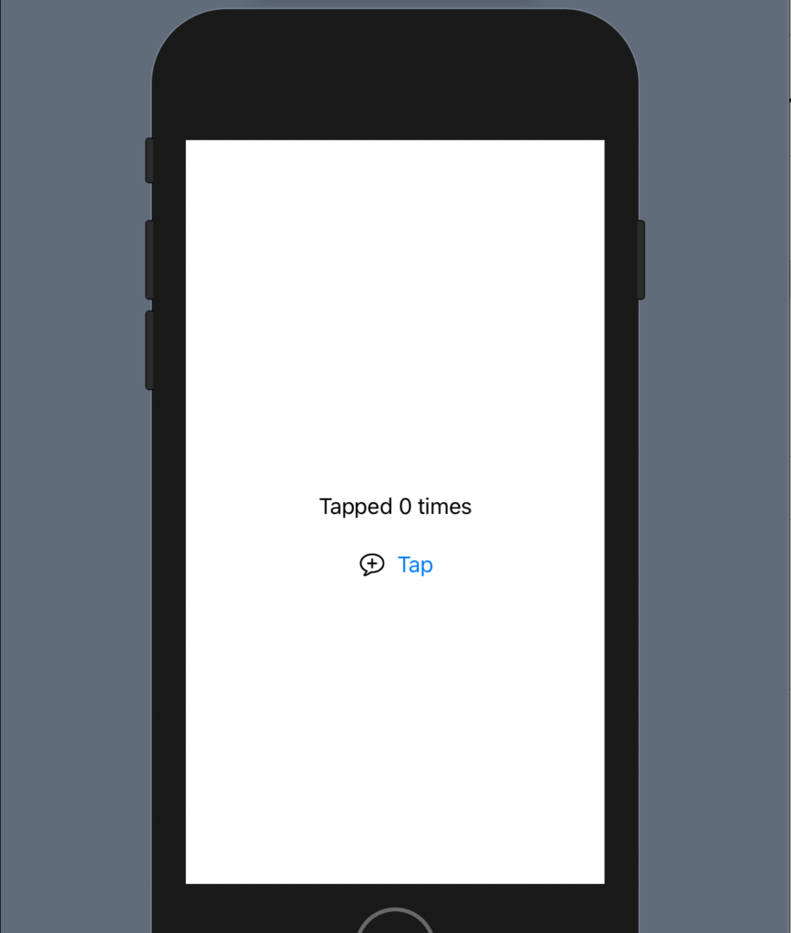
To see as refactoring the code adding some code:
struct ContentView: View {
    @State var counter: Int = 0

    var body: some View {
        VStack() {
            Text(("Tapped \(counter) times"))
                .padding()
            HStack {
                Image(systemName: "plus.message")
                Button(action: {counter = counter + 1}, label: {
                    Text("Tap")
                })
            }
        }
    }
}
We have a HStack with an Image and the Button:
Now, go on the code, press control and click on the HStack, will appear a menu:

Select “Show Code Action”, will appear:
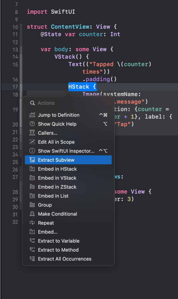
Now rename the ExtractView (default name for the extracted view) to PlusButton:
struct PlusButton: View {
    var body: some View {
        HStack {
            Image(systemName: "plus.message")
            Button(action: {counter = counter + 1}, label: {
                Text("Tap")
            })
        }
    }
}
Binding
We have an error: cannot find counter in the scope. It’s correct, we don’t have the definition of the counter in the PlusButtonView. We have to do a special declaration, using the keyword @Binding.
struct ContentView: View {
    @State var counter: Int = 0

    var body: some View {
        VStack() {
            Text(("Tapped \(counter) times"))
                .padding()
            PlusButton(counter: $counter)
        }
    }
}

struct PlusButton: View {
    @Binding var counter: Int
    var body: some View {
        HStack {
            Image(systemName: "plus.message")
            Button(action: {counter = counter + 1}, label: {
                Text("Tap")
            })
        }
    }
}
With the @Binding we can share and propagate the counter access in a different view. Simplify, we can say that with State, we say to monitor the change, with Binding get the change.
Note as is changed the way to pass counter in:
PlusButton(counter: $counter)
It’s necessary to use the $ near the counter variable, with the dollar symbol we specify the binding.
We can also use more PlusButton:
struct ContentView: View {
    @State var counter: Int = 0

    var body: some View {
        VStack() {
            Text(("Tapped \(counter) times"))
                .padding()
            PlusButton(counter: $counter)
            PlusButton(counter: $counter)
            PlusButton(counter: $counter)
        }
    }
}
Running the code you can verify that tapping every single button change the single common value (counter).
Note: English is not my native language, so I’m sorry for some errors. I appreciate it if your correct me.


