After more than 70 posts on SwiftUI, I decided to create a blog dedicated exclusively to SwiftUI (https://www.swiftui.blog) organized with a learning path from the easiest topics to the most complex ones. Here, I will continue writing about various subjects. I am not just SwiftUI—both for work and personal projects, I deal with different technologies, and I prefer my personal blog to reflect that.
SwiftUI
SwiftUI Chat App update
In this post, I’m writing a new version of the old posts about a chat GUI built with SwiftUI. I’ve removed the deprecated APIs and used the new ones released with iOS 18.
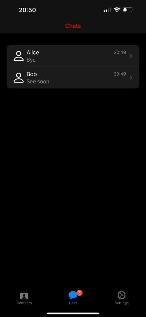
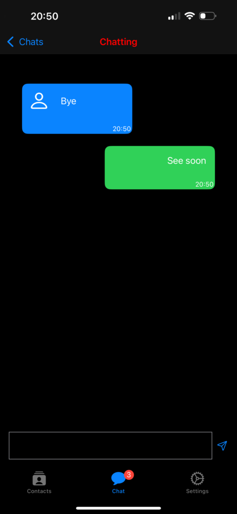
We are creating these screens: a list of contacts, a list of chats, and a chat screen. Note the red notification number on the chats tab.
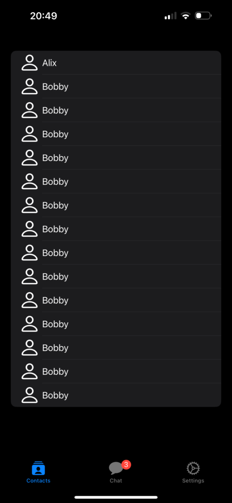
The contacts
struct ContentView: View {
    init () {
        let navBarAppearance = UINavigationBarAppearance()
        navBarAppearance.titleTextAttributes = [.foregroundColor: UIColor.red]
        navBarAppearance.largeTitleTextAttributes = [.foregroundColor: UIColor.red]
        UINavigationBar.appearance().backgroundColor = .black
        UINavigationBar.appearance().standardAppearance = navBarAppearance
        UINavigationBar.appearance().compactAppearance = navBarAppearance
        UINavigationBar.appearance().scrollEdgeAppearance = navBarAppearance
        UINavigationBar.appearance().tintColor = UIColor.red
    }

    var body: some View {
        TabView {
            Tab("Contacts", systemImage: "rectangle.stack.person.crop.fill") {
                NavigationStack {
                    ContactsView()
                        .navigationBarTitle("Contacts", displayMode: .inline)
                }
            }
            Tab("Chat", systemImage: "message.fill") {
                NavigationStack {
                    ChatsView()
                }
            }.badge(3)
            Tab("Settings", systemImage: "gear") {
                SettingsView()
            }
        }
    }
}
In the init, we initialize the background and foreground colors for the tab bar and navigation.
The body contains a neat way to define the TabView (refer here for more details https://nicoladefilippo.com/tabview-in-ios-18-and-xcode-16/). The Chat tab uses the badge property to display the red number, as shown in the example.
Chats Vew
struct ChatsView: View {
    var chats: Array<Chat> = [Chat(name: "Alice", image: "person", lastMessage: "Bye", timestamp: Date(), chatId: "1"), Chat(name: "Bob", image: "person", lastMessage: "See soon", timestamp: Date(), chatId: "2")
    ]

    init () {
        let navBarAppearance = UINavigationBarAppearance()
        navBarAppearance.titleTextAttributes = [.foregroundColor: UIColor.red]
        navBarAppearance.largeTitleTextAttributes = [.foregroundColor: UIColor.red]
        UINavigationBar.appearance().backgroundColor = .black
        UINavigationBar.appearance().standardAppearance = navBarAppearance
        UINavigationBar.appearance().compactAppearance = navBarAppearance
        UINavigationBar.appearance().scrollEdgeAppearance = navBarAppearance
        UINavigationBar.appearance().tintColor = UIColor.red
    }

    var body: some View {
        VStack{
            NavigationStack {
                List {
                    ForEach(chats) { chat in
                        NavigationLink(destination: ChattingView()){
                            HStack {
                                Image(systemName: "person")
                                .resizable()
                                .frame(width: 30, height: 30)
                                VStack(alignment: .leading) {
                                    HStack {
                                        Text(chat.name)
                                        Spacer()
                                        Text(timeFormat(date: chat.timestamp))
                                        .foregroundStyle(.gray)
                                        .font(.footnote)
                                    }
                                    Text(chat.lastMessage)
                                    .foregroundStyle(.gray)
                                    .font(.callout)
                                }
                            }
                        }
                    }
                }.scrollContentBackground(.hidden).background(Color.black)
            }
        }.frame(maxWidth: .infinity, maxHeight: .infinity)
        .background(Color.black)
        .navigationBarTitle("Chats", displayMode: .inline)
    }
}
In this view, we define an array of contacts that we display using a List and ForEach, where each row contains an image, the contact’s name, and the last chat time.
With .scrollContentBackground(.hidden).background(Color.black), we set the List background to black.
The VStack that contains everything has the background also set to black, ensuring the entire screen is black, even when the list doesn’t fill the entire screen.
Chat View
struct ChattingView: View {
    @State var chats: Array<Chat> =
    [Chat(name: "Alice", image: "person", lastMessage: "Bye", timestamp: Date(), chatId: "1"),
     Chat(name: "Bob", image: "person", lastMessage: "See soon", timestamp: Date(), chatId: "2")
    ]

    @State var writing: String = ""
    init () {
        let navBarAppearance = UINavigationBarAppearance()
        navBarAppearance.titleTextAttributes = [.foregroundColor: UIColor.red]
        navBarAppearance.largeTitleTextAttributes = [.foregroundColor: UIColor.red]
        UINavigationBar.appearance().backgroundColor = .black
        UINavigationBar.appearance().standardAppearance = navBarAppearance
        UINavigationBar.appearance().compactAppearance = navBarAppearance
        UINavigationBar.appearance().scrollEdgeAppearance = navBarAppearance
        UINavigationBar.appearance().tintColor = UIColor.red
    }

    var body: some View {
        VStack(spacing: 0) {
            // Chat
            Spacer()
            List {
                ForEach(chats) { chat in
                    if chat.name == "Bob" {
                        UserRowView(chat: chat)

                    } else {
                        ChatRowView(chat: chat)
                    }
                }.listRowBackground(Color.clear)
                .listRowSeparator(.hidden)
            }.scrollContentBackground(.hidden)
            .navigationBarTitle("Chatting", displayMode: .inline)
            .onTapGesture {
                self.endEditing()
            }
            // Input
            HStack() {
                TextEditor(text: $writing)
                    .frame(minHeight: 0, maxHeight: 50)
                    .border(Color.gray)

                Button(action: {
                    chats.append(Chat(name: "Bob", image:"", lastMessage: writing, timestamp: Date(), chatId: ""))
                    writing = ""
                    self.endEditing()
                }) {
                    Image(systemName: "paperplane")
                }

            }.ignoresSafeArea(.keyboard, edges: .bottom)
            .padding()
        }.background(Color.black)
    }

    private func endEditing() {
    UIApplication.shared.sendAction(#selector(UIResponder.resignFirstResponder), to:nil, from:nil, for:nil)
    }
}
This view also contains the settings for the tab bar and navigation. For the list of chats, we hide the scroll indicator and the row separator. We have two types of rows: one for the user (Bob) and the other to show messages from other people. We’ll take a closer look at that below. Now, please pay attention to the endEditing function; it’s called to hide the keyboard when the message is sent or when we want to stop typing.
Take a look at the rows:
struct ChatRowView: View {
    var chat: Chat
    var body: some View {
        VStack (alignment: .trailing){
            HStack() {
                Image(systemName: chat.image)
                    .resizable()
                    .frame(width: 30, height: 30)
                    .padding()
                Text(chat.lastMessage)
                Spacer()
            }.frame(maxWidth: 200)
            Text(timeFormat(date: chat.timestamp))
                .padding(2)
                .font(.caption)
                .foregroundStyle(.white)
        }.background(Color.blue)
        .clipShape(RoundedRectangle(cornerRadius: 10))
    }
}

struct UserRowView: View {
    var chat: Chat
    var body: some View {
        HStack {
            Spacer()
            VStack (alignment: .trailing){
                HStack() {
                    Spacer()
                    HStack {
                        Spacer()
                        Text(chat.lastMessage)
                            .padding()
                    }
                }
                Text(timeFormat(date: chat.timestamp))
                    .padding(2)
                    .font(.caption)
                    .foregroundStyle(.white)
            }.background(Color.green)
            .frame(minWidth: 10, maxWidth: 200)
            .clipShape(RoundedRectangle(cornerRadius: 10))
        }
    }
}

func timeFormat(date: Date) -> String {
    let formatter = DateFormatter()
    formatter.dateFormat = "HH:mm"
    return formatter.string(from: date)
}
The rows don’t have anything special apart from the alignment, but they use a new API to create rounded corners. Instead of using the deprecated cornerRadius, we utilize clipShape with a RoundedRectangle that has a corner radius.
You can find the comple code here: https://github.com/niqt/EEnigma/tree/main
Navigation in SwiftUI

Updated to iOS 18
In the previous posts, we have seen the fundaments of the SwiftUI. Now is the moment to starts to build something a bit more complex, how to implement the navigation in our apps with NavigationBar and the TabView.
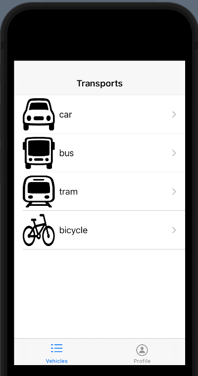
NavigationBar
Start from the code of the previous post (https://nicoladefilippo.com/list-in-swiftui/):
struct Vehicle: Identifiable {
    var id = UUID()
    var name: String
    var image: String
}

struct ContentView: View {
    @State var vehicles = [Vehicle(name: "car", image: "car"),
                    Vehicle(name: "bus", image: "bus"),
                    Vehicle(name: "tram", image: "tram"),
                    Vehicle(name: "bicycle", image: "bicycle")]

    var body: some View {
        List {
            ForEach(vehicles) { vehicle in
                RowView(vehicle: vehicle)
            }
            .onDelete { (indexSet) in
                self.vehicles.remove(atOffsets: indexSet)
            }
        }
    }
}

struct RowView: View {
    var vehicle: Vehicle
    var body: some View {
        HStack {
            Image(systemName: vehicle.image)
                .resizable()
                .frame(width: 60, height: 60)
            Text(vehicle.name)
        }
    }
}
We want to tap on one row and skip to a new view.
The first step is add a NavigationStack:
var body: some View {
        NavigationStack {
            List {
                ForEach(vehicles) { vehicle in
                    NavigationLink { EmptyView()
                    } label:{
                        RowView(vehicle: vehicle)
                    }
                }
                .onDelete { (indexSet) in
                    self.vehicles.remove(atOffsets: indexSet)
                }
            }.navigationTitle("Transports")
        }
    }
In the NavigationStack we insert the List how in the previous example. To add a title to the NavigationStack, you have to use the navigationTitle function.
To jump to another view we have to use the NavigationLink. In the body of this, we insert the RowView (we want to click on the row to jump) and how destination we use EmptyView, a blank default view, so if we tap on any row:
We want a not empty view but a view that display something.
Let’s go to create a view. First, from the file menu select the new file voice and then:
From the dialog select SwiftUI View and call it VehicleView.
Replace the EmptyView with the VehicleView:
NavigationLink {
      VehicleView(vehicle: vehicle)
    } label:{
         RowView(vehicle: vehicle)
    }
Now tapping on the list you jump on the new view and you’ll see “hello world”.
To show the info of the selected row, change the code of the VehicleView in:
import SwiftUI

struct VehicleView: View {
    var vehicle: Vehicle
    var body: some View {
        VStack(spacing: 20) {
            Image(systemName: vehicle.image)
                .resizable()
                .frame(width: 300, height: 300)
            Text("Selected the \(vehicle.name.uppercased())")
                .font(.title)
            Spacer()
        }
    }
}

#Preview {
    VehicleView(vehicle: Vehicle(name: "car", image: "car"))
}
In the view, there is defined a var of Vehicle type that we suppose contains the row passed, and show the information how defined in the VStack (see the post about VStack https://nicoladefilippo.com/layout-in-swiftui/). Note that in the Preview we pass a vehicle, it’s a default view used only for the preview (it’s helpful when you “design” the view without running the code).
How you can see we pass to the VehicleView vehicle. If everything it’s ok, if you tap the bus, you should have:
Is possible to have the title of the bar in the centre? Sure, add the navigationBarTitleDisplayMode in this way:
var body: some View {
        NavigationView {
            List {
                ForEach(vehicles) { vehicle in
                    NavigationLink(destination: VehicleView(vehicle: vehicle)) {
                        RowView(vehicle: vehicle)
                    }
                }
                .onDelete { (indexSet) in
                    self.vehicles.remove(atOffsets: indexSet)
                }
            }.navigationBarTitleDisplayMode(.inline)
                .navigationTitle("Vehicle")
        }
    }
Note the displayMode set to .inline.
Tab View
Now see how to define the TabView:
struct ContentView: View {
    var body: some View {
        TabView {
            Tab("Vehicles", systemImage: "list.dash") {
                Text("Tab1")
            }
            Tab("Profile", systemImage: "person.circle") {
                Text("Tab2")
            }
        }
    }
}
The magic word is TabView. In the body of this, we insert the views with relative Tab.
Now to create something more complex, we can use the code from the navigation stack example.
First, create a VehiclesView (note the plural).
import SwiftUI

struct Vehicle: Identifiable {
    var id = UUID()
    var name: String
    var image: String
}

struct VehiclesView: View {
    @State var vehicles = [Vehicle(name: "car", image: "car"),
                    Vehicle(name: "bus", image: "bus"),
                    Vehicle(name: "tram", image: "tram"),
                    Vehicle(name: "bicycle", image: "bicycle")]

    var body: some View {
        NavigationView {
            List {
                ForEach(vehicles) { vehicle in
                    NavigationLink(destination: VehicleView(vehicle: vehicle)) {
                        RowView(vehicle: vehicle)
                    }
                }
                .onDelete { (indexSet) in
                    self.vehicles.remove(atOffsets: indexSet)
                }
            }.navigationBarTitleDisplayMode(.inline)
                .navigationTitle("Vehicle")
        }
    }
}

struct RowView: View {
    var vehicle: Vehicle
    var body: some View {
        HStack {
            Image(systemName: vehicle.image)
                .resizable()
                .frame(width: 60, height: 60)
            Text(vehicle.name)
        }
    }
}

#Preview {
    VehiclesView()
}
Then, create a VehicleView as in the NavigationStack example and then change the TabView:
struct ContentView: View {
    var body: some View {
        TabView{
            Tab("Vehicles", systemImage: "list.dash") {
                VehiclesView()
            }
            Tab("Profile", systemImage: "person.circle") {
                Text("Tab2")
            }
        }
    }
}
Now in the first tab, we have a navigation stack and we can navigate in the first tab.
For exercise, you can create a profile page.
Note: English is not my native language, so I’m sorry for some errors. I appreciate it if your correct me.
Splash screen in SwiftUI
In this post, we’ll see an object that is present in many popular applications: the Splash Screen. With the storyboard, we have a specific object for that. In SwiftUI, the splash screen is a regular view that we can create however we want. In the example, the splash screen contains a heart that pulses for two seconds.
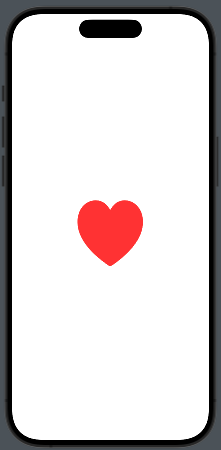
Take a look at the code:
struct SplashView: View {
    @State private var isAnimating = false
    var body: some View {
        VStack {
            Image(systemName: "heart.fill")
                .resizable()
                .frame(width: 100, height: 100)
                .foregroundColor(.red)
                .scaleEffect(isAnimating ? 1.5 : 1.0)
        }.onAppear {
            withAnimation(.easeInOut(duration: 1.0).repeatForever)) {
                isAnimating = true
            }
        }
    }
}
We have a variable used to start the animation (isAnimating). The image, a red heart, initially has dimensions of 100×100, but scales to 1.5 times its size. The animation lasts 1 second and loops indefinitely.
How do we display this view when the application starts? We have two possibilities:
- Create a coordinator view that contains the logic to decide what to display when the application starts.
- Add the logic mentioned in the previous point directly in the …App file.
The first solution may be the cleaner approach, but I also want to show how to modify the App file:
import SwiftUI

@main
struct SplashAppApp: App {
    @State var starting = true
    var body: some Scene {
        WindowGroup {
            if starting {
                SplashView()
                    .onAppear {
                        Task {
                            try await Task.sleep(nanoseconds: 2_000_000_000)
                            starting = false
                        }
                    }
            } else {
                ContentView()
            }
        }
    }
}
A starting variable is used to check if the application has already started or not. If the application is starting, the SplashView is displayed, and a task is initiated to wait for two seconds. After this time, the starting variable is toggled, and the main view of the application is displayed.
Implementing Temporary Row Highlighting how in iOS Settings with SwiftUI

If you are an iOS user and have ever tried to search for a feature in the settings by typing the name in the search bar, you might have noticed that when you jump to the page with the found feature, the row with the feature is highlighted for a few seconds. In this post, I’ll show a possible implementation for that.
First we create a page with a simple navigation link to jump to the page that contains the feature (in our case VPN).
struct ContentView: View {
    var body: some View {
        NavigationStack {
            NavigationLink("Settings", destination: ListWithHighlightView(search: "VPN"))
        }
    }
}
Then define the struct option, with simple an id, name, and hi (it’s true if need to be higligthed).
struct Option: Identifiable {
    var id = UUID()
    var hi = false
    var name = ""
}
In the View we create a simple array with some options, show the list of options. When the list is displayed (the onAppear), simply check the name of the item to higlight, if it found, we higlight, than calling in the task a timer for one second, we remove the highligting.
struct ListWithHighlightView: View {
    @State var options = [Option(name: "Wi-fi"), Option( name:"VPN"), Option(name: "Sound")]
    @State var search = ""
    var body: some View {
        VStack {
            List {
                ForEach(0..<options.count) { index in
                    Text(options[index].name)
                    .listRowBackground(Color(options[index].hi ? UIColor.systemFill : UIColor.systemBackground))
                    .onAppear {
                        if search == options[index].name {
                            options[index].hi = true
                            Task {
                                try await Task.sleep(nanoseconds: 1_000_000_000)
                                options[index].hi = false
                            }
                        }
                    }
                }
            }
        }
    }
}
The listRowBackground define the background of the row, that in this case contains only a text.
Note: English is not my native language, so I apologize for any errors. I use AI solely to generate the banner of the post; the content is human-generated.