Button Shape
In the previous post https://nicoladefilippo.com/text-and-button-with-swuiftui/, we saw how to create simple buttons, in this post we see also it’s possible also create a button with a particular shape, for example, a circle or ellipse.
struct ContentView: View {
    var body: some View {
        Button(action: {

        }) {
            Text("Press")
                .padding()
                .background(Color.red)
                .clipShape(Ellipse())
        }
    }
}
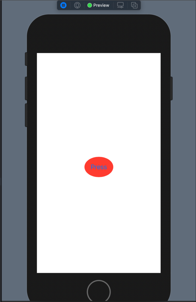
In this case, we have a Button with a text a red background and clipped has Ellipse. The result is:

You can try to use Circle() to see the different shape button.
Gradients
It’s possible also to use a gradient as a background instead of a simple color:
struct ContentView: View {
    var body: some View {
        Button(action: {

        }) {
            Text("Press")
                .padding()
                .foregroundColor(.white)
                .background(LinearGradient(gradient: Gradient(colors: [Color.yellow, Color.green]), startPoint: .trailing, endPoint: .leading))
                .clipShape(Ellipse())
        }
    }
}
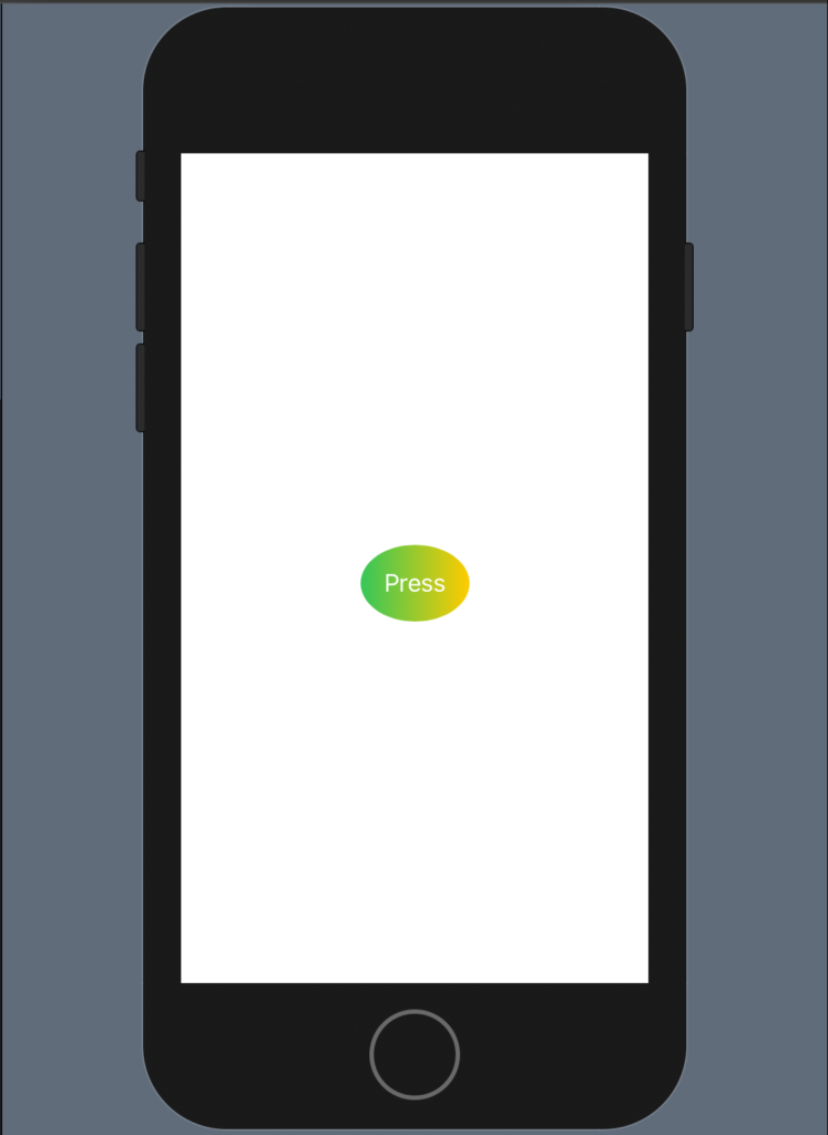
In this case, we have a linear gradient that starts from the yellow colour to finish in green, note as the gradient start on the right (trailing), if you invert trailing and leading you to invert also the effect.
The code produces:

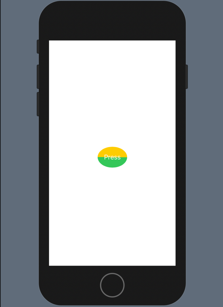
What happens if the start point is equal to the end point?

The code is:
struct ContentView: View {
    var body: some View {
        Button(action: {

        }) {
            Text("Press")
                .padding()
                .foregroundColor(.white)
                .background(LinearGradient(gradient: Gradient(colors: [Color.yellow, Color.green]), startPoint: .leading, endPoint: .leading))
                .clipShape(Ellipse())
        }
    }
}
Another nice example:
struct ContentView: View {
    var body: some View {
        Button(action: {

        }) {
            Text("Press")
                .padding()
                .foregroundColor(.white)
                .background(LinearGradient(gradient: Gradient(colors: [Color.black, Color.green]), startPoint: .trailing, endPoint: .leading
                ))
                .clipShape(Ellipse())
        }
    }
}
Note: English is not my native language, so I’m sorry for some errors. I appreciate it if your correct me.


