
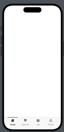
In this post, we’ll learn how to create a tab bar similar to LinkedIn, which features a horizontal black line on top of the selected tab item. As usual, let’s start by looking at the result:
We’ll follow those steps:
- Create the Tab Item Information – Define the details and content for each tab item.
- Create the TabView – Set up the overall TabView structure where the tab items will be displayed.
- Create the Tab Item – Implement the view used to display each individual tab item within the TabView..
The tabitem information
enum TabItems: Int, CaseIterable{
    case home = 0
    case bell
    case job
    case network

    var title: String{
        switch self {
        case .home:
            return "Home"
        case .bell:
            return "Favorite"
        case .job:
            return "Job"
        case .network:
            return "Profile"
        }
    }

    var iconName: String{
        switch self {
        case .home:
            return "house.fill"
        case .bell:
            return "heart.fill"
        case .job:
            return "bag.fill"
        case .network:
            return "person.2.fill"
        }
    }
}
TabItems are created as an enum with CaseIterable because this allows us to use the allCases function to retrieve all cases of the enum, which is useful in a forEach loop.
Create the TabView
struct ContentView: View {
    @State var selectedTab = 0
    var body: some View {
        ZStack(alignment: .bottom){
            TabView(selection: $selectedTab) {
                EmptyView() // Replace with your View
                    .tag(0)

                EmptyView() // Replace with your View
                    .tag(1)

                EmptyView() // Replace with your View
                    .tag(2)

                EmptyView() // Replace with your View
                    .tag(3)
            }
            HStack(alignment: .center) {
                ForEach((TabItems.allCases), id: \.self){ item in
                    HStack(alignment: .center) {
                        Spacer()
                        TabItemView(item: item, selected: $selectedTab)
                        Spacer()
                    }.frame(width:  80)
                }
            }.frame(maxWidth: .infinity, maxHeight: 70)
            .padding(.horizontal, 26)
            .padding(.bottom, -14)
        }
    }
}
In the code, we define a ZStack that contains the TabView and an HStack anchored at the bottom, which holds the tab items. The tab items are displayed by iterating over the list of cases. Each individual tab item is displayed using TabItemView, positioned between Spacers to center it horizontally.
Create the Tab Item
Take a look at the tab item.
struct TabItemView: View {
    var item: TabItems
    @Binding var selected: Int

    var body: some View {
        VStack {
            Button{
                selected = item.rawValue
            } label: {
                VStack(spacing: 10){
                    if selected == item.rawValue {
                        Color(.black).frame(width: 70, height: 2)
                            .padding(.top, 1)
                    } else {
                        Spacer().frame(width: 70, height: 2)
                            .padding(.top, 1)
                    }

                    Image(systemName: item.iconName)
                        .resizable()
                        .renderingMode(.template)
                        .foregroundStyle(selected == item.rawValue ? .black : .gray)
                        .frame(width: 20, height: 20)
                    Text(item.title)
                        .font(.system(size: 14))
                        .foregroundStyle(selected == item.rawValue ? .black : .gray)
                    }
                    Spacer()
                }
            }.frame(width: 80)
        }
    }
}
This view takes two parameters: selected, which contains the index of the selected tab (refer to the tag value in the TabView code), and item, which holds the tab information. Note the binding on selected; it is necessary because changes within the tab item must be propagated to the TabView. When a tab item is selected, a black line appears at the top. Otherwise, an empty element with the same dimensions as the line is displayed to prevent unwanted animations in the tab bar.
Feel free to improve this code, for example, by adding the ability to specify colors for different behaviors.
Note: English is not my native language, so I apologize for any errors. I use AI solely to generate the banner of the post; the content is human-generated.
To subscribe to my newsletter [https://nicoladefilippo.com/#mailinglist]