Read NFC tag in SwiftUI

One of the technologies often discussed (sometimes for security reasons) is Near Field Communication (NFC). In this post, we’ll learn how to read information from an NFC tag. It’s possible to embed various types of data in a tag, such as contact information, a URL, WiFi credentials, and more, which can significantly enhance your application’s functionality.

In this example, we’ll assume that the tag contains a simple string: “Hello tag.”

To begin, once you create a project, you need to add the Near Field Communication capability. In your code, you must also import CoreNFC. After that in the info add the permission “Privacy – NFC Scan Usage Description”, if you omit this, your app will crash and you became crazy to understand the reason.

Now, let’s take a look at the main part, the NFCReader. Start by creating a file named NFCReader.swift:

import Foundation
import CoreNFC

@Observable
public class NFCReader: NSObject, NFCNDEFReaderSessionDelegate {
    public var startAlert = "Hold your iPhone near the tag."
    public var raw = "Raw Data will be available after scan."
    public var session: NFCNDEFReaderSession?
    
    public func read() {
        guard NFCNDEFReaderSession.readingAvailable else {
            print("Error")
            return
        }
        session = NFCNDEFReaderSession(delegate: self, queue: nil, invalidateAfterFirstRead: true)
        session?.alertMessage = self.startAlert
        session?.begin()
    }
    
    public func readerSession(_ session: NFCNDEFReaderSession, didDetectNDEFs messages: [NFCNDEFMessage]) {
        DispatchQueue.main.async {
            if messages.count > 0, let dataMessage = String(data: messages[0].records[0].payload, encoding:.utf8) {
                self.raw = dataMessage
            }
            //session.invalidate()
        }
    }
    
    public func readerSessionDidBecomeActive(_ session: NFCNDEFReaderSession) {
    }
    
    public func readerSession(_ session: NFCNDEFReaderSession, didInvalidateWithError error: Error) {
        print("Session did invalidate with error: \(error)")
        self.session = nil
    }
}

The NFCReader is marked with the Observable annotation, introduced in iOS 17. This feature allows SwiftUI to easily detect changes occurring within this class.

The startAlert is the message that appears when the sheet prompting the user to move the tag near the phone is displayed. The variable raw will contain the string read from the tag.

The NFCNDEFReaderSession is the session used to read the tag. Note the invalidateAfterFirstRead parameter in the constructor; if set to true, the sheet displayed for reading the tag automatically disappears once the tag is read (otherwise, we must call session.invalidate(), see the commented code).

When the tag is read, the readSession function is called. In this case, we retrieve the information from the first record on the tag (there could be more than one), and get the payload. It is also possible to obtain the type of the information, the typeInformationFormat, and the tag identifier (as an exercise, I suggest displaying these pieces of information).

Finally, in the ContentView we have:

import SwiftUI
import CoreNFC

struct ContentView: View {
    @State var NFCR = NFCReader()
    
    var body: some View {
        VStack(spacing: 10) {
            Text("NFC data: \(NFCR.raw)")
            Button("Read NFC") {
                NFCR.read()
            }
        }
    }
}

Thus, we create the NFCReader as State so we can get the changes, tapping on the button start to read, if the things are good, the string read is displayed.

The code https://github.com/niqt/NfcExample/tree/main

Note: English is not my native language, so I apologize for any errors. I use AI solely to generate the banner of the post; the content is human-generated.

To subscribe to my newsletter [https://nicoladefilippo.com/#mailinglist]

Customize TabView in SwiftUI (Episode II°)

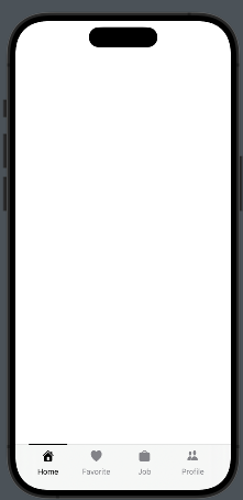
In this post, we’ll learn how to create a tab bar similar to LinkedIn, which features a horizontal black line on top of the selected tab item. As usual, let’s start by looking at the result:

We’ll follow those steps:

  • Create the Tab Item Information – Define the details and content for each tab item.
  • Create the TabView – Set up the overall TabView structure where the tab items will be displayed.
  • Create the Tab Item – Implement the view used to display each individual tab item within the TabView..

The tabitem information

enum TabItems: Int, CaseIterable{
    case home = 0
    case bell
    case job
    case network
    
    var title: String{
        switch self {
        case .home:
            return "Home"
        case .bell:
            return "Favorite"
        case .job:
            return "Job"
        case .network:
            return "Profile"
        }
    }
    
    var iconName: String{
        switch self {
        case .home:
            return "house.fill"
        case .bell:
            return "heart.fill"
        case .job:
            return "bag.fill"
        case .network:
            return "person.2.fill"
        }
    }
}

TabItems are created as an enum with CaseIterable because this allows us to use the allCases function to retrieve all cases of the enum, which is useful in a forEach loop.

Create the TabView

struct ContentView: View {
    @State var selectedTab = 0
    var body: some View {
        ZStack(alignment: .bottom){
            TabView(selection: $selectedTab) {
                EmptyView() // Replace with your View
                    .tag(0)
                
                EmptyView() // Replace with your View
                    .tag(1)
                
                EmptyView() // Replace with your View
                    .tag(2)
                
                EmptyView() // Replace with your View
                    .tag(3)
            }
            HStack(alignment: .center) {
                ForEach((TabItems.allCases), id: \.self){ item in
                    HStack(alignment: .center) {
                        Spacer()
                        TabItemView(item: item, selected: $selectedTab)
                        Spacer()
                    }.frame(width:  80)
                }
            }.frame(maxWidth: .infinity, maxHeight: 70)
            .padding(.horizontal, 26)
            .padding(.bottom, -14)
        }
    }
}

In the code, we define a ZStack that contains the TabView and an HStack anchored at the bottom, which holds the tab items. The tab items are displayed by iterating over the list of cases. Each individual tab item is displayed using TabItemView, positioned between Spacers to center it horizontally.

Create the Tab Item

Take a look at the tab item.

struct TabItemView: View {
    var item: TabItems
    @Binding var selected: Int
  
    var body: some View {
        VStack {
            Button{
                selected = item.rawValue
            } label: {
                VStack(spacing: 10){
                    if selected == item.rawValue {
                        Color(.black).frame(width: 70, height: 2)
                            .padding(.top, 1)
                    } else {
                        Spacer().frame(width: 70, height: 2)
                            .padding(.top, 1)
                    }
                    
                    Image(systemName: item.iconName)
                        .resizable()
                        .renderingMode(.template)
                        .foregroundStyle(selected == item.rawValue ? .black : .gray)
                        .frame(width: 20, height: 20)
                    Text(item.title)
                        .font(.system(size: 14))
                        .foregroundStyle(selected == item.rawValue ? .black : .gray)
                    }
                    Spacer()
                }
            }.frame(width: 80)
        }
    }
}

This view takes two parameters: selected, which contains the index of the selected tab (refer to the tag value in the TabView code), and item, which holds the tab information. Note the binding on selected; it is necessary because changes within the tab item must be propagated to the TabView. When a tab item is selected, a black line appears at the top. Otherwise, an empty element with the same dimensions as the line is displayed to prevent unwanted animations in the tab bar.

Feel free to improve this code, for example, by adding the ability to specify colors for different behaviors.

Note: English is not my native language, so I apologize for any errors. I use AI solely to generate the banner of the post; the content is human-generated.

To subscribe to my newsletter [https://nicoladefilippo.com/#mailinglist]
Customize TabView in Swiftui

In this post, we’ll explore how to customize the TabView with just a few lines of code.

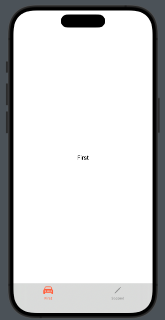
As usual, let’s start from the end:

We’ll specifically look at how to:

  • Change the color of the tabBar.
  • Modify the text and color of each tab item.
struct ContentView: View {
    var body: some View {
        TabView{
            Group {
                Text("First")
                .tabItem {
                    Label("First", systemImage: "car")
                }
                Text("Second")
                    .tabItem {
                        VStack{
                            Image(systemName: "pencil")
                            Text("Second")
                        }
                    }
            }.toolbarBackground(.visible, for: .tabBar)
            .toolbarBackground(Color.black.opacity(0.1), for: .tabBar)
        }
    }
}

(Note that in the tab item, the text and icon are defined in two different ways, just to demonstrate this possibility).

To set the color of the tabBar, we use:

.toolbarBackground(.visible, for: .tabBar)
.toolbarBackground(Color.black.opacity(0.1), for: .tabBar)

So, the background should be visible, utilizing black color with an opacity setting. Note that the properties are applied to the Group that contains the elements in the TabView. If we skip the Group, the properties will not be applied to all the tabs.

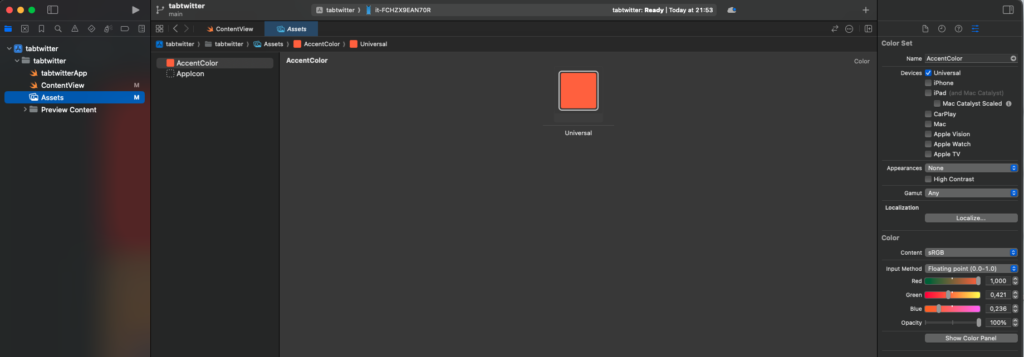
To change the color of the icon and the text of the tab item, we must define the accent color in the assets:

The AccentColor will be used for the tab item elements, as well as for buttons and other components.

Now you have the knowledge needed to customize your TabView.

Note: English is not my native language, so I apologize for any errors. I use AI solely to generate the banner of the post; the content is human-generated.

To subscribe to my newsletter [https://nicoladefilippo.com/#mailinglist]

Font Width in SwiftUI

One often overlooked element in mobile application design is the font. While the focus during design and development typically centers on colors and images, paying attention to font choice can significantly enhance your app’s appeal. If you’re interested in giving your app a unique improvement that sets it apart, this insightful post is for you.

In SwiftUI are existing four value for the font width:

  • Standard
  • Compressed
  • Expanded
  • Condensed

In the code:

struct ContentView: View {
    var body: some View {
        VStack {
            Text("Hello world")
                .fontWidth(.compressed)
            Text("Hello world")
                .fontWidth(.expanded)
            Text("Hello world")
                .fontWidth(.condensed)
        }.font(.largeTitle)
    }
}

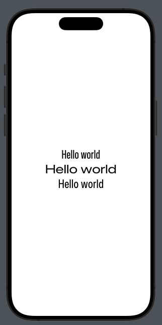
To have this:

How you can see it’s very simple to have nice screen changing only the font width.

Note: English is not my native language, so I apologize for any errors. I use AI solely to generate the banner of the post; the content is human-generated.

To subscribe to my newsletter [https://nicoladefilippo.com/#mailinglist]
GeometryRender in SwiftUI

Sure, sometimes when developing mobile applications, you find yourself in situations where you want some elements to have dimensions proportional to the screen. In such cases, GeometryReader is what you need.

With GeometryReader, it’s possible to assign sizes to our elements relative to their containers.

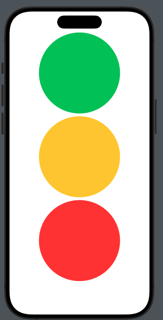
Let’s look at an example. Suppose we want to create a semaphore where each circle occupies a third of the screen width, like this

The code:

struct ContentView: View {
    var body: some View {
        GeometryReader { geometry in
            VStack {
                Circle().frame(height: geometry.size.height * 0.3).foregroundStyle(.green)
                Circle().frame(height: geometry.size.height * 0.3).foregroundStyle(.yellow)
                Circle().frame(height: geometry.size.height * 0.3).foregroundStyle(.red)
            }.frame(width: geometry.size.width)
            
        }
    }
}

Thus, for each circle, we set the height to 30% of the GeometryReader’s area (in this case, the screen) and set the size of the VStack to match the width of the render. If we omit this setting, the circles would be displayed on the left because the width of the VStack would default to the width of the circles.

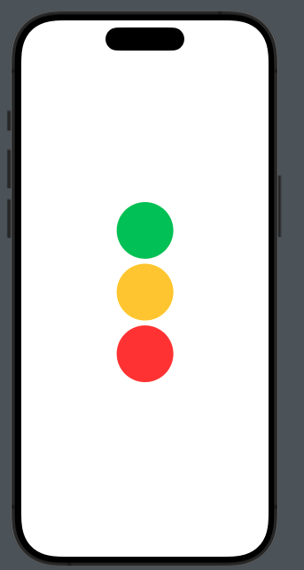
As mentioned at the beginning of this post, GeometryReader is excellent for setting the sizes of our elements relative to their containers. Now, let’s see how to create a circle with its height being 30% of a VStack that has a size of 300×300:

struct ContentView: View {
    var body: some View {
        VStack {
            GeometryReader { geometry in
                VStack {
                    Circle().frame(height: geometry.size.height * 0.3).foregroundStyle(.green)
                    Circle().frame(height: geometry.size.height * 0.3).foregroundStyle(.yellow)
                    Circle().frame(height: geometry.size.height * 0.3).foregroundStyle(.red)
                }.frame(width: 300)
            }
        }.frame(width: 300, height: 300)
    }
}

to have: