
This post is designed to demonstrate how to use assets in Xcode 15. It serves as a quick recap for experienced developers and a helpful introduction for beginners. In this post, we’ll cover how to:
- Add an image to the assets and use it in the code.
- Add a custom color.
- Set the Accent color.
- Add an icon.
Image in the assets
Start copying this image in the assets:
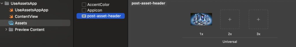
Now we see the preview of the image on the right panel, along with two empty rectangles labeled 2x and 3x. What do these numbers mean? On iOS, we don’t consider the pixel size but rather use points (this concept was introduced in 2010 with the iPhone 4). For 1x, one point is equivalent to one pixel, for 2x, one point corresponds to a 2 x 2 pixel square, and for 3x, one point corresponds to a 3 x 3 pixel square. This approach results in a logical resolution (Android uses Density-independent pixels, which is a concept similar to this).
If images for 2x or 3x resolutions are not provided, the 1x image will be used even on devices with higher resolutions. Let’s look at an example to understand this better:
iPhone 11 Pro
Logical Resolution = 375 x 812 pixels
Scale Factor = x3
Screen Resolution = 1125 x 2436 pixels
The advantage of this approach is that we work with a logical resolution, and we don’t need to worry about what happens on different screen sizes because the images are scaled automatically. Of course, if we want to achieve a better look and feel, it’s advisable to have 2x or 3x versions for devices with high resolutions.
How to use this image in the code?
struct ContentView: View {
    var body: some View {
        VStack {
            Image(.postAssetHeader)
        }
        .padding()
    }
}
Note that we refer to the image with a dot and the name in camel case notation. This is a new feature in Xcode 15, where we don’t use the name as a string, and names in snake case are automatically transformed into camel case.
Custom Color
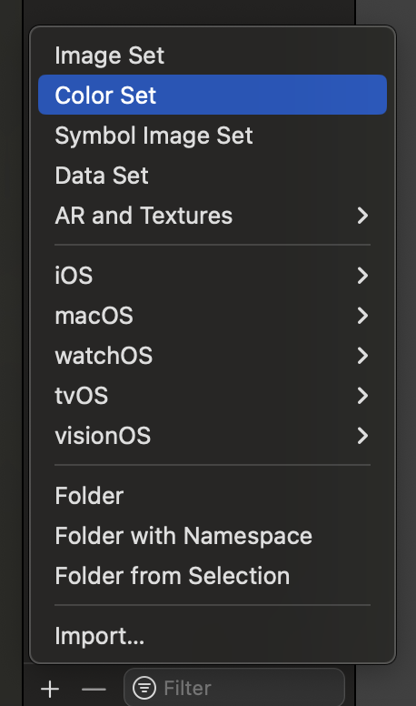
Now let’s see how to create a custom color. Start by clicking on the plus sign and selecting Color Set.
Afterward, define the color in the right panel:
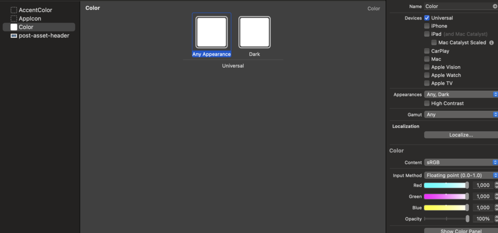
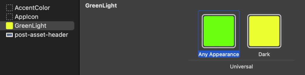
So, you can also change the name of the color to GreenLight. You should also specify the color for dark mode (it can be the same as the default; it’s your choice).
In the code:
struct ContentView: View {
    var body: some View {
        VStack {
            Text("Hello world")
                .foregroundStyle(.greenLight)
        }
        .padding()
    }
}
Note that like for the image the name is dot plus the name in camel case format.
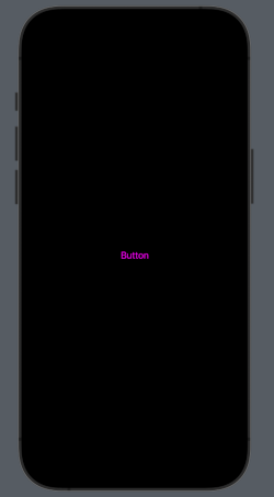
Accent Color
The accent color is the color applied to views and controls (such as button text, tab item text, and more). You can set it as a custom color using the options in the right panel:
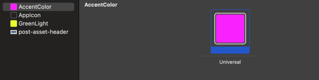
n the code, you don’t need to set anything; now, every text of controls will use it automatically.
struct ContentView: View {
    var body: some View {
        VStack {
            Button("Button") {
              // your action
            }
        }
        .padding()
    }
}
To have:
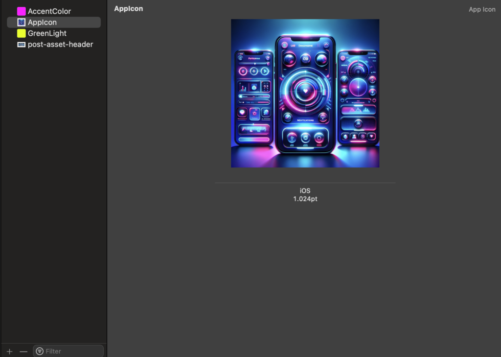
App icon
Now, creating the app icon is simple. You no longer need to create different images for different resolutions; just drag and drop one image, 1024×1024 in size, onto the rectangle. Use the image big-icon.jpg:
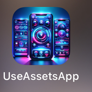
Now, run the application, and your app will have this nice icon on your phone:
That’all.


