Charts are not present in every mobile app, but they are quite common in sports, health, and finance applications. In this post, we’ll learn how to:
- Create a chart (bar and line)
- Set the unit
- Improve the visibility of the information on the bars
First create the structure of the data:
struct MoneyData: Identifiable {
    let id = UUID()
    let operation: Int
    let euro: Double
}
Then, add a chart to the View (note the import Charts):
import SwiftUI
import Charts
struct ContentView: View {
@State var expences: [MoneyData] = [MoneyData]()
var body: some View {
VStack {
Chart(expences, id: \.id) { ex in
BarMark(
x: .value("Operation", ex.operation),
y: .value("Money", ex.euro)
)
}
.frame(height: 300)
.padding()
.onAppear {
self.expences = initMoney()
}
}
}
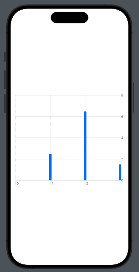
func initMoney() -> [MoneyData] {
return [MoneyData(operation: 1, euro: 2.5),
MoneyData(operation: 2, euro: 6.5), MoneyData(operation: 3, euro: 1.5)
]
}
}
To have:
Next, the chart iterates over the expenses array, displaying the operation on the X-axis and the euros on the Y-axis.
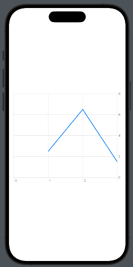
To create a linear chart, use LineMark instead of BarMark:
LineMark(
         x: .value("Operation", ex.operation),
         y: .value("Money", ex.euro)
)
To have:
Note that the last operation has three values but is not displayed. To avoid this behavior, we need to add one value at the beginning and one at the end of the X-axis. Let’s see how to do this:
struct ContentView: View {
    @State var expences: [MoneyData] = [MoneyData]()
    @State var gridValue = [Int]()

    var body: some View {
        VStack {
            Chart(expences, id: \.id) { ex in
                LineMark(
                    x: .value("Operation", ex.operation),
                    y: .value("Money", ex.euro)
                )
            }.chartXAxis {
                AxisMarks(values: gridValue)
            }
            .frame(height: 300)
            .padding()
            .onAppear {
                self.expences = initMoney()
                self.gridValue = Array((expences[0].operation - 1)...(expences[expences.count - 1].operation + 1))
            }
        }
    }
    func initMoney() -> [MoneyData] {
        return [MoneyData(operation: 1, euro: 2.5),
                MoneyData(operation: 2, euro: 6.5), MoneyData(operation: 3, euro: 1.5)

        ]
    }
}
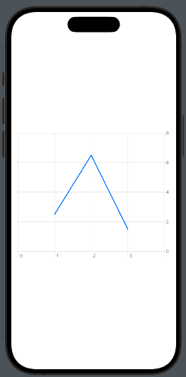
First, we add a State variable gridValue, initialized in the onAppear method with an interval for the operation that is larger than the interval in the money data (e.g., [0,3] instead of [1,2]).
This interval is used by applying:
.chartXAxis {
                AxisMarks(values: gridValue)
            }
Thus, we have:
Now, let’s see what happens if we use dates on the X-axis.
To use dates, first, adjust the data structure to include dates.
struct RunData: Identifiable {
    let id = UUID()
    let date: Date
    let km: Double
}
Then make some small changes in the code to use this type of data with the chart:
struct ContentView: View {
    @State var races: [RunData] = [RunData]()

    var body: some View {
        VStack {
            Chart(races, id: \.id) { run in
                BarMark(
                    x: .value("Date", run.date),
                    y: .value("Km", run.km)
                )
            }
            .frame(height: 300)
            .padding()
            .onAppear {
                self.races = initData()
            }
        }
    }
    func initData() -> [RunData] {
        let dateFormatter = ISO8601DateFormatter()
        dateFormatter.formatOptions = [.withFullDate]

        return [RunData(date: dateFormatter.date(from: "2024-05-03") ?? Date.now, km: 15),
                RunData(date: dateFormatter.date(from: "2024-05-05") ?? Date.now, km: 20),
                RunData(date: dateFormatter.date(from: "2024-05-07") ?? Date.now, km: 10)
        ]
    }
}
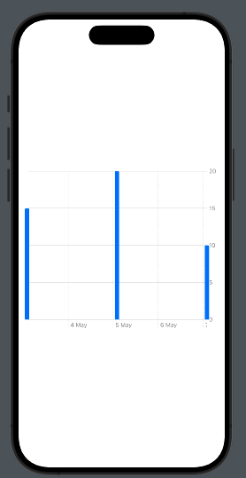
Simply, we replaced the moneyData with runData and used a different initialization function, just to have:
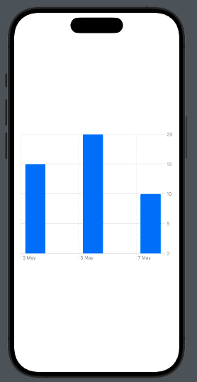
As you can see, we only have the label for “5 May.” Don’t worry, we have a simpler solution that I showed before. We can add the unit value for the X-axis:
BarMark(
         x: .value("Date", run.date, unit: .day),
         y: .value("Km", run.km)
)
Now we see:
Now you should have the knowledge base to implement charts in your app.