
To help you with creating an onboarding screen using a custom pager with a custom font, custom color, and button, I’ll guide you through the steps:
Create the Pager Component:
- The pager will typically be a component or a view that allows the user to swipe through different screens (each representing a step in the onboarding process).
Custom Font and Color:
- To apply a custom font, first add the font files to your project. Then, set the font for the text elements in your pager screens.
- For custom colors, define the color values (like hex codes or RGB) in your project’s color resources or stylesheet. Apply these colors to the text, background, or other elements as needed.
Adding a Button:
- Create a custom button
First, take a look how to create a pager:
TabView {
      Text("First page")
      Text("Second page")
      Text("Third page")
}.tabViewStyle(.page)
Now see how add a font:
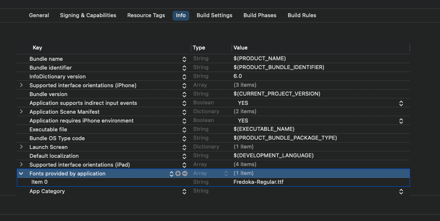
- download Fredoka from here https://fonts.google.com/specimen/Fredoka
- add it to the project select from the File menu “Add file to your project” and select the font file
- write the font file mane in the info section “Font provided by application
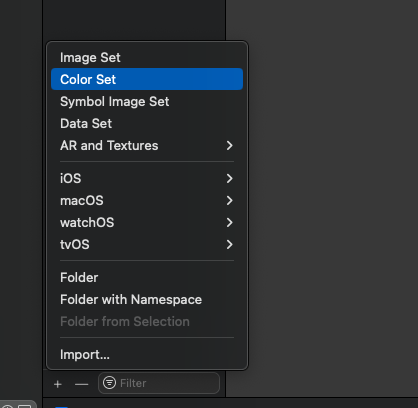
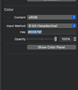
Now add a custom color, in the project open assets and add color:
Set a name for the color and in the right panel set the color value.
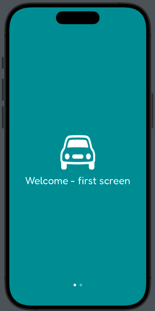
Now create three views, using the custom color and the custom font, and please download also the san Francisco symbols (https://developer.apple.com/sf-symbols/) for the images.
struct ContentView: View {
    var body: some View {
        TabView {
            VStack {
                Image(systemName: "car")
                    .resizable()
                    .frame(width: 100, height: 100)
                Text("Welcome - first screen")
                    .font(Font.custom("Fredoka-Regular", size: 30, relativeTo: .largeTitle))
            }
            VStack {
                Image(systemName: "bolt.car")
                    .resizable()
                    .frame(width: 100, height: 100)
                Text("Welcome - second screen")
                    .font(Font.custom("Fredoka-Regular", size: 30, relativeTo: .largeTitle))
            }
        }.tabViewStyle(.page)
        .background(Color("onboardingColor"))
        .foregroundStyle(.white)
    }
}
The first screen is:
To add custom button with a white border:
VStack {
       Image(systemName: "bolt.car")
       .resizable()
       .frame(width: 100, height: 100)
       Text("Welcome - second screen")
       .font(Font.custom("Fredoka-Regular", size: 30, relativeTo: .largeTitle))

       Button("Start") {

       }
       .padding()
       .overlay(
           Capsule()
           .stroke(Color.white, lineWidth: 2)

        )
 }
To add the border to the button we use an overlay with a capsule shape empty with only a white border.
Enjoy creating your onboarding screen. Remember, a well-designed onboarding experience can significantly enhance user engagement and understanding of your app.