Row List with More Items in SwiftUI

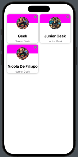
Usually, a row in a list displays one element, but there are cases when you need to show more items. Think about the list displayed in LinkedIn under the ‘Network’ section. What I want to build is something like that.

We have a card with a background, a photo, and some personal information.

We need to follow two steps:

  • Create the info card
  • Create the list

Create the info card

Let’s start by taking a look at the code:

struct PhotoCard: View {
    let imageName: String
    let title: String
    let subtitle: String
    var delete : () -> ()
    
    var body: some View {
        VStack {
            ZStack {
                VStack(spacing: 0) {
                    Color(.magenta)
                        .frame(width: .infinity, height: 50)
                    Color(.white)
                        .frame(width: .infinity, height: 50)
                }
                Image(imageName)
                  .resizable()
                  .foregroundColor(.blue)
                  .frame(width: 70, height: 70)
                  .clipShape( Circle())
            }.overlay (
                VStack {
                    HStack {
                        Spacer()
                        Button(action: delete) {
                            Image(systemName: "xmark.circle.fill")
                                .foregroundColor(.gray)
                        }
                    }.padding(5)
                    Spacer()
                }
            )
            Text(title)
                .font(.title2)
                .fontWeight(.bold)
                .frame(height: 30)
            Text(subtitle)
                .font(.subheadline)
                .foregroundColor(.secondary)
        }
        .background(Color.white)
        .cornerRadius(10)
        .shadow(radius: 5)
        .padding(1)
    }
}

The card receives the information to display, along with a callback function that is triggered when the user clicks the X button.

The card is a VStack with rounded corners—nothing special here. The interesting part is at the beginning, where we use a ZStack to display the colored background, half magenta and half white. On top of the background, we display the photo in a circular shape (automatically centered in the ZStack). The close button is displayed using the overlay and Its position is achieved by working with a combination of VStack, HStack, and Spacer.

Create the list

The code:

struct Person: Identifiable {
    let id = UUID()
    var name: String
    var title: String
    var image: String
}

struct ContentView: View {
    @State var items = [Person(name: "Geek", title: "Senior Geek", image: "image"),
                        Person(name: "Junior Geek", title: "Junior Geek", image: "junior"),
                        Person(name: "Nicola De Filippo", title: "Senior Geek", image: "image")]
    
    var body: some View {
        GeometryReader { geometry in
            NavigationView {
                ScrollView {
                    ForEach((0...items.count / 2), id: \.self) { index in
                        HStack {
                            Spacer()
                            if items.count > index * 2 {
                                PhotoCard(
                                    imageName: items[index * 2].image,
                                    title: items[index * 2].name,
                                    subtitle: items[index * 2].title, delete:
                                        {
                                            delete(index * 2)
                                        }
                                ).frame(width: geometry.size.width * 0.45)
                            }
                            if items.count > index * 2 + 1 {
                                PhotoCard(
                                    imageName: items[index * 2 + 1].image,
                                    title: items[index * 2 + 1].name,
                                    subtitle: items[index * 2 + 1].title,
                                    delete:
                                        {
                                            delete(index * 2 + 1)
                                        }
                                ).frame(width: geometry.size.width * 0.45)
                            } else {
                                Divider()
                                    .frame(width: geometry.size.width * 0.45, height: 0)
                            }
                            Spacer()
                        }
                    }
                    
                }.listStyle(PlainListStyle())
                    .environment(\.defaultMinListRowHeight, 1)
                    .onAppear {
                        UITableView.appearance().separatorStyle = .none
                        UITableView.appearance().separatorColor = .clear
                    }
            }
            .navigationTitle("Fruit List")
        }
    }
    func delete(_ index: Int) {
        self.items.remove(at: index)
    }
}

At the top, we define a Person struct that contains the details of each person. Then, we create an array with three people. We use GeometryReader to calculate the card width as a percentage of the screen width. The iteration is performed over half the length of the items since we are displaying two elements per row. Note that if the number of items is odd, the last element is a Divider. When the application starts, we modify the list properties to remove the line separators.

Finally, we define the delete function, which removes an element at the specified index. This function is passed as a property to the card view.

Replace my information and image with yours, and have fun with it!

Note: English is not my native language, so I’m sorry for some errors. I appreciate if your correct me. Only the image is by AI.

Code on demand with REST

Code on demand

In the paper Architectural Styles and the Design of Network-based Software Architectures by Roy Thomas Fielding, REST is defined. Today, when people think of REST, they often associate it with CRUD operations, more or less. However, one of the properties defined in the paper is ‘Code on Demand,’ where the client can request a script or binary from the server (similar to what happens when a browser requests JavaScript files to extend the behavior of a web page).

It’s nice, but it’s not exclusive to the web world. Take a look at this example in Qt:

import QtQuick
import QtQuick.Controls 2.5

Page {
    id: page
    Button {
        text: "load"
        anchors.bottom: parent.bottom
        anchors.horizontalCenter: parent.horizontalCenter
        onClicked: {
            loader.source = new URL("https://server/test.qml")
        }
    }

    Loader {
        id: loader
        anchors.verticalCenter: parent.verticalCenter
        anchors.horizontalCenter: parent.horizontalCenter
    }
}

When you click the button, we load:

import QtQuick
import QtQuick.Controls 2.5

Item {
    anchors.fill: parent

    Column {
        anchors.fill: parent
        TextField {
            width: dp(100)
            placeholderText: "Write here"
        }
        Button {
            text: "Ok"
            onClicked: {
            }
        }
    }
}

I think that the power of code on demand is sometimes underrated, yet we have the tools to leverage it. Please try to use it in a real case.

Splash screen in SwiftUI

In this post, we’ll see an object that is present in many popular applications: the Splash Screen. With the storyboard, we have a specific object for that. In SwiftUI, the splash screen is a regular view that we can create however we want. In the example, the splash screen contains a heart that pulses for two seconds.

Take a look at the code:

struct SplashView: View {
    @State private var isAnimating = false
    var body: some View {
        VStack {
            Image(systemName: "heart.fill")
                .resizable()
                .frame(width: 100, height: 100)
                .foregroundColor(.red)
                .scaleEffect(isAnimating ? 1.5 : 1.0)
        }.onAppear {
            withAnimation(.easeInOut(duration: 1.0).repeatForever)) {
                isAnimating = true
            }
        }
    }
}

We have a variable used to start the animation (isAnimating). The image, a red heart, initially has dimensions of 100×100, but scales to 1.5 times its size. The animation lasts 1 second and loops indefinitely.

How do we display this view when the application starts? We have two possibilities:

  • Create a coordinator view that contains the logic to decide what to display when the application starts.
  • Add the logic mentioned in the previous point directly in the …App file.

The first solution may be the cleaner approach, but I also want to show how to modify the App file:

import SwiftUI

@main
struct SplashAppApp: App {
    @State var starting = true
    var body: some Scene {
        WindowGroup {
            if starting {
                SplashView()
                    .onAppear {
                        Task {
                            try await Task.sleep(nanoseconds: 2_000_000_000)
                            starting = false
                        }
                    }
            } else {
                ContentView()
            }
        }
    }
}

A starting variable is used to check if the application has already started or not. If the application is starting, the SplashView is displayed, and a task is initiated to wait for two seconds. After this time, the starting variable is toggled, and the main view of the application is displayed.

Job to be done

Reading the third capitol – Identify digital capabilities – of “Principle of WEB API Design” (https://www.amazon.com/Principles-Web-Design), i discovered the JTBD (Job to be done) It can be an alternative to the user story. This concept is formuled by C. Christensen (author of The Innovator’s dilemma). The job is about the desidered outcome and the job stories identify the jobs to be done for every product. If the user story has the form:

  • As a
  • I want
  • so that

the job story has the form:

  • When (the trigger event)
  • I want (the capability)
  • So can (the outcome)

For example:

  • When I find a product I want to buy
  • I want to add the product to my shopping cart
  • so I can include it in my order.

I like this approach; I feel it is more pragmatic than the user story.

You can find more information take a look to https://jtbd.info/ and download or buy the book from here https://jtbd.info/when-coffee-and-kale-compete-in-paperback-kindle-8d4c11a3d90f


Cogentcore

On July 24th, the first release of Cogent (https://www.cogentcore.org/), a new Go GUI cross-platform tool (Windows, OSX, Linux, Wasm, iOS, Android), was launched. This tool uses only Go language to build interfaces, with no templates or other files (like YAML, JSX), and the styling is done directly in the code. It follows the Material style.

What do I like about this project?

  • Clear goal
  • How to achieve the goal
  • The styling

What don’t I like?

  • I think that the best solution for GUI tools is a combination of declarative and imperative languages, like Qt (Qml + C++ or JavaScript), SwiftUI + Swift, and Slint, which also has an approach like this. Using this tool feels like going back to the time of Qt Widget.
  • For mobile, it uses Material Design, but I think that for mobile, it is essential to respect the native user interface.

For a first release, it looks good. I will keep it under observation and recommend you do the same.