
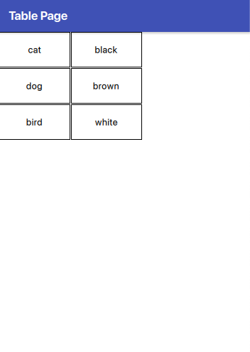
Take a look at how the TableView works in Qt6 with QML. If we refer to the example from the official documentation, we find this code:
 import QtQuick 2.14
 import Qt.labs.qmlmodels 1.0

 TableView {
     anchors.fill: parent
     columnSpacing: 1
     rowSpacing: 1
     clip: true

     model: TableModel {
         TableModelColumn { display: "name" }
         TableModelColumn { display: "color" }

         rows: [
             {
                 "name": "cat",
                 "color": "black"
             },
             {
                 "name": "dog",
                 "color": "brown"
             },
             {
                 "name": "bird",
                 "color": "white"
             }
         ]
     }

     delegate: Rectangle {
         implicitWidth: 100
         implicitHeight: 50
         border.width: 1

         Text {
             text: display
             anchors.centerIn: parent
         }
     }
 }
It produces this:
If we add more columns to the model in the following manner:
model: TableModel {
                    TableModelColumn { display: "name" }
                    TableModelColumn { display: "color" }
                    TableModelColumn { display: "feet" }
                    TableModelColumn { display: "fly" }

                    rows: [
                        {
                            "name": "cat",
                            "color": "black",
                            "feet": "four",
                            "fly": "no"
                        },
                        {
                            "name": "dog",
                            "color": "brown",
                            "feet": "four",
                            "fly": "no"
                        },
                        {
                            "name": "bird",
                            "color": "white",
                            "feet": "two",
                            "fly": "yes"
                        }
                    ]
                }
we have:
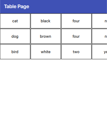
In this approach, not all elements are visible because each cell is of the same size. While this uniformity can be visually appealing, it may not always be practical. Next, let’s see how we can add a custom header and adjust the cells to have widths based on the size of the elements within them.
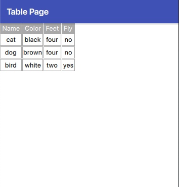
Let’s start with the header:
           HorizontalHeaderView {
                id: horizontalHeader
                anchors.left: tableView.left
                anchors.top: parent.top
                syncView: tableView
                clip: true
                model: ["Name", "Color", "Feet", "Fly"]
                delegate:
                    Rectangle {
                        implicitWidth: txt.width + dp(5)
                        implicitHeight: txt.height + dp(5)
                        color: "darkgray"
                        AppText {
                            id: txt
                            text: modelData
                            anchors.centerIn: parent
                            color: "white"
                        }

                }

            }
First, we attach the header to the left side of the table and set the syncView to the tableView. This ensures synchronization between the table and the header, meaning each header column aligns with its corresponding column in the tableView. Next, we define the labels for the header. Finally, we see in the delegate how to display the header’s cells.
The tableView:
            TableView {
                id: tableView
                anchors.left: parent.left
                anchors.right: parent.right
                anchors.top: horizontalHeader.bottom
                anchors.bottom: parent.bottom
                columnSpacing: 1
                rowSpacing: 1
                clip: true
                contentWidth: parent.width
                columnWidthProvider: column => { return -1; }
                model: // is the same

                delegate: Rectangle {
                    implicitWidth: Math.max(horizontalHeader.columnWidth(column), txtRow.width) + dp(5)
                    implicitHeight: txtRow.height + dp(10)
                    border.color: "darkgray"
                    Text {
                        id: txtRow
                        text: display
                        anchors.centerIn: parent
                    }
                }
            }
The model remains the same as previously mentioned and is not included here. Regarding the positioning, the top of the table is anchored to the bottom of the header, as one would expect. The code enabling cell width to be based on the element’s width within the cell is as follows: columnWidthProvider: column => { return -1; }. The columnWidthProvider property expects a function that returns the width for a column. However, if it returns -1, the size is automatically calculated based on the size of the element in the cell.
Another important aspect to note is the use of the following code:
implicitWidth: Math.max(horizontalHeader.columnWidth(column), txtRow.width) + dp(5)
Why is this necessary? It ensures that if the text in the header of a column is wider than the text in the data cells, the size of the header remains readable. This code calculates the maximum width between the header and the row text, and then adds a small margin (dp(5)) for better visual spacing.
The final result is:
“Note: English is not my native language, so please excuse any errors. I would appreciate your assistance in correcting them.”