Playing music in SwiftUI application

In this short post, we’ll learn how to add the play function to our SwiftUI application. To test this functionality, we will add a Christmas song to our previous project (timer-and-shape-in-swiftui).

First, we need to create a player. We’ll do this by using the new Observable class annotation, which also works in the latest iOS 17. Some might wonder why I’m focusing on the latest features. The goal of my post is to update current iOS developers on the latest advancements and to help new developers, who usually start by using the most recent tools, create code effectively.

So, let’s take a look at the player:

import AVFoundation

@Observable
class AudioPlayerViewModel {
  var audioPlayer: AVAudioPlayer?

  var isPlaying = false

  init() {
    if let sound = Bundle.main.path(forResource: "silent", ofType: "mp3") {
      do {
        self.audioPlayer = try AVAudioPlayer(contentsOf: URL(fileURLWithPath: sound))
      } catch {
        print("AVAudioPlayer can't be instantiated.")
      }
    } else {
      print("Audio file not found.")
    }
  }

  func playOrPause() {
    guard let player = audioPlayer else { return }

    if player.isPlaying {
      player.pause()
      isPlaying = false
    } else {
      player.play()
      isPlaying = true
    }
  }
}

First, we import the AVFoundation framework, as described in the official documentation at https://developer.apple.com/av-foundation/. As we can read there: “AVFoundation is the full featured framework for working with time-based audiovisual media on iOS, macOS, watchOS and tvOS. Using AVFoundation, you can easily play, create, and edit QuickTime movies and MPEG-4 files, play HLS streams, and build powerful media functionality into your apps”.

In the class, the player is defined as an optional, because it could be null for some reason. After that, we retrieve the path to the file we want to play and pass it to the player’s constructor. If something goes wrong, we’ll see an error message.

The method playOrPause, plays or stops the music depending the current playing state.

Regarding the audio file, it has not been added to the assets, but rather to the project structure.

Now add the player to the code:

.
.
@State var audioPlayerViewModel = AudioPlayerViewModel()
    
    var body: some View {
        ZStack {
            Color.black.frame(maxWidth: .infinity, maxHeight: .infinity).opacity(0.9).edgesIgnoringSafeArea(.all)
            VStack(spacing: 0) {
                Image(systemName: stars[indexStar])
                    .resizable()
                    .frame(width: 100, height: 100)
                    .foregroundStyle(.yellow)
                    .offset(y: 20)
                TriangleWidthDecoration(triangleWidth: 260, leftColorDecoration: currentColors[3], rightColorDecoration: currentColors[7])
                
            }.offset(y: -50)
            ForEach(Array(widths.enumerated()), id: \.offset) { index, leaf in
                TriangleWidthDecoration(triangleWidth: Double(leaf), leftColorDecoration: currentColors[index], rightColorDecoration: currentColors[index * 2])
                    .offset(y: 60 * Double( index + 1))
            }
            
            Rectangle()
                .frame(width: 20, height: 60)
                .foregroundStyle(.brown)
                .offset(y: 360)
        }.onReceive(timer) { _ in
            shuffleColor()
            self.indexStar = (self.indexStar + 1) % 2
        }.onAppear {
            audioPlayerViewModel.playOrPause()
        }.onTapGesture {
            audioPlayerViewModel.playOrPause()
        }
    }
    
    func shuffleColor() {
        for i in 0..<currentColors.count {
            currentColors[i] = colors[Int.random(in: 0..<9)]
        }
    }
}

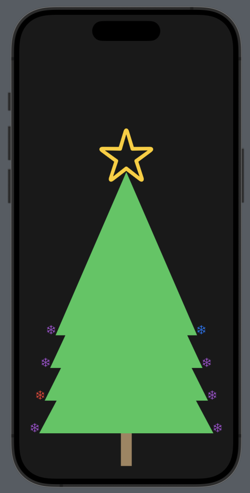
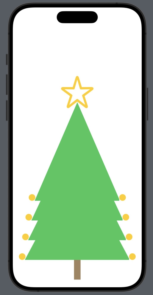
The music starts when the tree appears. You can play or stop it by tapping on the tree.

You can obtain a free MP3 file from this source: https://www.freemusicpublicdomain.com/royalty-free-christmas-music/

The code is here

https://github.com/niqt/swift/tree/master/ChristmasTree

That’s all.

Note: English is not my native language, so I’m sorry for some errors. I appreciate if your correct me.

Timer and Shape in SwiftUI

Creating a Dynamic Christmas Tree with Decorations and Light Effects

In this blog, we’ll learn:

  • how create geometric triangle.
  • How create a tree using triangles.
  • How use a timer to change the color of the Christmas tree decorations.

Shortly, we’ll create this (tree.mov):

Create the triangle

struct Triangle: Shape {
    func path(in rect: CGRect) -> Path {
        var path = Path()

        path.move(to: CGPoint(x: rect.midX, y: rect.minY)) // A
        path.addLine(to: CGPoint(x: rect.minX, y: rect.maxY)) // AB
        path.addLine(to: CGPoint(x: rect.maxX, y: rect.maxY)) // BC
        path.addLine(to: CGPoint(x: rect.midX, y: rect.minY)) // CA

        return path
    }
}

First, the triangle implements the Shape protocol and creates a triangular shape by drawing in this way (considering that we pass a rectangle/frame):

Remember that the coordinates start from the top of the screen.

Create the tree

We want to create a tree by overlapping triangles, similar to this Christmas tree

struct ContentView: View {
    var body: some View {
        ZStack {
            VStack(spacing: 0) {
                Image(systemName: "star")
                    .resizable()
                    .frame(width: 100, height: 100)
                    .foregroundStyle(.yellow)
                    .offset(y: 20)
                HStack(alignment: .bottom) {
                 Circle().background().foregroundStyle(.yellow).frame(width: 20, height: 20)
                    .offset(x: 10)
                    Triangle()
                        .frame(width: 260, height: 300)
                        .foregroundStyle(.green)
                    Circle().background().foregroundStyle(.yellow).frame(width: 20, height: 20)
                        .offset(x: -10)
                }
            }.offset(y: -50)
            HStack(alignment: .bottom) {
                Circle().background().foregroundStyle(.yellow).frame(width: 20, height: 20)
                    .offset(x: 10)
                Triangle()
                    .frame(width: 280, height: 300)
                    .foregroundStyle(.green)
                
                Circle().background().foregroundStyle(.yellow).frame(width: 20, height: 20)
                    .offset(x: -10)
            }.offset(y: 60)
            
            HStack(alignment: .bottom) {
                Circle().background().foregroundStyle(.yellow).frame(width: 20, height: 20)
                    .offset(x: 10)
                Triangle()
                    .frame(width: 300, height: 300)
                    .foregroundStyle(.green)
                
                Circle().background().foregroundStyle(.yellow).frame(width: 20, height: 20)
                    .offset(x: -10)
            }.offset(y: 120)
            HStack(alignment: .bottom) {
                Circle().background().foregroundStyle(.yellow).frame(width: 20, height: 20)
                    .offset(x: 10)
                Triangle()
                    .frame(width: 320, height: 300)
                    .foregroundStyle(.green)
                
                Circle().background().foregroundStyle(.yellow).frame(width: 20, height: 20)
                    .offset(x: -10)
            }.offset(y: 180)
            Rectangle()
                .frame(width: 20, height: 60)
                .foregroundStyle(.brown)
                .offset(y: 360)
        }
    }
}

(Don’t worry, I’ll provide the GitHub link at the end.)

Let’s explore how this code works:

  • We use a ZStack to overlap the triangles.
  • We start from the bottom by adding the trunk.
  • Begin with the first triangle within an HStack, accompanied by two yellow circles representing the decorations. Everything is aligned at the bottom because we want to move the circles near the base of the triangle. We use the offset to position the circles, as well as to position the triangle.
  • The other triangles are added by changing the offset and the size of each triangle.
  • At the end (actually at the beginning of the code), we have a VStack that contains the first triangle with a star on top.

Now we have this:

It’s not quite what we want yet, and the code could be improved. Let’s do some refactoring.

Use the timer

First, we create a view that contains a triangle with two decorations:

struct TriangleWidthDecoration: View {
    var triangleWidth: Double = 300
    var leftColorDecoration: Color = .yellow
    var rightColorDecoration: Color = .yellow
    let triangleHeight: Double = 300
    
    var body: some View {
        HStack(alignment: .bottom) {
            Image(systemName: "snowflake")
                .foregroundStyle(leftColorDecoration)
            .frame(width: 20, height: 20)
                .offset(x: 10)
            Triangle()
                .frame(width: triangleWidth, height: triangleHeight)
                .foregroundStyle(.green)
            Image(systemName: "snowflake")
                .foregroundStyle(rightColorDecoration)
                .frame(width: 20, height: 20)
                .offset(x: -10)
        }
    }
}

So, we define four properties:

  • triangleWidth: the lenght of the base
  • triangleHeight: the constant height of the triangle
  • leftColorDecoration: the color of the decorarion on the left side
  • rightColorDecoration: the color of the decoration on the right side

Note that now the decoration is a snowflake.

Now the main code is:

var body: some View {
        ZStack {
            VStack(spacing: 0) {
                Image(systemName: "star")
                    .resizable()
                    .frame(width: 100, height: 100)
                    .foregroundStyle(.yellow)
                    .offset(y: 20)
                TriangleWidthDecoration(triangleWidth: 260, leftColorDecoration: .yellow, rightColorDecoration: .yellow)
                
            }.offset(y: -50)
            ForEach(Array(widths.enumerated()), id: \.offset) { index, leaf in
                TriangleWidthDecoration(triangleWidth: Double(leaf), leftColorDecoration: .yellow, rightColorDecoration: .yellow)
                    .offset(y: 60 * Double( index + 1))
            }
            
            Rectangle()
                .frame(width: 20, height: 60)
                .foregroundStyle(.brown)
                .offset(y: 360)
        }
    }

Apart from the triangle on the top, the others are drawn using a ForEach loop, where for each triangle, the offset is calculated using the index (pay close attention to the ForEach definition). The width is obtained from this array:

var widths = [280, 300, 320]

The work is not yet complete because we want to achieve the effect of real Christmas lights, with random colors. Therefore, we add:

var widths = [280, 300, 320]
    let timer = Timer.publish(every: 1, on: .main, in: .common).autoconnect()
    var colors = [Color.red, Color.purple, Color.blue, Color.orange, Color.gray, Color.yellow, Color.cyan, Color.mint, Color.pink]
    var stars = ["star", "star.fill"]
    @State var indexStar = 0
    @State var currentColors = [Color]( repeating: .gray, count: 8 )

The timer is used to change the color every second.

  • The colors: a list of colors that can be used for the decorations.
  • The stars: contains the possible images for the star.
  • The indexStar: contains the index of the current image used for the star.
  • The currentColors: contains the current colors (note that there are eight, four per side).

The timer run in the main thread because work in the GUI side and with the .common option because work alongside with common events.

The code now is:

var body: some View {
        ZStack {
            Color.black.frame(maxWidth: .infinity, maxHeight: .infinity).opacity(0.9).edgesIgnoringSafeArea(.all)
            VStack(spacing: 0) {
                Image(systemName: stars[indexStar])
                    .resizable()
                    .frame(width: 100, height: 100)
                    .foregroundStyle(.yellow)
                    .offset(y: 20)
                TriangleWidthDecoration(triangleWidth: 260, leftColorDecoration: currentColors[3], rightColorDecoration: currentColors[7])
                
            }.offset(y: -50)
            ForEach(Array(widths.enumerated()), id: \.offset) { index, leaf in
                TriangleWidthDecoration(triangleWidth: Double(leaf), leftColorDecoration: currentColors[index], rightColorDecoration: currentColors[index * 2])
                    .offset(y: 60 * Double( index + 1))
            }
            
            Rectangle()
                .frame(width: 20, height: 60)
                .foregroundStyle(.brown)
                .offset(y: 360)
        }.onReceive(timer) { _ in
            shuffleColor()
            self.indexStar = (self.indexStar + 1) % 2
        }
    }

The color for the decorations is taken from the currentColors array, using the index. Every second, the colors are remixed using the shuffleColor function, and the image of the star is changed because the indexStar is updated (there are only two possible values: 0 or 1).

The timer event is captured using the onReceive with the timer (we use the underscore because we don’t need the timer’s value).

The shuffle functions is:

func shuffleColor() {
        for i in 0..<currentColors.count {
            currentColors[i] = colors[Int.random(in: 0..<9)]
        }
    }

Finally, at the beginning of the ZStack, a dark background is set.

https://github.com/niqt/swift/tree/master/ChristmasTree

That’s all.

Note: English is not my native language, so I’m sorry for some errors. I appreciate if your correct me.

Mastering Customization: Configuring the Look and Feel of Lists in SwiftUI

In this post, we’ll learn how to configure the look and feel of a list. The image we’re using is from unsplash,; rename it ‘zoe’ and copy it into the assets.

Let’s start from the end and begin by envisioning what we want to create:

First, install the San Francisco symbols (if you haven’t already), then create the data structure that we want to display in the list:

struct Decoration: Identifiable {
    let id = UUID()
    var name: String
    var color: Color
    var image: String
}

The struct implement the Identifiable protocol, because we need add an unique identifier.

In the ContentView, we initialize the data:

struct ContentView: View {
    var decorations = [Decoration(name: "Star", color: .yellow, image:  "star.fill"), Decoration(name: "Light", color: .pink, image: "lightbulb.fill"), Decoration(name: "Snow", color: .white, image:"snowflake")]
    

We add only three Christmas decorations.

In the body:

var body: some View {
        NavigationStack {
            List(decorations) { decoration in
                NavigationLink(destination: EmptyView()) {
                    HStack {
                        Image(systemName: decoration.image)
                            .foregroundStyle(decoration.color)
                            .frame(width: 50, height: 50)
                        Text(decoration.name)
                            .foregroundColor(decoration.color)
                            .opacity(0.7)
                            .font(.title)
                            .fontWeight(.bold)
                    }
                }.listRowBackground(Color(red: 0.1, green: 0.1, blue: 0.1))
                .listRowSeparatorTint(.white)
                    
            }
            .navigationTitle("Decorations")
            .background(Image("zoe").resizable().aspectRatio(contentMode: .fill)
                .edgesIgnoringSafeArea(.all)
            )
            .scrollContentBackground(.hidden)
            .opacity(0.8)
            
        }
    }

The content of each row is displayed using an HStack, which includes the name, color and the image of the decoration, utilizing the data from the decoration array.

Now, let’s take a look at the individual customizations:

.listRowBackground(Color(red: 0.1, green: 0.1, blue: 0.1))

With this, we set the background of the row to a custom gray, instead of the default white (in light mode) or black (in dark mode).

.listRowSeparatorTint(.white)

To enhance the visibility of the row separator, we use this code to change its default color.

.background(Image("zoe").resizable().aspectRatio(contentMode: .fill)
.edgesIgnoringSafeArea(.all))
.opacity(0.8)
.scrollContentBackground(.hidden)

Therefore, we set the image as the background with a certain opacity and use all the available screen space, ignoring the safe area on every edge. Note that this last property is applied to the image, not to the background. Finally, we hide the background of the content so that the image is fully visible.

If you execute this code, you will see the title with the default black color (when using light mode). However, we want the title to always be in white. To achieve this, we add the init function to ContentView:

init() {
      // Large Navigation Title
      UINavigationBar.appearance().largeTitleTextAttributes =  [.foregroundColor: UIColor.white]
      // Inline Navigation Title
      UINavigationBar.appearance().titleTextAttributes = [.foregroundColor: UIColor.white]
    }

In this way, we set the text color for large and inline titles. Note the ‘UI’ prefix, which means that we are using functions from UIKit.

Note: English is not my native language, so I’m sorry for some errors. I appreciate if your correct me.

SwiftUI Sheets Demystified (Episode II°)

In the previous episode (SwiftUI Sheets Demystified (Episode I°)), we learned how to open a sheet. In this episode, we will learn how to open the sheet by passing a selected value. Here’s a brief overview of what we’ll cover:

  • Selecting a color name from a list, passing the selected color to the sheet, and using it as the background color.
  • How to tap a row in a list that has an empty zone

First, let’s define the color struct:

struct IColor: Identifiable {
    let id = UUID()
    var name: String
    var value: Color
}

This struct implements the Identifiable protocol so we add the id identifier. The name contains the color name, instead the value the color.

Now, let’s take a look at the ContentView::

struct ContentView: View {
    var colors = [IColor(name: "red", value: .red), IColor(name: "blue", value: .blue), IColor(name: "green", value: .green)]
    @State var colorSelected: IColor?
    var body: some View {
        NavigationStack {
            List{
                ForEach(colors) { color in
                    HStack() {
                        Text(color.name)
                        Spacer()                           
                    }.contentShape(Rectangle())
                    .onTapGesture {
                        colorSelected = color
                    }
                }
            }.sheet(item: $colorSelected) { color in
                SheetUIView(color: $colorSelected)
            }
        }
    }
}

We have a list of three colors. We define a state variable colorSelected as an optional because initially, no color is selected.

The list of colors is displayed using a horizontal stack comprising a Text and a Spacer (to fill the entire row of the list).

We define the onTapGesture to set colorSelected to the chosen color. Then, the sheet is opened when the colorSelected variable changes its value. In this case, it opens with the SheetUIView that receives the selected color.

The SheetUIView is this:

struct SheetUIView: View {
    @Environment(\.dismiss) private var dismiss
    @Binding var color: IColor?
    var body: some View {
        ScrollView {
        }.overlay(
            HStack {
                Spacer()
                VStack {
                    Button(action: {
                        dismiss()
                    }, label: {
                        Image(systemName: "chevron.down.circle.fill")
                            .font(.largeTitle)
                            .foregroundColor(.white)
                    })
                        .padding(.trailing, 20)
                        .padding(.top, 10)
                    Spacer()
                }
            }
        ).ignoresSafeArea(.all)
            .background(
                color?.value ?? .white
            )
    }
}

The view is identical to that of the first episode, with only two differences: the image has been removed for brevity, and it’s added the

.background(
     color?.value ?? .white
)

Note that the default color value is set to white. It’s essential to define a default value not only for when the sheet is opened, but also for when it’s closed. Without a default value, the selected color would be null when the sheet is closed, potentially causing the app to crash.

One consideration to keep in mind, take a look in the ContentView at:

.contentShape(Rectangle())

It’s necessary to make the entire row clickable. If we omit this, only the text area of the row will be clickable.

To conclude, in the SheetUIView, use the following preview instruction to avoid errors:

#Preview {
    @State var color: IColor? = IColor(name: "white", value: .white)
    return SheetUIView(color: $color)
}

Note: English is not my native language, so I’m sorry for some errors. I appreciate if your correct me.

SwiftUI Sheets Demystified (Episode I°)

In this post, we learn how to use sheets in SwiftUI. We will cover:

  • Open and close a not full screen sheet
  • Open and close a full screen sheet

In this example i use this image unsplash

Creating a Non-Full-Screen Sheet

Begin by creating the project and adding the image to the assets. I’ve renamed it susan.

struct ContentView: View {
    @State var isPresented = false
    var body: some View {
        NavigationStack {
            Text("Sheet")
                .toolbar {
                    ToolbarItem(placement: .confirmationAction) {
                        Button("+") {
                            isPresented = true
                        }.font(.largeTitle)
                    }
                }
        }
        .sheet(isPresented: $isPresented, content: {
            SheetUIView()
        })
    }
}

First, we add a ‘plus’ button to the toolbar. When this button is tapped, the variable isPresented is set to true. Once isPresented becomes true, the sheet is presented, displaying the SheetUIView.

Define the SheetUIView:

struct SheetUIView: View {
    @Environment(\.dismiss) private var dismiss
    var body: some View {
        ScrollView {
            VStack {
                Image("susan")
                .resizable()
                .aspectRatio(contentMode: .fit)
                Text("The sheet")
            }
        }.overlay(
            HStack {
                Spacer()
                VStack {
                    Button(action: {
                        dismiss()
                    }, label: {
                        Image(systemName: "chevron.down.circle.fill")
                            .font(.largeTitle)
                            .foregroundColor(.white)
                    })
                        .padding(.trailing, 20)
                        .padding(.top, 10)
                    Spacer()
                }
            }
        )
    }
}

Using the Environment‘s dismiss, we call DismissAction on the current view. The body of the view contains an image at the top and some simple text. Although sheets are typically closed with a top-down swipe action, this might not always be intuitive. Therefore, we add a close button for clarity. Specifically, we place a button on the top-right corner with an action that calls dismiss(), thereby closing the sheet.

Creating a Full-Screen Sheet:

First, let’s start with a small modification in the ContentView.

struct ContentView: View {
    @State var isPresented = false
    var body: some View {
        NavigationStack {
            Text("Sheet")
                .toolbar {
                    ToolbarItem(placement: .confirmationAction) {                     
                        Button("+") {
                            isPresented = true
                        }.font(.largeTitle)
                    }
                }
        }
        .fullScreenCover(isPresented: $isPresented){
            SheetUIView()
        }
    }
}

We replace sheet with fullScreenCover for this implementation.

In the SheetUIView, we ignore the safe area to achieve a visually appealing effect:

The code:

struct SheetUIView: View {
    @Environment(\.dismiss) private var dismiss
    var body: some View {
        ScrollView {
            VStack {
                Image("susan")
                .resizable()
                .aspectRatio(contentMode: .fit)
                Text("The sheet")
            }
        }.overlay(
            HStack {
                Spacer()
                VStack {
                    Button(action: {
                        dismiss()
                    }, label: {
                        Image(systemName: "chevron.down.circle.fill")
                            .font(.largeTitle)
                            .foregroundStyle(.white)
                    })
                        .padding(.trailing, 20)
                        .padding(.top, 10)
                    Spacer()
                }
            }
        ).ignoresSafeArea(edges: .all)
    }
}

A tip for both scenarios mentioned above: If you’re not using an image but rather a VStack within a ScrollView, it’s advisable to define the VStack with these dimensions:

ScrollView {
            VStack {
                Spacer(minLength: 100)
                Text("Hello")
            }.frame(maxWidth: .infinity, maxHeight: .infinity)
        }
        ......

This is necessary to prevent the close button, defined in the overlay, from following the text in the VStack and ensure it stays at the top right border.

That’s all for this post. In the next one episode-ii, we will explore additional scenarios for using sheets.

Note: English is not my native language, sorry for any errors. I use ChatGPT only to generate the banner of the post, the content is human.