
In this post, we see how to use the images with SwiftUI and how to create some beautiful effect.
In beginning, we have to add an image to the assets of the XCode project. Click on the assets:
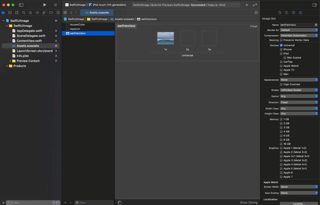
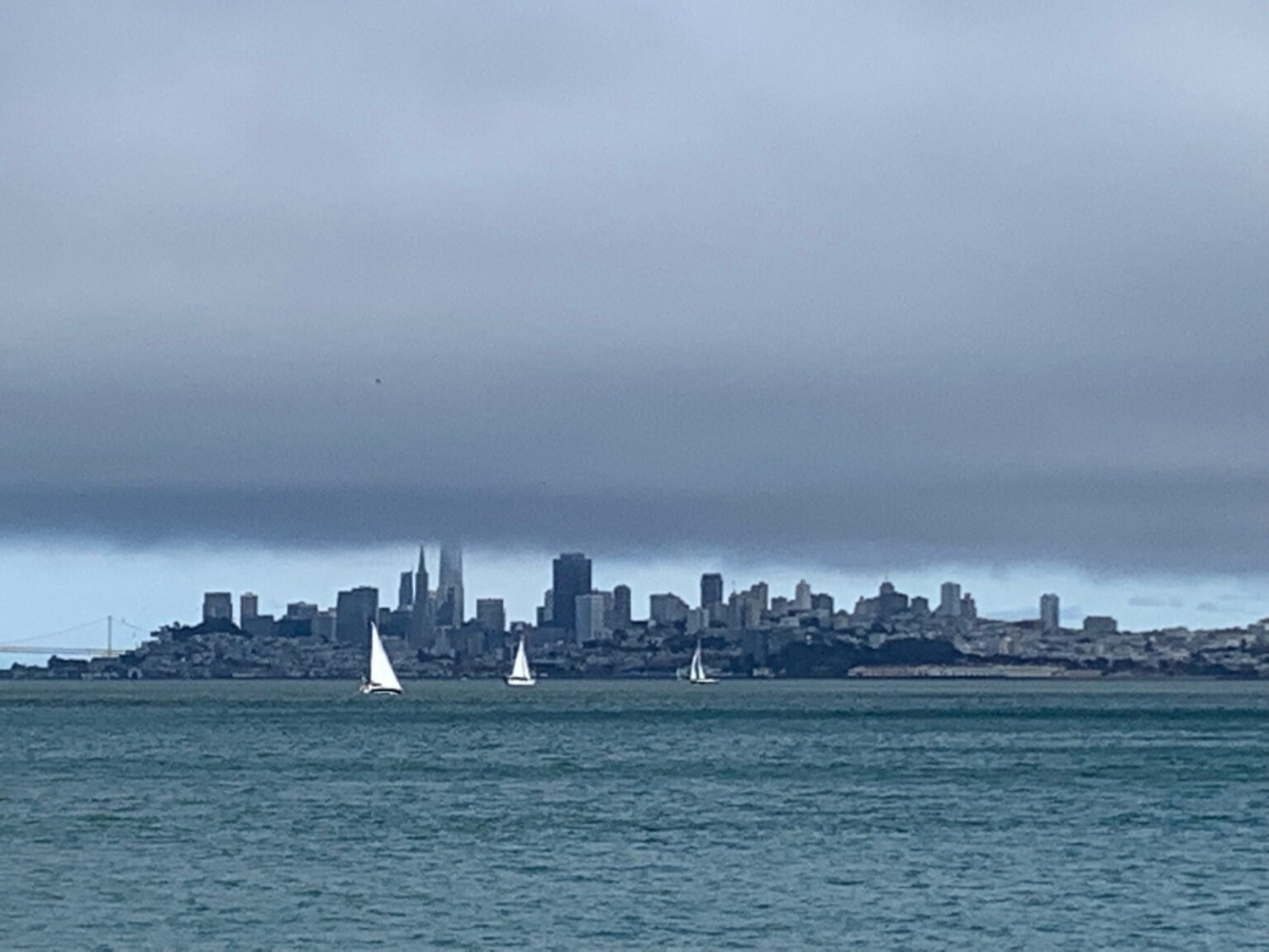
Drag your image under the AppIcon (you can use the image in the header of this post https://nicoladefilippo.com/wp-content/uploads/2021/04/sanfrancisco-1-1536×1152.jpg).
To use the image in the code:
import SwiftUI

struct ContentView: View {
    var body: some View {
        Image("sanfrancisco")
    }
}
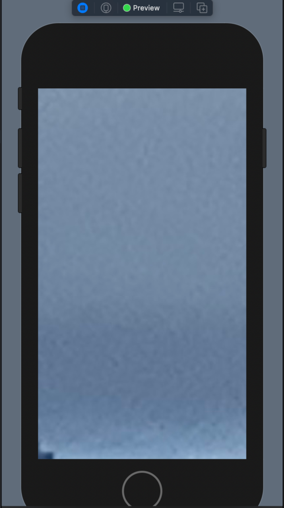
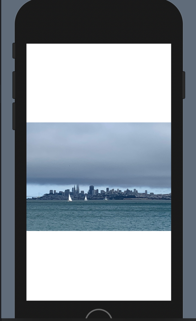
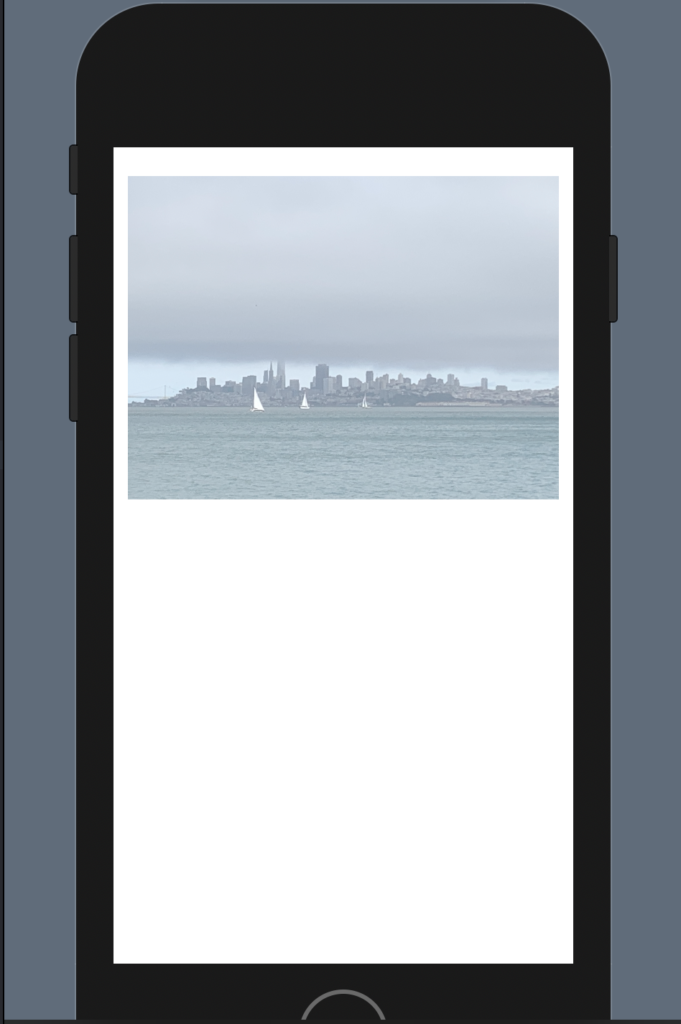
In this way we see the image in bad way:
To resize the image we have to add the resizable:
Image("sanfrancisco")
            .resizable()
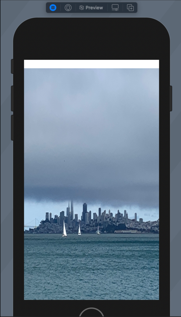
To remove the white on the top we choose to ignore the safe area in this way:
struct ContentView: View {
    var body: some View {
        Image("sanfrancisco")
            .resizable()
            .aspectRatio(contentMode: .fill)
            .edgesIgnoringSafeArea(.all)

    }
}
Try this code and see what happen.
Aspect ratio
To default the aspect ratio is fill (fill the space but not preserve the aspect ratio), to preserve the aspect ratio:
struct ContentView: View {
    var body: some View {
        Image("sanfrancisco")
            .resizable()
            .aspectRatio(contentMode: .fit)
    }
}
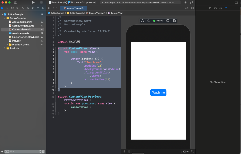
It’s not very nice, we can add rounded corner and padding:
struct ContentView: View {
    var body: some View {
        Image("sanfrancisco")
            .resizable()
            .aspectRatio(contentMode: .fit)
            .cornerRadius(40)
            .padding()
    }
}
To have:
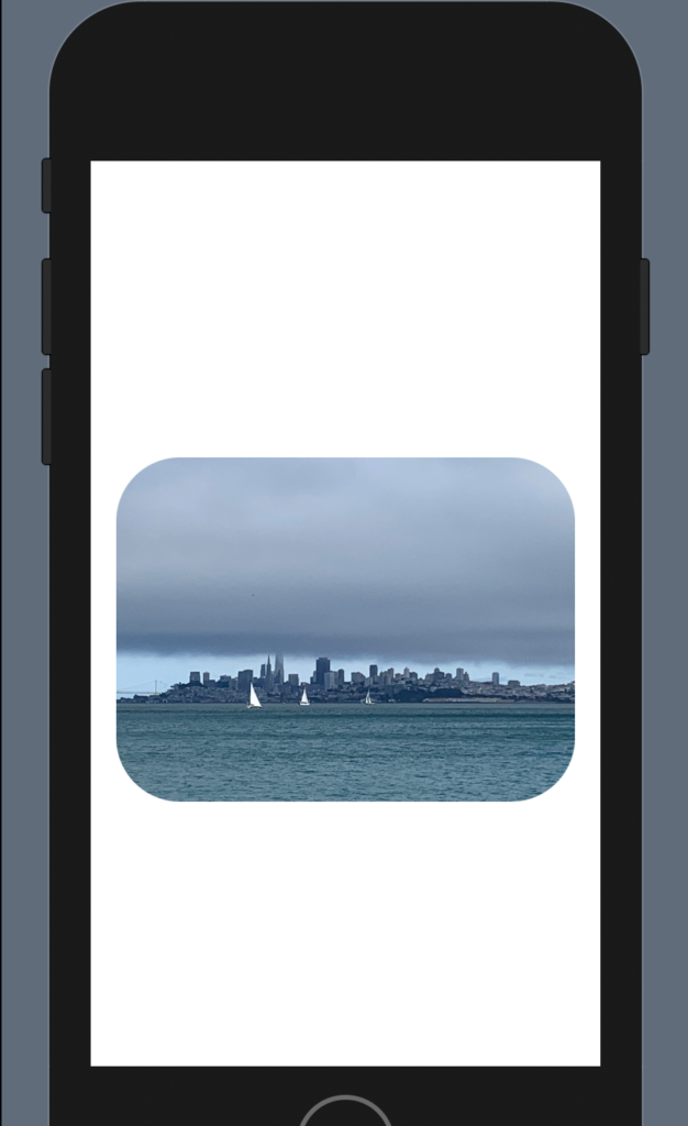
Note: add the padding after the corner radius otherwise you will have the rounded corner.
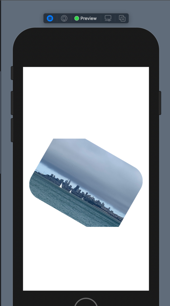
Effects
There is also another effect, for example, rotation, I show how to have a photo with a cut edges.
struct ContentView: View {
    var body: some View {
        Image("sanfrancisco")
            .resizable()
            .aspectRatio(contentMode: .fit)
            .cornerRadius(40)
            .padding()
            .rotationEffect(.init(degrees: 30))
            .cornerRadius(40)
            .padding()
    }
}
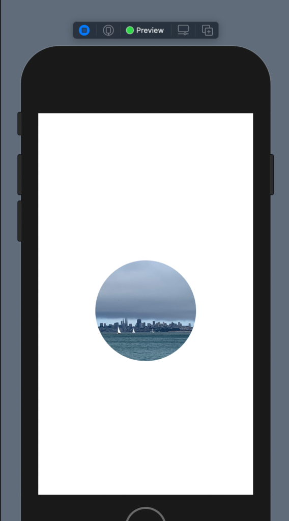
Shape
It’s possible also to give a shape and size to the image:
struct ContentView: View {
    var body: some View {
        Image("sanfrancisco")
            .resizable()
            .aspectRatio(contentMode: .fit)
            .clipShape(Circle())
            .frame(width: 200)
    }
}
Overlay
Now see how to overlay an object with another not using the ZStack. First, we push the image on the topo using a VStack and a spacer; change the size using a frame and change the opacity:
struct ContentView: View {
    var body: some View {
        VStack {
            Image("sanfrancisco")
            .resizable()
            .aspectRatio(contentMode: .fit)
            .frame(width: 300)
            .opacity(0.5)
            Spacer()
        }

    }
}
Now we want to add a title on the top of the photo:
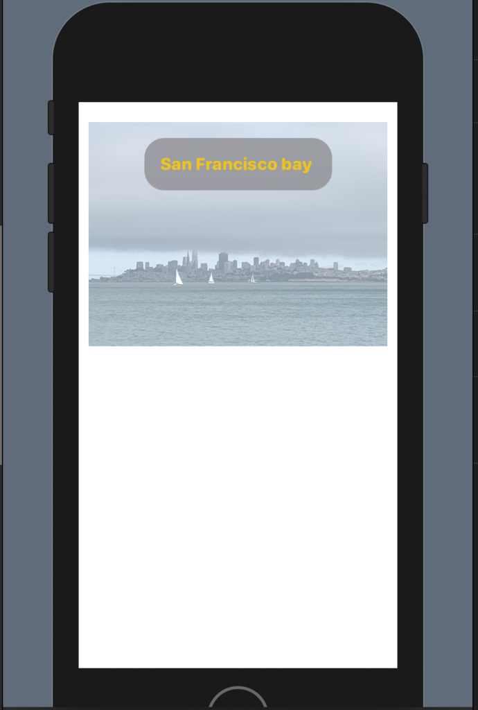
The code:
struct ContentView: View {
    var body: some View {
        VStack {
            Image("sanfrancisco")
            .resizable()
            .aspectRatio(contentMode: .fit)
            .frame(width: 300)
            .opacity(0.5)
            .overlay(
                Text("San Francisco bay ")
                    .fontWeight(.heavy)
                    .font(.system(.headline, design: .rounded))
                    .foregroundColor(.yellow)
                    .padding()
                    .background(Color.gray)
                    .cornerRadius(20)
                    .opacity(0.8)
                    .padding(),
                    alignment: .top

                )
            Spacer()
        }

    }
}
We added an overlay with a Text with properties that we already know (from previous post https://nicoladefilippo.com/text-and-button-with-swuiftui/), note instead of the alignment, with this we say where to set the text. Alignment is a property of the overlay (note the comma after the last padding).
Note: English is not my native language, so I’m sorry for some errors. I appreciate it if your correct me.


