Customize TabView in SwiftUI (Episode II°)

In this post, we’ll learn how to create a tab bar similar to LinkedIn, which features a horizontal black line on top of the selected tab item. As usual, let’s start by looking at the result:
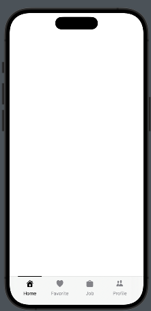
We’ll follow those steps:

  • Create the Tab Item Information – Define the details and content for each tab item.
  • Create the TabView – Set up the overall TabView structure where the tab items will be displayed.
  • Create the Tab Item – Implement the view used to display each individual tab item within the TabView..

The tabitem information

enum TabItems: Int, CaseIterable{
    case home = 0
    case bell
    case job
    case network
    
    var title: String{
        switch self {
        case .home:
            return "Home"
        case .bell:
            return "Favorite"
        case .job:
            return "Job"
        case .network:
            return "Profile"
        }
    }
    
    var iconName: String{
        switch self {
        case .home:
            return "house.fill"
        case .bell:
            return "heart.fill"
        case .job:
            return "bag.fill"
        case .network:
            return "person.2.fill"
        }
    }
}

TabItems are created as an enum with CaseIterable because this allows us to use the allCases function to retrieve all cases of the enum, which is useful in a forEach loop.

Create the TabView

struct ContentView: View {
    @State var selectedTab = 0
    var body: some View {
        ZStack(alignment: .bottom){
            TabView(selection: $selectedTab) {
                EmptyView() // Replace with your View
                    .tag(0)
                
                EmptyView() // Replace with your View
                    .tag(1)
                
                EmptyView() // Replace with your View
                    .tag(2)
                
                EmptyView() // Replace with your View
                    .tag(3)
            }
            HStack(alignment: .center) {
                ForEach((TabItems.allCases), id: \.self){ item in
                    HStack(alignment: .center) {
                        Spacer()
                        TabItemView(item: item, selected: $selectedTab)
                        Spacer()
                    }.frame(width:  80)
                }
            }.frame(maxWidth: .infinity, maxHeight: 70)
            .padding(.horizontal, 26)
            .padding(.bottom, -14)
        }
    }
}

In the code, we define a ZStack that contains the TabView and an HStack anchored at the bottom, which holds the tab items. The tab items are displayed by iterating over the list of cases. Each individual tab item is displayed using TabItemView, positioned between Spacers to center it horizontally.

Create the Tab Item

Take a look at the tab item.

struct TabItemView: View {
    var item: TabItems
    @Binding var selected: Int
  
    var body: some View {
        VStack {
            Button{
                selected = item.rawValue
            } label: {
                VStack(spacing: 10){
                    if selected == item.rawValue {
                        Color(.black).frame(width: 70, height: 2)
                            .padding(.top, 1)
                    } else {
                        Spacer().frame(width: 70, height: 2)
                            .padding(.top, 1)
                    }
                    
                    Image(systemName: item.iconName)
                        .resizable()
                        .renderingMode(.template)
                        .foregroundStyle(selected == item.rawValue ? .black : .gray)
                        .frame(width: 20, height: 20)
                    Text(item.title)
                        .font(.system(size: 14))
                        .foregroundStyle(selected == item.rawValue ? .black : .gray)
                    }
                    Spacer()
                }
            }.frame(width: 80)
        }
    }
}

This view takes two parameters: selected, which contains the index of the selected tab (refer to the tag value in the TabView code), and item, which holds the tab information. Note the binding on selected; it is necessary because changes within the tab item must be propagated to the TabView. When a tab item is selected, a black line appears at the top. Otherwise, an empty element with the same dimensions as the line is displayed to prevent unwanted animations in the tab bar.

Feel free to improve this code, for example, by adding the ability to specify colors for different behaviors.

Note: English is not my native language, so I apologize for any errors. I use AI solely to generate the banner of the post; the content is human-generated.

To subscribe to my newsletter [https://nicoladefilippo.com/#mailinglist]

Customize TabView in Swiftui

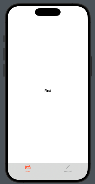
In this post, we’ll explore how to customize the TabView with just a few lines of code.

As usual, let’s start from the end:

We’ll specifically look at how to:

  • Change the color of the tabBar.
  • Modify the text and color of each tab item.
struct ContentView: View {
    var body: some View {
        TabView{
            Group {
                Text("First")
                .tabItem {
                    Label("First", systemImage: "car")
                }
                Text("Second")
                    .tabItem {
                        VStack{
                            Image(systemName: "pencil")
                            Text("Second")
                        }
                    }
            }.toolbarBackground(.visible, for: .tabBar)
            .toolbarBackground(Color.black.opacity(0.1), for: .tabBar)
        }
    }
}

(Note that in the tab item, the text and icon are defined in two different ways, just to demonstrate this possibility).

To set the color of the tabBar, we use:

.toolbarBackground(.visible, for: .tabBar)
.toolbarBackground(Color.black.opacity(0.1), for: .tabBar)

So, the background should be visible, utilizing black color with an opacity setting. Note that the properties are applied to the Group that contains the elements in the TabView. If we skip the Group, the properties will not be applied to all the tabs.

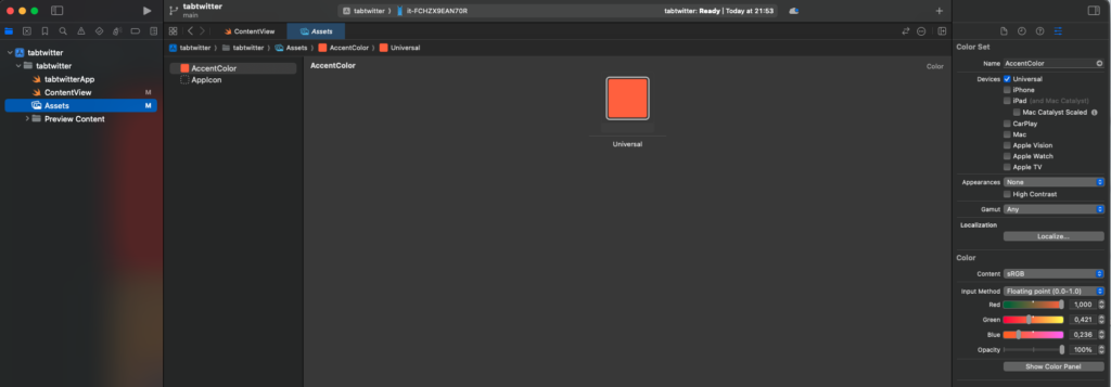
To change the color of the icon and the text of the tab item, we must define the accent color in the assets:

The AccentColor will be used for the tab item elements, as well as for buttons and other components.

Now you have the knowledge needed to customize your TabView.

Note: English is not my native language, so I apologize for any errors. I use AI solely to generate the banner of the post; the content is human-generated.

To subscribe to my newsletter [https://nicoladefilippo.com/#mailinglist]
Font Width in SwiftUI

One often overlooked element in mobile application design is the font. While the focus during design and development typically centers on colors and images, paying attention to font choice can significantly enhance your app’s appeal. If you’re interested in giving your app a unique improvement that sets it apart, this insightful post is for you.

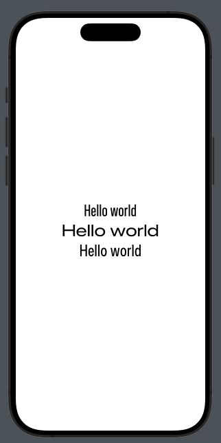
In SwiftUI are existing four value for the font width:

  • Standard
  • Compressed
  • Expanded
  • Condensed

In the code:

struct ContentView: View {
    var body: some View {
        VStack {
            Text("Hello world")
                .fontWidth(.compressed)
            Text("Hello world")
                .fontWidth(.expanded)
            Text("Hello world")
                .fontWidth(.condensed)
        }.font(.largeTitle)
    }
}

To have this:

How you can see it’s very simple to have nice screen changing only the font width.

Note: English is not my native language, so I apologize for any errors. I use AI solely to generate the banner of the post; the content is human-generated.

To subscribe to my newsletter [https://nicoladefilippo.com/#mailinglist]
Scan QR code in SwiftUI

If your app requires QR code scanning capabilities, or if you’re simply interested in this topic, you might find this post useful.

First, we’ll craft the primary view, integrating a toolbar button that unveils a sheet dedicated to scanning, with the QR code displayed centrally upon detection.

Subsequently, we’ll delineate the sheet featuring a closure mechanism, ensuring it automatically dismisses upon QR code identification.

Lastly, we’ll delve into the crux of the matter: the scanning process itself.

First thing we have to add to the permission the Privacy – Camera Usage Description otherwise the app will not start.

Introducing the ContentView:

struct ContentView: View {
    @State var qr = ""
    @State var scan = false
    
    var body: some View {
        NavigationStack {
            VStack {
                Text(qr)
            }.sheet(isPresented: $scan) {
                SheetView(qrCode: $qr)
            }
            .padding()
            .toolbar {
                Button(action: {
                    qr = ""
                    scan = true
                }) {
                    Image(systemName: "qrcode.viewfinder")
                }
            }
        }
    }
}

Thus, the SheetView is activated when the scan button is pressed, and any QR code scanned is stored in the QR variable.

Here’s a closer look at the SheetView:

import SwiftUI

struct SheetView: View {
    @Environment(\.dismiss) private var dismiss
    @Binding var qrCode: String
    var body: some View {
        VStack {
            QrScannerView(qr: $qrCode)
        }.overlay(
            VStack {
                Spacer()
                Button("Close") {
                    dismiss()
                }.foregroundStyle(.black)
                    .frame(maxWidth: 60, maxHeight: 60)
                    .background(.yellow)
                    .cornerRadius(10)
            }
        ).onChange(of: qrCode) {
            dismiss()
        }
    }
}

#Preview {
    @State var dum = ""
    return SheetView(qrCode: $dum)
}

This view incorporates the QrScannerView, which stands as the cornerstone of the application, alongside a button for closing the view. Upon detecting a QR code, the sheet is automatically dismissed via the onChange mechanism.

Now, onto the crucial part:

import SwiftUI
import VisionKit

@MainActor
struct QrScannerView: UIViewControllerRepresentable {
    @Binding var qr: String
   
    var scannerViewController: DataScannerViewController = DataScannerViewController(
        recognizedDataTypes: [.barcode()],
        qualityLevel: .accurate,
        recognizesMultipleItems: false,
        isHighFrameRateTrackingEnabled: false,
        isHighlightingEnabled: false
    )
    
    var scannerAvailable: Bool {
        DataScannerViewController.isSupported &&
        DataScannerViewController.isAvailable
    }
    
    
    func makeUIViewController(context: Context) -> DataScannerViewController {
        scannerViewController.delegate = context.coordinator
        return scannerViewController
    }
    
    func updateUIViewController(_ uiViewController: DataScannerViewController, context: Context) {
    }
    
    func makeCoordinator() -> Coordinator {
        return Coordinator(self)
    }
        
    class Coordinator: NSObject, DataScannerViewControllerDelegate {
        var parent: QrScannerView
        var qr = ""
        init(_ parent: QrScannerView) {
            self.parent = parent
            parent.start()

        }
        
        func dataScanner(_ dataScanner: DataScannerViewController, didAdd addedItems: [RecognizedItem], allItems: [RecognizedItem]) {
            processAddedItems(items: addedItems)
        }
        
        func dataScanner(_ dataScanner: DataScannerViewController, didRemove removedItems: [RecognizedItem], allItems: [RecognizedItem]) {
        }
        
        func dataScanner(_ dataScanner: DataScannerViewController, didUpdate updatedItems: [RecognizedItem], allItems: [RecognizedItem]) {
        }
        
        func dataScanner(_ dataScanner: DataScannerViewController, didTapOn item: RecognizedItem) {
            processItem(item: item)
        }
        
        
        func processAddedItems(items: [RecognizedItem]) {
            for item in items {
                processItem(item: item)
            }
        }

        func processItem(item: RecognizedItem) {
            switch item {
            case .barcode(let code):
                parent.qr = code.payloadStringValue ?? ""
            case .text(_):
                break
            @unknown default:
                print("Should not happen")
            }
        }
    }
}

To delve deeper, it’s essential to highlight a few key points, starting with the importation of VisionKit. This toolkit empowers developers to scan not only QR codes and barcodes but also text.

The view is annotated with @MainActor, indicating it executes on the main thread, ensuring the UI remains responsive and updated in real-time.

It implements the UIViewControllerRepresentable protocol, facilitating the integration of a UIViewController within SwiftUI. This approach enables SwiftUI views to manage traditional UIKit controllers seamlessly.

The qr variable is designated to store the string extracted from the QR code, serving as a bridge for data retrieved from scans.

scannerViewController encapsulates the scanner controller, initialized with specific properties tailored for barcode scanning, although it’s also capable of scanning text.

scannerAvailable assesses the availability of the scanner (and by extension, the camera), ensuring the device can perform the required operations.

updateUIViewController is responsible for configuring the controller post-initialization, while makeController initializes and returns the controller, setting the stage for its operation.

The controller adheres to the DataScannerControllerViewDelegate protocol, which is defined as an object that analyzes live video from the camera for text, data within text, and machine-readable codes, essentially handling the intricate aspects of scanning.

Scanning starts automatically upon the controller’s initialization, with a call to start from the parent object, streamlining the process for immediate action.

processItem meticulously analyzes discovered items; if an item is identified as a QR code, its string value is captured and processed accordingly.

The use of @unknown default in Swift provides a safeguard against potential incompatibilities that might arise in the future, ensuring the application remains robust across updates and changes in the development landscape.

The code https://github.com/niqt/swift-qr-code

Note: English is not my native language, so I apologize for any errors. I use AI solely to generate the banner of the post; the content is human-generated.

To subscribe to my newsletter [https://nicoladefilippo.com/#mailinglist]

Table in SwiftUI (Episode III° – The Split)

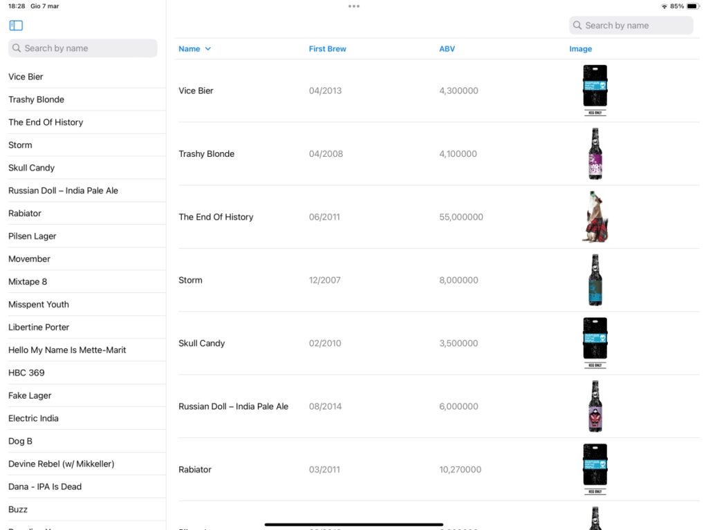
When you use the app on an iPad, you often see a list on the left and some details on the right. In this post, we will explore how to implement this layout.

Our starting point is the code from the first post in this series, which you can find in ContentView.swift.

The first change we’ll make is to create our TableView struct::

struct TableView: View {
    @State var beers: [Beer] = []
    @State var page = 0
    @State private var sortOrder = [KeyPathComparator(\Beer.name, order: .reverse)]
    @State private var searchText = ""
    @State private var beerSelected: Set<Beer.ID> = Set<Beer.ID>()
    var body: some View {
        Table(beersSearched, selection: $beerSelected, sortOrder: $sortOrder) {
            TableColumn("Name", value: \.name)
            TableColumn("First Brew", value: \.first_brewed)
            TableColumn("ABV") { beer in
                Text("\(beer.abv)")
            }
            TableColumn("Image") { beer in
                AsyncImage(url: URL(string: beer.image_url)) { image in
                    image.resizable().scaledToFit()
                } placeholder: {
                    ProgressView()
                }
                .frame(width: 100, height: 100)
            }
        }.onAppear {
            Task {
                await getBeers()
            }
        }.onChange(of: sortOrder) {
            beers.sort(using: sortOrder)
        }.searchable(text: $searchText, prompt: Text("Search by name"))
    }
    
    var beersSearched: [Beer] {
        if searchText.count == 0 {
            return self.beers
        } else {
            return self.beers.filter({(beer: Beer) -> Bool in
                return beer.name.lowercased().contains(searchText.lowercased())
            })
        }
    }
    
    func getBeers() async {
        do {
            page += 1
            let url = URL(string: "https://api.punkapi.com/v2/beers?page=\(page)&per_page=30")!
            let (data, _) = try await URLSession.shared.data(from: url)
            let beersLoaded = try JSONDecoder().decode([Beer].self, from: data)
            beers = beersLoaded + beers
            beers.sort(using: sortOrder)
        } catch {
            print("Some error")
        }
    }
}

This approach allows us to reuse the code as follows:

struct ContentView: View {
    var body: some View {
        NavigationSplitView(sidebar: {
            TableView()
        }, detail: {
            TableView()
        })
    }
}

With the NavigationSplitView, there is an element on the left (the sidebar) and the rest of the space is dedicated to the detail view. If we insert a table in the sidebar, only the first column will be visible:

With this code, the same view is presented in both the sidebar and the details section. As an exercise, you can try to create your own custom detail view.

Here is one possible solution:

struct TableView: View {
    @State var beers: [Beer] = []
    @State var page = 0
    @State private var sortOrder = [KeyPathComparator(\Beer.name, order: .reverse)]
    @State private var searchText = ""
    @Binding var beerSelected: Beer?
    @State var idSelected: Beer.ID?
    
    var body: some View {
        Table(beersSearched, selection: $idSelected, sortOrder: $sortOrder) {
            TableColumn("Name", value: \.name)
            TableColumn("First Brew", value: \.first_brewed)
            TableColumn("ABV") { beer in
                Text("\(beer.abv)")
            }
            TableColumn("Image") { beer in
                AsyncImage(url: URL(string: beer.image_url)) { image in
                    image.resizable().scaledToFit()
                } placeholder: {
                    ProgressView()
                }
                .frame(width: 100, height: 100)
            }
        }.onAppear {
            Task {
                await getBeers()
            }
        }.onChange(of: sortOrder) {
            beers.sort(using: sortOrder)
        }.searchable(text: $searchText, prompt: Text("Search by name"))
        .onChange(of: idSelected) { // <-- New
            beerSelected = beers.first(where: {(beer) in beer.id == idSelected!})
        }
    }
    
    // the rest of the code is equal
}

I made a few minor adjustments:

  • The beerSelected variable is now an optional of type Beer? This variable will hold the selected beer and is bound to the variable passed from ContentView.
  • idSelected contains the ID of the selected beer.
  • I added a new onChange method, which searches for the selected beer by its ID. I’m aware it’s not the best approach, but for this purpose, it’s sufficient.

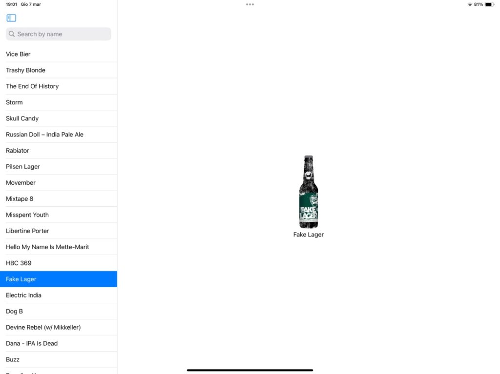
The ContentView is now updated as follows:

struct ContentView: View {
    @State private var beerSelected: Beer?

    var body: some View {
        NavigationSplitView(sidebar: {
            TableView(beerSelected: $beerSelected)
        }, detail: {
            if let selected = beerSelected {
                VStack {
                    AsyncImage(url: URL(string: selected.image_url)) { image in
                        image.resizable().scaledToFit()
                    } placeholder: {
                        ProgressView()
                    }
                    .frame(width: 200, height: 200)
                    Text("\(selected.name)")
                }
            } else {
                Text("Please Select")
            }
        })
    }
}

In the ContentView, we declare beerSelected which is passed to the TableView. When it’s not null, we display the name and the image of the beer.

One last thing, is possible change the width of the column, using the property width.

With this post, the series is complete. Stay tuned for new posts.

Note: English is not my native language, so I apologize for any errors. I use AI solely to generate the banner of the post; the content is human-generated.