PencilKit in SwiftUI

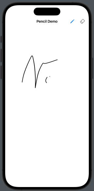
Today, numerous mobile and embedded applications utilize digital pencils for capturing signatures or similar tasks (such as in courier apps, bank offices, etc.). In this post, we’ll explore how to use PencilKit in SwiftUI.

Let’s start by defining our goal:

The ContentView define the settings of the applications:

import SwiftUI
import PencilKit

struct ContentView: View {
    @State var canvas = PKCanvasView()
    @State var drawing = true
    @State var color: Color = .black
    @State var type: PKInkingTool.InkType = .pen
    
    var body: some View {
        NavigationStack {
            CanvasView(canvas: $canvas, drawing: $drawing, type: $type)
            .navigationTitle("Pencil Demo")
            .font(.system(size: 35))
            .navigationBarTitleDisplayMode(.inline)
            .foregroundStyle(Color.purple)
            .toolbar {
                Button(action: {
                    drawing.toggle()
                }) {
                    Image(systemName: "pencil")
                    .font(.headline)
                    .foregroundStyle(drawing ? Color.blue: Color.gray)
                }
                Button(action: {
                    drawing.toggle()
                }) {
                    Image(systemName: "eraser")
                    .font(.headline)
                    .foregroundStyle(drawing ? Color.gray: Color.blue)
                }
            }
        }
    }
}

As we can see, here’s what we do:

  • import the PencilKit
  • Define the color
  • Define the type of the tool (pencil or pen, etc.)
  • Create a canvas of PKCanvasView() type
  • Add two buttons to select what we want do, if draw or erase
  • Call the CanvasView defined below

The CanvasView

struct CanvasView: UIViewRepresentable {
    @Binding var canvas: PKCanvasView
    @Binding var drawing: Bool
    @Binding var type: PKInkingTool.InkType

    var ink : PKInkingTool {
         PKInkingTool(type, color: UIColor(Color.black))
    }
    
    var eraser = PKEraserTool(.bitmap)
    
    func makeUIView(context: Context) -> PKCanvasView {
        canvas.drawingPolicy = .anyInput
        canvas.tool = drawing ? ink : eraser
        return canvas
    }
    
    func updateUIView(_ uiView: PKCanvasView, context: Context) {
        uiView.tool = drawing ? ink : eraser
    }
}

The CanvasView implements the UIViewRepresentable protocol, enabling us to incorporate a UIKit view within a SwiftUI. This approach allows for a seamless integration of PencilKit functionalities into SwiftUI applications.

The variable ink specifies the tool used on the canvas—be it a pen for drawing or an eraser for corrections. It’s worth noting the versatility of the eraser tool: it can be configured as a bitmap eraser, which erases only the specific parts it touches (optionally with a defined width), or as a vector eraser, which removes entire lines upon contact.

The makeUIView method is responsible for initializing the PKCanvasView, setting up the canvas where users can draw or write. On the other hand, the updateUIView method ensures the canvas view is updated appropriately, reflecting any changes in its configuration or the tools used.

I encourage you to experiment with this virtual pen and explore the colors to truly understand the capabilities of this powerful tool. Dive into PencilKit with SwiftUI and discover the potential of digital drawing and note-taking in your apps.

Custom Component in SwifUI

SwiftUI is a powerful tool, though one area ripe for improvement is the variety of components available. In this post, we’ll explore how to build a custom component: a search text field.

Adding a searchable component in SwiftUI is straightforward—you can easily add a search field to the navigation bar with just one line of code. However, the challenge arises when you want to place this component in the middle of the screen or in any position other than the navigation bar. For such custom requirements, you’ll need to build it yourself. Let me show you one possible way to achieve this.

The GOAL

To construct our custom search text field, we require three key components:

  1. Image: To serve as the search icon, visually indicating the purpose of the text field.
  2. TextField: This is where the user will input their search query. It’s the core component of our search functionality.
  3. Button: A clear to clear the current input in the text field.
struct CustomSearchView: View {
    @State var searchText: String = ""
    var onSubmit: (String) -> Void
    var body: some View {
        HStack {
            Image(systemName: "magnifyingglass")
            .resizable()
            .frame(width: 20, height:20)
            .foregroundStyle(Color(.systemGray))
            
            TextField("Search", text: $searchText)
            .onSubmit {
                onSubmit(searchText)
            }
            
            Button("Cancel") {
                searchText = ""

            }
        }.padding(10)
        .background(Color(.systemGray6))
        .cornerRadius(10)
    }
}

A part the graphic settings, the main parts are:

@State var searchText: String = ""
var onSubmit: (String) -> Void
  • The searchText acts as a @State variable, essential for capturing the text input from the TextField.
  • The variable var onSubmit: (String) -> Void is defined as a closure (or a callback, for those familiar with other programming languages). We utilize this closure to handle the onSubmit event of the TextField. The primary goal here is to forward the text inputted by the user to the view containing our custom search bar.

Example of Usage

struct BarSearchView: View {
    
    var body: some View {
        VStack {
            CustomSearchView(onSubmit: search)
        }.padding()
    }
    
    func searched(searched: String) {
        print(searched)
    }
}

Therefore, we define a searched function, which we pass to the CustomSearchView. This function is invoked when the user submits text via the search bar.

Enjoy creating your components.

Note: English is not my native language, so I apologize for any errors. I use AI solely to generate the banner of the post; the content is human-generated.

Share data in a SwiftUI application

Many blog posts are responses to my students’ questions, and this one is no different. Often, my students need to build fast prototypes without saving permanent data and want to avoid writing complicated code with Core Data or the newer SwiftData. They frequently ask, “How can we share data across the application without passing it as a parameter to every view?” The answer is to use an EnvironmentObject.

Definition

First, let’s define the object that we want to share:

struct Event: Identifiable {
    var id = UUID()
    var name: String
}

class Shared: ObservableObject {
    @Published var events: [Event] = [Event]()
}

The shared object will be a class, marked as ObservableObject (allowing us to catch changes), with the events array being the published property. In this case, we have only one array, but there’s no limit to the number of properties that can be published.

Usage

After defining the class, we need to declare a variable of the shared class using @StateObject. Then, we pass this variable to the .environmentObject modifier. These steps are performed in just one view—the root view of any other views that will use the shared object.

struct ContentView: View {
    @State var isPresented = false
    @StateObject var shared = Shared()
    
    var body: some View {
        NavigationView {
            List(shared.events) { event in
                Text(event.name)
            }.toolbar {
                ToolbarItem {
                    Button(action: {isPresented = true}) {
                        Label("Add Event", systemImage: "plus")
                    }
                }
            }
        }.sheet(isPresented: $isPresented, content: {
            DemoUIView()                
        }).environmentObject(shared)
    }
}

In this scenario, the root view displays a list of events. By tapping on the plus icon, we can add another event.

Any other view that uses (displays or modifies) the shared data simply needs to declare @EnvironmentObject var shared: Shared. In this case we type the event name and add this event to the events list.

struct DemoUIView: View {
    @State var name = ""
    @EnvironmentObject var shared: Shared

    var body: some View {
        VStack {
            TextField("Event Name", text: $name)
            Button("Save", action: {
                shared.events.append(Event(name: name))
            })
        }.padding()
    }
}

Enjoy creating your application.

Note: English is not my native language, so I apologize for any errors. I use AI solely to generate the banner of the post; the content is human-generated.

Drag And Drop in SwiftUI

In this post, we’ll explore how to use Drag & Drop building blocks to create a fun and educational game! Learn how to make players sort trash into the correct bins, just like in the video below:

The goal is to drag and drop items into the correct bins. Newspapers will disappear from the list when placed in the recycling bin, while plastic and glass will be rejected.

The Data

Let’s start with the defition of the data of the element that we want drag:

struct ImageItem: Identifiable {
    var id = UUID()
    var name: String
    var image: String
}

@Observable
class Images  {
    var items: Array<ImageItem> = Array<ImageItem>()
 
    init() {
        items = [
            ImageItem(name: "newspaper", image: "newspaper"),
            ImageItem(name: "plastic", image: "plastic"),
            ImageItem(name: "glass", image: "glass")
        ]
    }
}

We define a struct that includes the name of the element, the image of the element, and a unique ID. After that, we define a class (which is defined as Observable, and is valid starting from iOS 17) that contains the list of elements we want to drag. It’s marked as observable because we need to monitor changes within it.

Visualization

The graphic visualization of the ImageItem is this:

struct ImageUIView: View {
    var imageItem: ImageItem
 
    var body: some View {
        VStack{
            Image(imageItem.image)
                .resizable()
                .frame(width: 150, height: 150)
        }
        .cornerRadius(8)
    }
}

The graphical visualization of the ImageItem is straightforward: it’s a simple image with a fixed size. Additionally, I’ve incorporated a VStack for those who wish to add a text description for the image.

Actions

Now take a look to the main part:

sstruct ContentView: View {
    @State private var images = Images()
    @State private var draggingItem: ImageItem?
    
    var body: some View {
        HStack {
            VStack {
                ForEach(images.items, id: \.id) { imageItem in
                    ImageUIView(imageItem: imageItem)
                        .onDrag({
                            draggingItem = imageItem
                            return NSItemProvider() })
                }
            }
            .frame(width: 150)
            .frame(maxHeight: 150)
            .padding(.leading)

            Spacer()
            
            VStack {
                Image(systemName: "trash")
                .resizable()
                .frame(width: 280, height: 220)
                .background(Color.gray.opacity(0.25))
                .border(.yellow, width: 1)
                .padding(.trailing)
                .onDrop(of: [.text], delegate: DropViewDelegate(items:$images.items, draggedItem: $draggingItem))
            }
        }
    }
}

We define the variables for the images specified in the previously defined class, along with a draggingItem, an optional variable that holds the element we are currently dragging. When we invoke the onDrag method, draggingItem gets set, and the closure returns an NSItemProvider(). This is described in the Apple documentation as follows: “An item provider for conveying data or a file between processes during drag-and-drop or copy-and-paste activities, or from a host app to an app extension”.

In the onDrop method, we specify the types that we want to consider, in this case, text, along with a delegate. This involves using the list of items and the draggingItem as follows:

struct DropViewDelegate: DropDelegate {
    @Binding var items: [ImageItem]
    @Binding var draggedItem: ImageItem?
    
    func performDrop(info: DropInfo) -> Bool {
        items.remove(at: 0)
        return true
    }
    
    func validateDrop(info: DropInfo) -> Bool {
        if let draggedItem = draggedItem, draggedItem.name == "newspaper" {
            return true
        }
        return false
    }
}

The first function to be called is validateDrop. In this instance, it checks the name of the image, so the drop action is validated/accepted based on the value of the name.

If the validation is successful, the drop action is performed by executing the code within performDrop. In this example (to keep it brief), we remove the first element of the list, which is the newspaper. In a real-world scenario, we could apply a filter to the items.

Enjoy creating your game.

Note: English is not my native language, sorry for any errors. I use AI only to generate the banner of the post, the content is human.

Tap Gesture and List in SwiftUI

In this post, we’ll explore how to utilize tap gestures within a list. Our objective is:

Therefore, we have a list of options (or whatever you prefer) that we can enable or disable.

We will define an Option type:

struct Option: Identifiable {
    let id = UUID()
    var name: String
    var enabled: Bool
}

In the view, we declare a list that iterates over a list of options, retrieving both the index and the element for each iteration. For each individual element, we display the name. If the enable option is set to true, we also display an image of a checkmark. When the user taps on a row, the status of the property is toggled.

struct ContentView: View {
    @State var options = [Option(name: "Option1", enabled: false),
                   Option(name: "Option2", enabled: false),
                   Option(name: "Option3", enabled: false)]
    
    var body: some View {
        List(Array(options.enumerated()), id: \.offset) { index, option in
            HStack() {
                Text(option.name)
                Spacer()
                if option.enabled {
                    Image(systemName: "chevron.down")
                        .foregroundColor(.gray)
                }
            }.contentShape(Rectangle())
            .onTapGesture {
                options[index].enabled = !options[index].enabled
            }
        }
    }
}

Note that we add a contentShape to cover the entire width of the list, and it’s on this shape that the onTap gesture is applied. The options are declared as a @State because we need to change the ‘enabled’ value, and these changes must be propagated to the UI.

Note: English is not my native language, sorry for any errors. I use ChatGPT only to generate the banner of the post, the content is human.