Drag gesture with SwiftUI

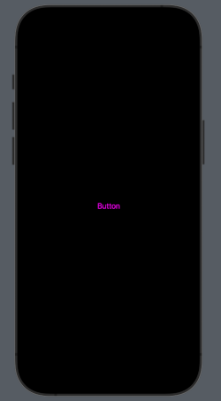
In this post, we’ll learn how to use a drag gesture to check the scrolling direction of a list. The goal is to hide the tab bar and change the appearance of a floating button based on whether the list is scrolling up or down, similar to the behavior of the Gmail app. (Check the code from previous post floating-button-in-swiftui).

First step: Define the two different styles for the Floating Button:

struct FullFB: View {
    var body: some View {
        Label("write", systemImage: "pencil")
        .font(.title.weight(.semibold))
        .padding()
        .background(.pink)
        .foregroundStyle(.white)
        .clipShape(RoundedRectangle(cornerSize: CGSize(width: 40, height: 40)))
        .shadow(radius: 4, x: 0, y: 4)
    }
}

struct SmallFB: View {
    var body: some View {
        Image(systemName: "pencil")
        .font(.title.weight(.semibold))
        .padding()
        .background(.pink)
        .foregroundStyle(.white)
        .clipShape(Circle())
        .shadow(radius: 4, x: 0, y: 4)
    }
}

The code should be self-explanatory: the first style is a rounded rectangle button featuring both text and an icon, while the second style is a circular button with only an icon.

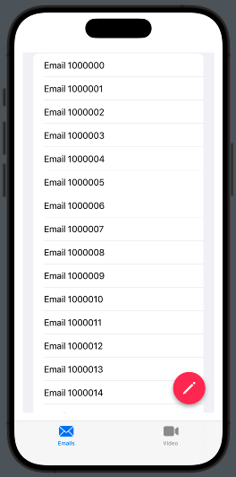
Now take a look to the list:

List(initList(), id:\.self) { mail in
                        HStack {
                            Text(mail)
                            Spacer()
                        }
                    }
                    .gesture(
                        DragGesture().onChanged { value in
                            if value.translation.height > 0{
                                tabbarVisibility = .visible
                            } else {
                                tabbarVisibility = .hidden
                            }
                        }
                    ).toolbar(tabbarVisibility, for: .tabBar)

We display a list of text, but we also attach a gesture to the list. When the DragGesture changes its value, we check the translation. If it’s greater than zero, the list is scrolling up, and we set the tab bar visibility to visible. In any other case, it’s set to hidden.

The complete code is:

struct ContentView: View {
    @State var tabbarVisibility: Visibility = .visible
    var body: some View {
        TabView {
            NavigationStack {
                ZStack {
                    List(initList(), id:\.self) { mail in
                        HStack {
                            Text(mail)
                            Spacer()
                        }
                    }
                    .gesture(
                        DragGesture().onChanged { value in
                            if value.translation.height > 0{
                                tabbarVisibility = .visible
                            } else {
                                tabbarVisibility = .hidden
                            }
                        }
                    ).toolbar(tabbarVisibility, for: .tabBar)
                    .padding()
                    
                    VStack {
                        Spacer()
                        HStack {
                            Spacer()
                            NavigationLink { EmptyView()} label: {
                                if tabbarVisibility == .visible {
                                    FullFB()
                                } else {
                                    SmallFB()
                                }
                                                            
                            }.padding()
                        }
                    }.padding()
                }
            }.tabItem {
                Label("Emails", systemImage: "envelope")
            }
            Text("Second tab")
            .tabItem {
                Label("Video", systemImage: "video")
            }
        }
        
    }
    func initList() -> [String] {
        var emails = [String]()
        for i in 1000000...1000100 {
            emails.append("Email " + String(i))
        }
        return emails
    }
}

The tabbarvisibility is also used to determine which type of floating button to display.

Towards coding and beyond… If you’d like to stay updated with the latest content from my blog, consider subscribing to my weekly newsletter.

Note: English is not my native language, sorry for any errors. I use ChatGPT only to generate the banner of the post, the content is human.

Floating button in SwiftUI

The Apple User Interface Guidelines don’t mention floating buttons, and there is no native component for them. However, some applications, such as Twitter and the Gmail client, do use them.

In this post, we’ll explore how to create a floating button, taking the Gmail app client as our example.

We aim to create this:

Therefore, we need to create a TabView. Inside the first tab, we’ll use a ZStack that contains both a list and a button.

struct ContentView: View {
    var body: some View {
        TabView {
            NavigationStack {
                ZStack {
                    List(initList(), id:\.self) { mail in
                        Text(mail)
                    }
                    VStack {
                        Spacer()
                        HStack {
                            Spacer()
                            NavigationLink { EmptyView()} label:{
                                Image(systemName: "pencil")
                                    .font(.title.weight(.semibold))
                                    .padding()
                                    .background(.pink)
                                    .foregroundStyle(.white)
                                    .clipShape(Circle())
                                    .shadow(radius: 4, x: 0, y: 4)
                            }.padding()          
                        }
                    }.padding()
                }
            }.tabItem {
                Label("Emails", systemImage: "envelope")
            }
            Text("Second tab")
                .tabItem {
                    Label("Video", systemImage: "video")
                }
        }
    }
    func initList() -> [String] {
        var emails = [String]()
        for i in 1000000...1000100 {
            emails.append("Email " + String(i))
        }
        return emails
    }
}

The list is initialized with the initList utility function. Within the ZStack, we display the list of emails and a navigation link represented by a button. The button is placed within a VStack accompanied by a Spacer, pushing it to the bottom. Additionally, it is nested inside an HStack with another Spacer, positioning it on the right side.

Tapping on the button we move on an EmptyView.

Feel free to experiment with the code—it’s the best way to learn and discover new possibilities. Dive in and have fun!

If you’d like to stay updated with the latest content from my blog, consider subscribing to my weekly newsletter.

AppStorage in SwiftUI (Form episode II°)

In this post, we’ll explore how to use AppStorage. Commonly, UserDefaults is employed to save small amounts of data, such as user preferences in an app. However, it comes with certain limitations:

  • The data is saved in a single .plist file, indicating that having a large file is not the optimal solution. On Apple TV, there is a fixed limit of 1 MB, but it’s recommended to keep the file size smaller, particularly if these default values are loaded at app startup for speed considerations.
  • The data is stored in plaintext, so it’s NOT suitable for sensitive information.
  • The permitted types are: Data, String, Date, Bool, Int, Double, Float, Array, Dictionary, and URL.

What is AppStorage? It’s a wrapper for UserDefaults that allows us to save and load data from UserDefaults without having to directly call it.

Take a look at a short example:

struct ContentView: View {
    @AppStorage("enabled") private var enabled = false
    @AppStorage("nickname") private var nickname = ""
    
    var body: some View {
        VStack {
            Form {
                TextField("Nickname", text: $nickname)
                Toggle(isOn: $enabled) {
                    Text("Enable")
                }
            }
        }
        .padding()
    }
}

So, we declare the variable with @AppStorage and use it similarly to how we use @State variables. The primary difference is that, in this case, the changes are automatically saved (and loaded).

Simple and powerful. That’all.

Form in Swiftui (Episode I°)

Many times in an app, we need to display a set number of static information items. For example, consider a user profile. While our initial instinct might be to use a list, it’s not always the best choice. Lists are typically designed for displaying an undefined number of elements. In cases where we have a fixed number of information pieces to show, it’s more appropriate to use a Form to achieve a structured layout like this:

The code is:

struct ContentView: View {
    @State var second: String = ""
    @State var enabled: Bool = true
    
    var body: some View {
        VStack {
            Form {
                HStack {
                    Spacer()
                    Image(systemName: "person.circle")
                        .resizable()
                        .frame(width: 100, height: 100)
                    Spacer()
                }
                Text("Name")
                TextField("Last Name", text: $second)
                Text("Address")
                Toggle(isOn: $enabled) {
                    Text("Enabled")
                }
                DatePicker(selection:.constant(Date()), displayedComponents: [.date], label: { Text("Birth date") })
            }
        }
    }
}

In a Form, we have the flexibility to incorporate various types of objects. For example, you can include an image (within an HStack), a read-only text, a text field, a toggle switch, and a date picker. You can even add buttons and more.

That’s all for this episode. In the next one, we’ll learn how to save the information displayed in the form.

Assets in XCode 15

This post is designed to demonstrate how to use assets in Xcode 15. It serves as a quick recap for experienced developers and a helpful introduction for beginners. In this post, we’ll cover how to:

  1. Add an image to the assets and use it in the code.
  2. Add a custom color.
  3. Set the Accent color.
  4. Add an icon.

Image in the assets

Start copying this image in the assets:

Now we see the preview of the image on the right panel, along with two empty rectangles labeled 2x and 3x. What do these numbers mean? On iOS, we don’t consider the pixel size but rather use points (this concept was introduced in 2010 with the iPhone 4). For 1x, one point is equivalent to one pixel, for 2x, one point corresponds to a 2 x 2 pixel square, and for 3x, one point corresponds to a 3 x 3 pixel square. This approach results in a logical resolution (Android uses Density-independent pixels, which is a concept similar to this).

If images for 2x or 3x resolutions are not provided, the 1x image will be used even on devices with higher resolutions. Let’s look at an example to understand this better:

iPhone 11 Pro
Logical Resolution = 375 x 812 pixels
Scale Factor = x3
Screen Resolution = 1125 x 2436 pixels

The advantage of this approach is that we work with a logical resolution, and we don’t need to worry about what happens on different screen sizes because the images are scaled automatically. Of course, if we want to achieve a better look and feel, it’s advisable to have 2x or 3x versions for devices with high resolutions.

How to use this image in the code?

struct ContentView: View {
    var body: some View {
        VStack {
            Image(.postAssetHeader)
        }
        .padding()
    }
}

Note that we refer to the image with a dot and the name in camel case notation. This is a new feature in Xcode 15, where we don’t use the name as a string, and names in snake case are automatically transformed into camel case.

Custom Color

Now let’s see how to create a custom color. Start by clicking on the plus sign and selecting Color Set.

Afterward, define the color in the right panel:

So, you can also change the name of the color to GreenLight. You should also specify the color for dark mode (it can be the same as the default; it’s your choice).

In the code:

struct ContentView: View {
    var body: some View {
        VStack {
            Text("Hello world")
                .foregroundStyle(.greenLight)
        }
        .padding()
    }
}

Note that like for the image the name is dot plus the name in camel case format.

Accent Color

The accent color is the color applied to views and controls (such as button text, tab item text, and more). You can set it as a custom color using the options in the right panel:

n the code, you don’t need to set anything; now, every text of controls will use it automatically.

struct ContentView: View {
    var body: some View {
        VStack {
            Button("Button") {
              // your action
            }
        }
        .padding()
    }
}

To have:

App icon

Now, creating the app icon is simple. You no longer need to create different images for different resolutions; just drag and drop one image, 1024×1024 in size, onto the rectangle. Use the image big-icon.jpg:

Now, run the application, and your app will have this nice icon on your phone:

That’all.