Map in SwiftUI (episode III – Look Around)

In this episode, we’ll learn how to use the LookAround feature in our applications. To summarize, we will cover:

  1. How to select a marker on the map
  2. How to display the 3D landscape of the selected marker

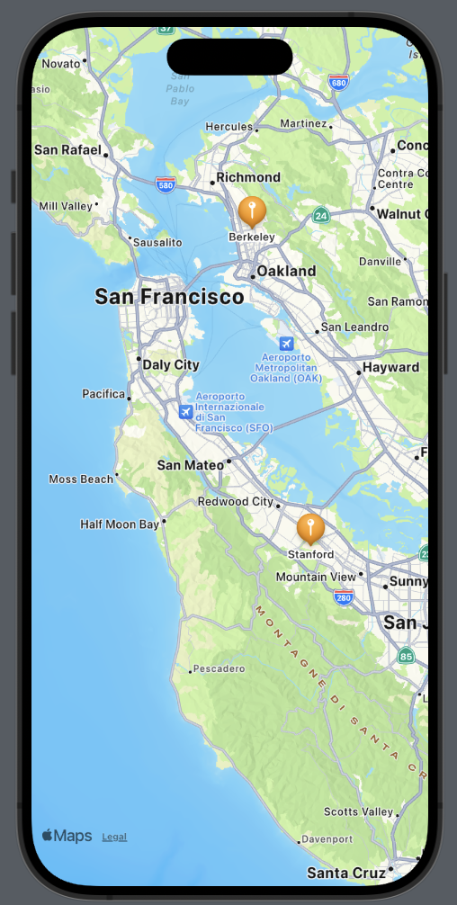
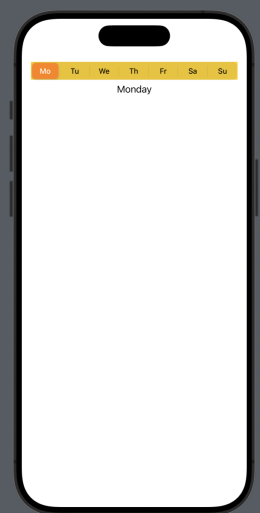
Starting from the end, we aim for this:

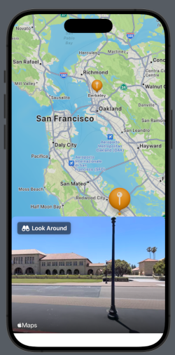
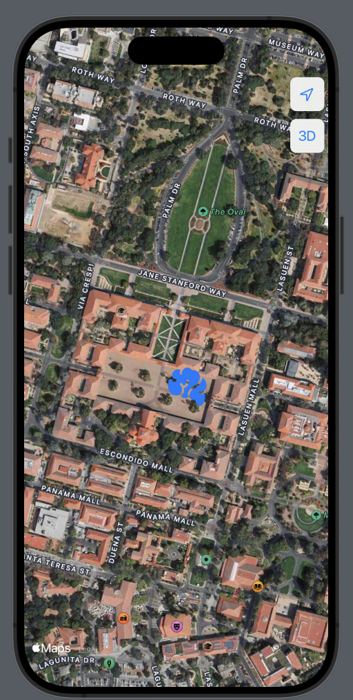
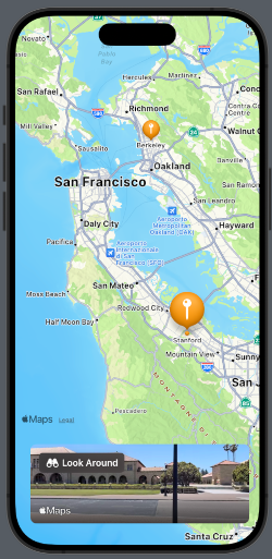
And by tapping on Look Around:

We’ll use the same points as in the previous example [https://nicoladefilippo.com/map-in-swiftui-episode-ii/], and we’ll also incorporate a Sheet for detailed explanations [https://nicoladefilippo.com/swiftui-sheets-demystified-episode-i/].

Select a Marker

struct ContentView: View {
    @State var position: MapCameraPosition = .region(MKCoordinateRegion(
        center: .init(latitude: 37.554169, longitude: -122.313057),
        span: .init(latitudeDelta: 0.7, longitudeDelta: 0.7)
    ))
    
    @State var placeSelected: Int?
    
    var places = [Place(name: "Berkeley", coordinates: CLLocationCoordinate2D(latitude: 37.8715, longitude: -122.2730)), Place(name: "Stanford", coordinates: CLLocationCoordinate2D(latitude: 37.4280, longitude: -122.1697))]
    
    var body: some View {
        VStack{
            Map(position: $position, selection: $placeSelected) {
                ForEach(Array(places.enumerated()), id: \.offset) { index, place in
                    Marker(place.name, coordinate: place.coordinates)
                        .tint(.orange)              
                }
            }
        }
    }

Let’s begin by setting the position (the initial center of the map) in San Mateo, CA. We’ll declare a variable placeSelected that will contain the index of the selected marker, and an array of places, where each place is defined as follows:

struct Place: Identifiable {
    let id = UUID()
    var name: String
    var coordinates: CLLocationCoordinate2D = .init(latitude: 0.0, longitude: 0.0)
}

The placeSelected variable is optional because it can assume a nil value, not only at the beginning but also when tapping on different places on the map apart from the markers.

Therefore, the map is declared by passing the initial position and the selectedPlace.

If you noticed, in the second image the selected balloon is larger. If we also want to change its color, we can use a function like this:

func getColor(_ index: Int, _ selected: Int?) -> Color {
   if selected != nil && selected! == index{
       return .blue
   }
   return .orange
}

…and use it in the tint setting:

Marker(place.name, coordinate: place.coordinates)
.tint(getColor(index, placeSelected))

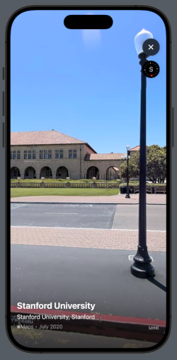
Show the 3D landscape of the selected marker

First, let’s create the sheet that contains a preview of the LookAround feature:

struct SheetUIView: View {
    @State private var lookAroundScene: MKLookAroundScene?
    var selectedPlace: Place
    var body: some View {
        LookAroundPreview(initialScene: lookAroundScene)
        .onAppear {
            lookAroundScene = nil
            Task {
                let request = MKLookAroundSceneRequest(coordinate: selectedPlace.coordinates)
                lookAroundScene = try? await request.scene
            }
        }
    }
}

This view declares a lookAroundScene that contains the scene. This variable is set by calling a request to MKLookAroundSceneRequest. This operation is executed in a Task to avoid freezing the application.

Now, let’s see how to use this view:

@State var isPresented: Bool = false
    var body: some View {
        VStack{
            Map(position: $position, selection: $placeSelected) {
                ForEach(Array(places.enumerated()), id: \.offset) { index, place in
                        Marker(place.name, coordinate: place.coordinates)
                        .tint(.orange)
                }
            }
        }.sheet(isPresented: $isPresented, content: {
            SheetUIView(selectedPlace: places[placeSelected!])
                .presentationDetents([.fraction(0.4)])
        })
        .onChange(of: placeSelected) {
            guard placeSelected != nil else { return }
                isPresented = true
        }
    }

First, we added an isPresented variable; when it’s true, the sheet is displayed. Using .presentationDetents([.fraction(0.4)]), we set the height of the sheet to 40% of the screen height. This view receives the selected place as a parameter.

The event of placeSelected being changed is captured by onChange. Here, we verify that the variable is not nil, and only in this case isPresented becomes true, causing the sheet to appear.

Another method to present the LookAround feature could be as follows

var body: some View {
        VStack{
            Map(position: $position, selection: $placeSelected) {
                ForEach(Array(places.enumerated()), id: \.offset) { index, place in
                        Marker(place.name, coordinate: place.coordinates)
                        .tint(.orange)
                }
            }
        }.safeAreaInset(edge: .bottom) {
            HStack {
                Spacer()
                VStack(spacing: 0) {
                    if isPresented {
                        SheetUIView(selectedPlace: places[placeSelected!])
                        .frame(height: 128)
                        .clipShape(RoundedRectangle(cornerRadius: 10))
                        .padding([.top, .horizontal])
                        }
                    }
            }
            Spacer()
        }
        .onChange(of: placeSelected) {
            guard placeSelected != nil else { return }
                isPresented = true
        }
    }

This time, we display the preview of the LookAround feature at the bottom of the screen, not using a sheet dialog, but by inserting the SheetView into the safe area. Here, the view has rounded corners and a fixed height, as shown in the screen:

That’s all for this episode.

Map in SwiftUI (episode II°)

In this post, we’ll learn how to:

  • Add Markers
  • Customize Annotations
  • Add Map Buttons

Add Markers

Let’s see how to add a marker to both Berkeley and Stanford Universities.

First, we’ll create a structure for our locations:

struct Place: Identifiable {
    let id = UUID()
    var name: String
    var coordinates: CLLocationCoordinate2D = .init(latitude: 0.0, longitude: 0.0)
}

The struct implements the Identifiable protocol because we need to define an ID for each element. This is especially crucial as we want to use an array of places, and it’s necessary to uniquely identify an element when iterating over the array. The other fields of the struct should be self-explanatory.

Now, let’s see how to display these two places on the map. We’ll set the center of the map over San Mateo, CA, as it’s equidistant from both locations. Then, for each place, we’ll add a marker on the map:

struct ContentView: View {
    let locationManager = CLLocationManager()
    
    @State var position: MapCameraPosition = .region(MKCoordinateRegion(
        center: .init(latitude: 37.554169, longitude: -122.313057),
        span: .init(latitudeDelta: 0.7, longitudeDelta: 0.7)
    ))
    
    var places = [Place(name: "Berkeley", coordinates: CLLocationCoordinate2D(latitude: 37.8715, longitude: -122.2730)), Place(name: "Stanford", coordinates: CLLocationCoordinate2D(latitude: 37.4275, longitude: -122.1697))]

    var body: some View {
        ZStack{
            Map(position: $position) {
                ForEach(places) { place in
                    Marker(place.name, coordinate: place.coordinates)
                    .tint(.orange)
                }
            }
        }
    }
}

The marker requires two parameters: a string for identification and the coordinates. It’s also possible to change some properties, such as the color. In this case, we’ve set it to orange.

Customize Annotations

If we need a different marker or don’t like the default one, we can customize our own using annotations. Suppose we want to use an orange brain icon for the universities, we could create it as follows:

Annotation(place.name, coordinate: place.coordinates) {
                        Image(systemName: "brain.fill")
                            .resizable()
                            .frame(width: 50, height: 50)
                            .foregroundStyle(.orange)
                    }

Instead of an image, we can add whatever we want, such as a button, additional text, or a shape, and so on.

If we want to hide the default title, it’s possible by modifying the titles property:

Annotation(place.name, coordinate: place.coordinates) {
                        Image(systemName: "brain.fill")
                            .resizable()
                            .frame(width: 50, height: 50)
                            .foregroundStyle(.orange)
                    }.annotationTitles(.hidden)

Add Map Buttons

MapKit provides us the opportunity to use various map buttons, which we will explore in the next section:

  • MapUserLocationButton: Centers the map on the user’s current position.
  • MapPitchToggle: Switches between 2D and 3D views (note that this is not possible for all cities).
var body: some View {
        ZStack{
            Map(position: $position) {
                ForEach(places) { place in
                    Annotation(place.name, coordinate: place.coordinates) {
                        Image(systemName: "brain.fill")
                            .resizable()
                            .frame(width: 50, height: 50)
                            .foregroundStyle(.blue)
                    }.annotationTitles(.hidden)
                }
            }.mapControls {
                MapUserLocationButton()
                MapPitchToggle()
            }.mapStyle(.hybrid(elevation:.realistic))
        }
    }

I have also changed the map style to a hybrid (satellite) view and added elevation to the camera.

For 2D:

For 3D:

Map in SwiftUI (Episode I°)

This post is the first in a series about using Maps in SwiftUI. In this post, we’ll learn how to:

  • Create a Map
  • Show the user’s position
  • Add a circle centered on the user’s position

Map Creation

First, we need to add values in the info.plist for:

  • Privacy – Location Always Usage Description
  • Privacy – Location When In Use Usage Description

Now, let’s take a look at the code:

import SwiftUI
import MapKit

struct ContentView: View {
    @State var position: MapCameraPosition = .region(MKCoordinateRegion(
        center: .init(latitude: 47.499167,longitude: 8.726667),
        span: .init(latitudeDelta: 0.2, longitudeDelta: 0.2)
    ))
    
    var body: some View {
        ZStack{
            Map(position: $position) 
            .ignoresSafeArea(.all)
        }
    }
}

To use the map, we need to import MapKit, then define a position such as MapCameraPosition (with iOS 17, the direct use of the region is deprecated). The span represents the amount of map to display (think of it as zoom). (I used the coordinates of Winterthur in memory of Niklaus Wirth, who passed away a few days ago). The map is displayed in fullscreen mode because it ignores the safe area.

Show User Position

Now, take a look at how to create a map centered on the user’s position:

struct ContentView: View {
    let locationManager = CLLocationManager()

    @State var position: MapCameraPosition = .userLocation(fallback: .automatic)
    
    var body: some View {
        ZStack{
            Map(position: $position) {
                UserAnnotation()
            }
            .ignoresSafeArea(.all)           .onAppear{self.locationManager.requestWhenInUseAuthorization()
            }
        }
    }
}

First, we define a locationManager; it’s necessary to access the user’s position. When the map appears, it will request the user’s permission.

In this case, ‘position’ contains the user’s location (the fallback is a position to use if the map hasn’t resolved the person’s location).

Add a circle around the user position

struct ContentView: View {
    let locationManager = CLLocationManager()
    @State var distance: CLLocationDistance = 500.0
    @State var defaultLocation: CLLocationCoordinate2D = CLLocationCoordinate2D(latitude: 0.0, longitude: 0.0)

    @State var position: MapCameraPosition = .userLocation(fallback: .automatic)
    
    var body: some View {
        ZStack{
            Map(position: $position) {
                MapCircle(center:  locationManager.location?.coordinate ?? defaultLocation, radius: distance)
                    .foregroundStyle(Color(white: 0.4, opacity: 0.25))
                    .stroke(.orange, lineWidth: 2)
                UserAnnotation()
            }
            .ignoresSafeArea(.all)
            .onAppear{self.locationManager.requestWhenInUseAuthorization()
            }
        }
    }
}

Here we’ve added a distance (in meters) that we use as the radius for the MapCircle. The MapCircle is centered using the coordinates of the user, obtained through the locationManager. In the image, you’ll also see a black circle; that’s Apple Park.

That’s all for this episode.

Horizontal Menu in SwiftUI

In this post, we’ll learn how to build a horizontal menu similar to the one used in the Medium mobile application, like this:

The code is:

struct MenuSwiftUIView: View {
    var days = ["Monday", "Tuesday", "Wednesday", "Thursday",
    "Friday", "Saturday", "Sunday"]
    @State var selected = 0
    var body: some View {
        VStack {
            ScrollView(.horizontal) {
                HStack(spacing: 0) {
                    ForEach(Array(days.enumerated()), id: \.offset) {  index, day in
                        VStack {
                            Text(day).padding(5)
                                .foregroundStyle(.white)
                            if selected == index {
                                Color(.white)
                                    .frame(height: 2)
                            } else {
                                Color(.gray)
                                    .frame(height: 1)
                            }
                                
                        }.onTapGesture {
                            selected = index
                        }
                    }
                }
            }.scrollIndicators(ScrollIndicatorVisibility.hidden)
            Spacer() // Here what you want show considering the selected value
        }.padding()
        .background(.black)
    }
}

We define an array of strings that contains the menu options and a variable selected to store the value of the selected index in the menu.

The menu is built using a ScrollView that scrolls horizontally. In this, we add the Text that shows the label and the bottom line.

The HStack has spacing set to zero to avoid space between the bottom lines.

To have the index of the elements, we create a collection of indices and elements with Array(days.enumerated())

[(offset: 0, element: "Monday"), (offset: 1, element: "Tuesday"), (offset: 2, element: "Wednesday"), (offset: 3, element: "Thursday"), (offset: 4, element: "Friday"), (offset: 5, element: "Saturday"), (offset: 6, element: "Sunday")]

We hide the scrollbar in this way:

.scrollIndicators(ScrollIndicatorVisibility.hidden)

The line (indicator) changes color depending on the selected item.

For the last step, we can extract the ScrollView to create a reusable component:

struct HorizontalMenu: View {
    var labels: Array<String> = []
    var defaultColor = Color.gray
    var selectedColor = Color.white
    var textColor = Color.white
    
    @Binding var selected: Int
    
    var body: some View {
        ScrollView(.horizontal) {
            HStack(spacing: 0) {
                ForEach(Array(labels.enumerated()), id: \.offset) {  index, label in
                    VStack {
                        Text(label).padding(5)
                            .foregroundStyle(textColor)
                        if selected == index {
                            selectedColor
                                .frame(height: 2)
                        } else {
                            defaultColor
                                .frame(height: 1)
                        }
                        
                    }.onTapGesture {
                        selected = index
                    }
                }
            }
        }.scrollIndicators(ScrollIndicatorVisibility.hidden)
    }
}

Note that we bind the selected variable because we need to use its value in the main view.

Thus, the code becomes:

struct MenuSwiftUIView: View {
    var days = ["Monday", "Tuesday", "Wednesday", "Thursday",
    "Friday", "Saturday", "Sunday"]
    @State var selected = 0
    var body: some View {
        VStack {
            HorizontalMenu(labels: days, selected: $selected)
            Spacer() // Here what you want show considering the selected value
        }.padding()
        .background(.black)
    }
}

(Blog image from unsplash)

Segmented Control in SwiftUI

In this post we’ll learn:

  • How to create a segment control.
  • How to customize the look and feel of a segment control.

Create the segment control

Let’s start by creating a segment control that allows choosing from the days of the week:

struct SegUIView: View {
    @State private var daySelected = 0
    var body: some View {
        VStack {
            Picker("Choose a day", selection: $daySelected) {
                Text("Mo").tag(0)
                Text("Tu").tag(1)
                Text("We").tag(2)
                Text("Th").tag(3)
                Text("Fr").tag(4)
                Text("Sa").tag(5)
                Text("Su").tag(6)
            }
            .pickerStyle(.segmented)
            Text("Selected the day \(daySelected)")
            Spacer()
        }.padding()
    }
}

So, the Segment Control is created by using a Picker and setting its style to segmented. If you remove this style, the default Picker appears as a contextual menu.

The state variable daySelected stores the tag value of the selected item. We then simply display this value in a Text.

Thus we have:

Thus, upon selecting a day, we see the number corresponding to daySelected (the tag number).

To create something more realistic, we can create a function that returns a view for the different daySelected:

@ViewBuilder
func DayView(day: Int) -> some View {
    switch (day) {
    case 0:
        Text("Monday")
    case 1:
        Text("Tuesday")
    case 2:
        Text("Wednesday")
    case 3:
        Text("Thursday")
    case 4:
        Text("Friday")
    case 5:
        Text("Saturday")
    case 6:
        Text("Sunday")
    default:
        Text("")
    }
    
}

By replacing the code in the body, we can update the view dynamically based on the daySelected. Here’s how it’s done:

var body: some View {
        VStack {
            Picker("Choose a day", selection: $daySelected) {
                Text("Mo").tag(0)
                Text("Tu").tag(1)
                Text("We").tag(2)
                Text("Th").tag(3)
                Text("Fr").tag(4)
                Text("Sa").tag(5)
                Text("Su").tag(6)
            }
            .pickerStyle(.segmented)
            DayView(day: daySelected)
            Spacer()
        }.padding()
    }

Customize the Segment Control

The background of the Picker can be changed by using its background property:

var body: some View {
        VStack {
            Picker("Choose a day", selection: $daySelected) {
                Text("Mo").tag(0)
                Text("Tu").tag(1)
                Text("We").tag(2)
                Text("Th").tag(3)
                Text("Fr").tag(4)
                Text("Sa").tag(5)
                Text("Su").tag(6)
            }
            .pickerStyle(.segmented)
            .background(.yellow)
            DayView(day: daySelected)
            Spacer()
        }.padding()
    }

Instead, to change the properties of the text and the background color of the selected element, we need to use code from UIKit. Therefore, we define an init function in this way:

init() {
    // Color for the selected item
    UISegmentedControl.appearance().selectedSegmentTintColor = UIColor.orange
    
    // The text color for the selected item
UISegmentedControl.appearance().setTitleTextAttributes([.foregroundColor: UIColor.white], for: .selected)
}

So we have:

If we want to remove the separator between the days, we can add this code to the init function:

UISegmentedControl.appearance().setDividerImage(UIImage(), forLeftSegmentState: .normal, rightSegmentState: .normal, barMetrics: .default)

To change the text color of the unselected items, add the following code:

UISegmentedControl.appearance().setTitleTextAttributes([.foregroundColor: UIColor.magenta], for: .normal)

The code https://github.com/niqt/swift/tree/master/SegmentController