In this post, we’ll learn how to:
- Add Markers
- Customize Annotations
- Add Map Buttons
Add Markers
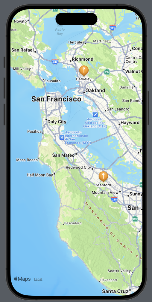
Let’s see how to add a marker to both Berkeley and Stanford Universities.
First, we’ll create a structure for our locations:
struct Place: Identifiable {
    let id = UUID()
    var name: String
    var coordinates: CLLocationCoordinate2D = .init(latitude: 0.0, longitude: 0.0)
}
The struct implements the Identifiable protocol because we need to define an ID for each element. This is especially crucial as we want to use an array of places, and it’s necessary to uniquely identify an element when iterating over the array. The other fields of the struct should be self-explanatory.
Now, let’s see how to display these two places on the map. We’ll set the center of the map over San Mateo, CA, as it’s equidistant from both locations. Then, for each place, we’ll add a marker on the map:
struct ContentView: View {
    let locationManager = CLLocationManager()

    @State var position: MapCameraPosition = .region(MKCoordinateRegion(
        center: .init(latitude: 37.554169, longitude: -122.313057),
        span: .init(latitudeDelta: 0.7, longitudeDelta: 0.7)
    ))

    var places = [Place(name: "Berkeley", coordinates: CLLocationCoordinate2D(latitude: 37.8715, longitude: -122.2730)), Place(name: "Stanford", coordinates: CLLocationCoordinate2D(latitude: 37.4275, longitude: -122.1697))]

    var body: some View {
        ZStack{
            Map(position: $position) {
                ForEach(places) { place in
                    Marker(place.name, coordinate: place.coordinates)
                    .tint(.orange)
                }
            }
        }
    }
}
The marker requires two parameters: a string for identification and the coordinates. It’s also possible to change some properties, such as the color. In this case, we’ve set it to orange.
Customize Annotations
If we need a different marker or don’t like the default one, we can customize our own using annotations. Suppose we want to use an orange brain icon for the universities, we could create it as follows:
Annotation(place.name, coordinate: place.coordinates) {
                        Image(systemName: "brain.fill")
                            .resizable()
                            .frame(width: 50, height: 50)
                            .foregroundStyle(.orange)
                    }
Instead of an image, we can add whatever we want, such as a button, additional text, or a shape, and so on.
If we want to hide the default title, it’s possible by modifying the titles property:
Annotation(place.name, coordinate: place.coordinates) {
                        Image(systemName: "brain.fill")
                            .resizable()
                            .frame(width: 50, height: 50)
                            .foregroundStyle(.orange)
                    }.annotationTitles(.hidden)

Add Map Buttons
MapKit provides us the opportunity to use various map buttons, which we will explore in the next section:
- MapUserLocationButton: Centers the map on the user’s current position.
- MapPitchToggle: Switches between 2D and 3D views (note that this is not possible for all cities).
var body: some View {
        ZStack{
            Map(position: $position) {
                ForEach(places) { place in
                    Annotation(place.name, coordinate: place.coordinates) {
                        Image(systemName: "brain.fill")
                            .resizable()
                            .frame(width: 50, height: 50)
                            .foregroundStyle(.blue)
                    }.annotationTitles(.hidden)
                }
            }.mapControls {
                MapUserLocationButton()
                MapPitchToggle()
            }.mapStyle(.hybrid(elevation:.realistic))
        }
    }
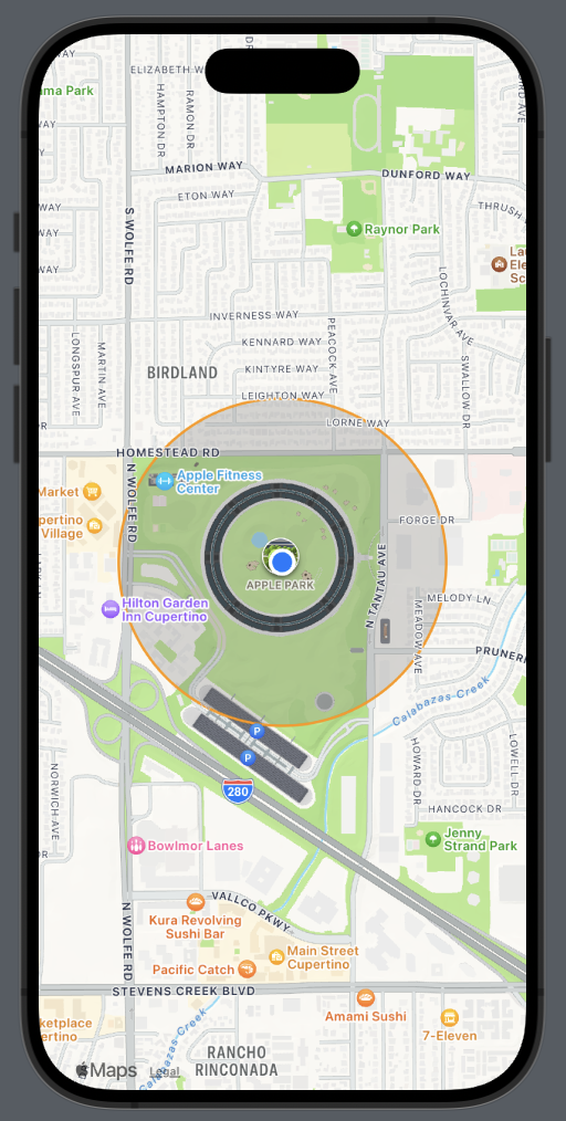
I have also changed the map style to a hybrid (satellite) view and added elevation to the camera.
For 2D:
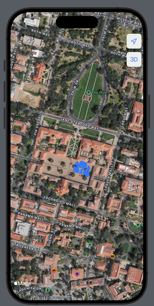
For 3D: