In this post, we’ll learn how to configure the look and feel of a list. The image we’re using is from unsplash,; rename it ‘zoe’ and copy it into the assets.
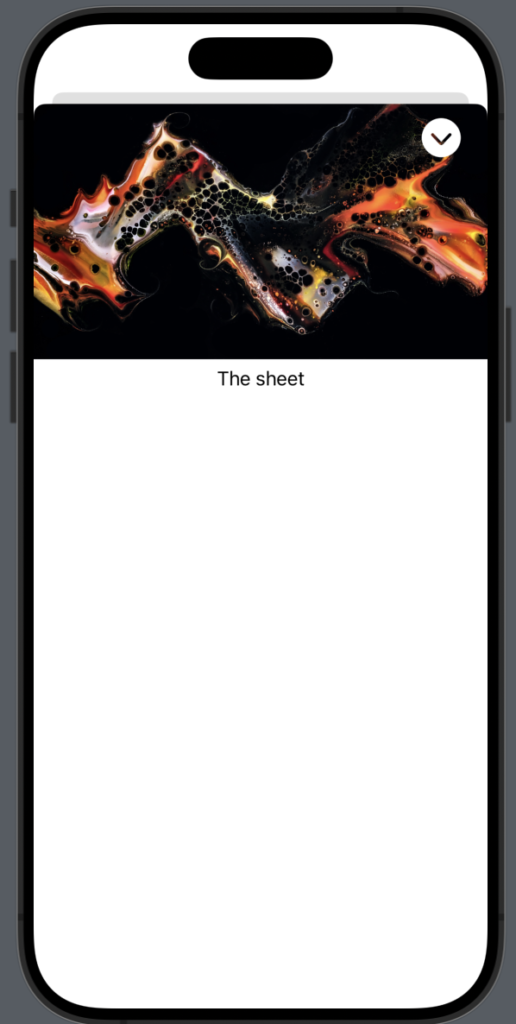
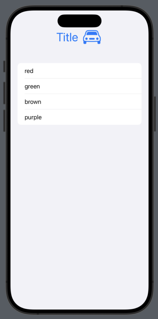
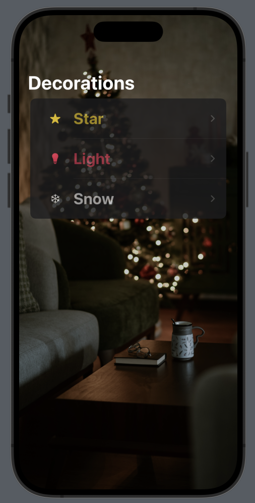
Let’s start from the end and begin by envisioning what we want to create:
First, install the San Francisco symbols (if you haven’t already), then create the data structure that we want to display in the list:
struct Decoration: Identifiable {
    let id = UUID()
    var name: String
    var color: Color
    var image: String
}
The struct implement the Identifiable protocol, because we need add an unique identifier.
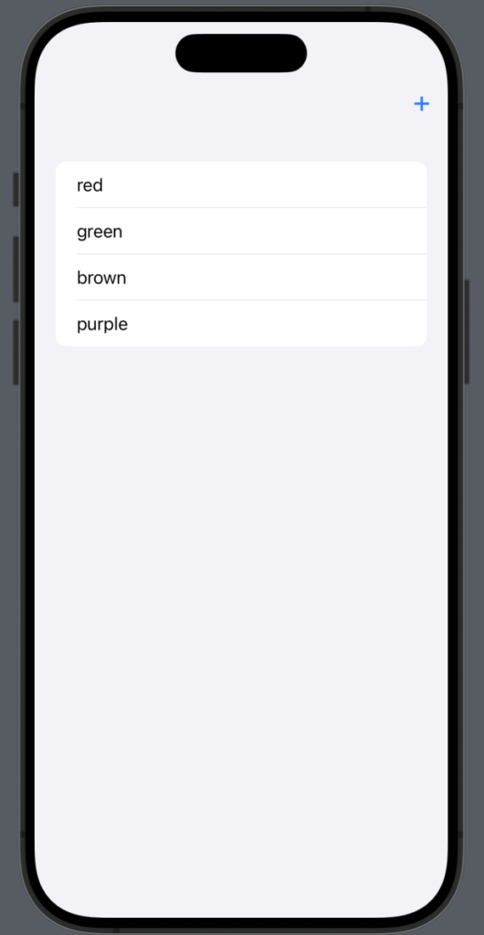
In the ContentView, we initialize the data:
struct ContentView: View {
    var decorations = [Decoration(name: "Star", color: .yellow, image:  "star.fill"), Decoration(name: "Light", color: .pink, image: "lightbulb.fill"), Decoration(name: "Snow", color: .white, image:"snowflake")]
We add only three Christmas decorations.
In the body:
var body: some View {
        NavigationStack {
            List(decorations) { decoration in
                NavigationLink(destination: EmptyView()) {
                    HStack {
                        Image(systemName: decoration.image)
                            .foregroundStyle(decoration.color)
                            .frame(width: 50, height: 50)
                        Text(decoration.name)
                            .foregroundColor(decoration.color)
                            .opacity(0.7)
                            .font(.title)
                            .fontWeight(.bold)
                    }
                }.listRowBackground(Color(red: 0.1, green: 0.1, blue: 0.1))
                .listRowSeparatorTint(.white)

            }
            .navigationTitle("Decorations")
            .background(Image("zoe").resizable().aspectRatio(contentMode: .fill)
                .edgesIgnoringSafeArea(.all)
            )
            .scrollContentBackground(.hidden)
            .opacity(0.8)

        }
    }
The content of each row is displayed using an HStack, which includes the name, color and the image of the decoration, utilizing the data from the decoration array.
Now, let’s take a look at the individual customizations:
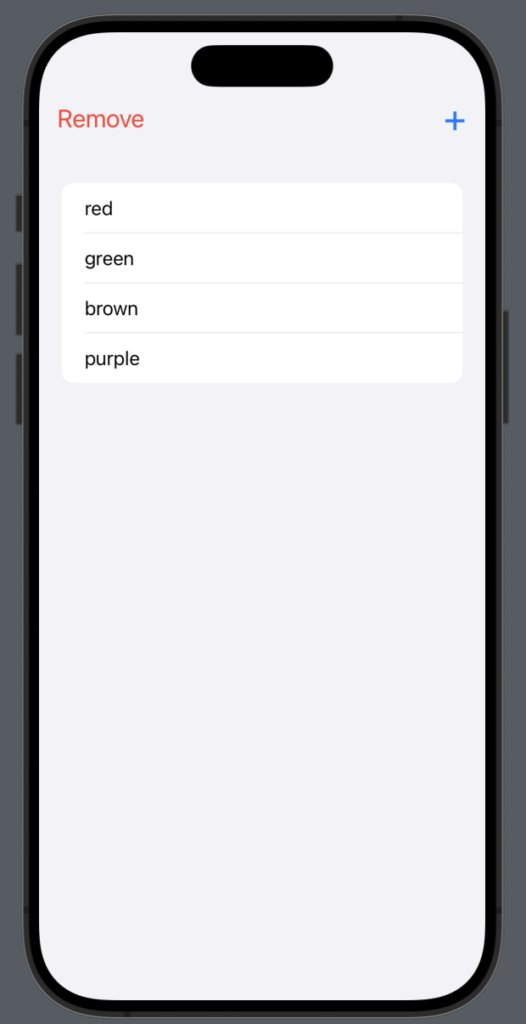
.listRowBackground(Color(red: 0.1, green: 0.1, blue: 0.1))
With this, we set the background of the row to a custom gray, instead of the default white (in light mode) or black (in dark mode).
.listRowSeparatorTint(.white)
To enhance the visibility of the row separator, we use this code to change its default color.
.background(Image("zoe").resizable().aspectRatio(contentMode: .fill)
.edgesIgnoringSafeArea(.all))
.opacity(0.8)
.scrollContentBackground(.hidden)
Therefore, we set the image as the background with a certain opacity and use all the available screen space, ignoring the safe area on every edge. Note that this last property is applied to the image, not to the background. Finally, we hide the background of the content so that the image is fully visible.
If you execute this code, you will see the title with the default black color (when using light mode). However, we want the title to always be in white. To achieve this, we add the init function to ContentView:
init() {
      // Large Navigation Title
      UINavigationBar.appearance().largeTitleTextAttributes =  [.foregroundColor: UIColor.white]
      // Inline Navigation Title
      UINavigationBar.appearance().titleTextAttributes = [.foregroundColor: UIColor.white]
    }
In this way, we set the text color for large and inline titles. Note the ‘UI’ prefix, which means that we are using functions from UIKit.
Note: English is not my native language, so I’m sorry for some errors. I appreciate if your correct me.